
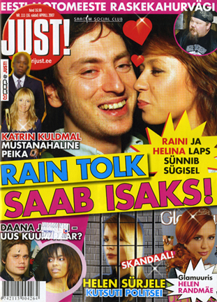
During a recent visit to Finland I discovered an Estonian { and not Russian magazine as I mentioned earlier, thanks to a note from Mikhail Smetana from Afisha Magazine Moscow, Russia} called JUST. It is a celebrity weekly magazine, as we call this type of magazines in the States, or a gossip weekly as they refer to this type of magazines in the rest of the world. I bought two weekly issues, but I was lucky enough not to open the magazines until I arrived back in the States. What a surprise. Remember those photo-shopped pictures of Britney Spears and Lindsay Lohan coming down from the car without underwear. Well most of the magazines in the States and in most of the world opted not to scare their readers and either edited or blurred the pictures using the magic of Photoshop. Not JUST magazine. They published both pictures as is. No editing, no Photoshop, no blurring… Pictures that I can’t even show on my blog (yet with some Google help you can find them on the web), however you will thank me for not showing the pictures if you see them. I am not a fan of altering pictures and or using Photoshop to add or delete parts of pictures, but at the same time I am a big believer in the power of editing… as in edit the pictures out… those pictures are the biggest exception to the theory that a picture is worth a 1,000 words… in the aforementioned pictures, trust me a 1,000 words would have helped me and many other readers avoid a few nightmares…

“JUST” the bare facts… or Brit and Lindsay with no Photoshop
May 17, 2007D Sport: Is it the car or the girl?
May 16, 2007

Well, D Sport magazine gives you the option with every issue. This month, and every month the magazine offers two split covers to choose from. This month it is issue number 54A and issue number 54B. The difference between A and B, as you can see above, is the “position” the model is “connected” to the car. For those who would like to see more of the car they can buy edition A; those who want to see more of the girl they can buy edition B. Those who can’t decide, just spend $10 and you can own both… I mean copies A and B of the magazine and not the car and the girl.
To Vs. or not to Vs.
May 15, 2007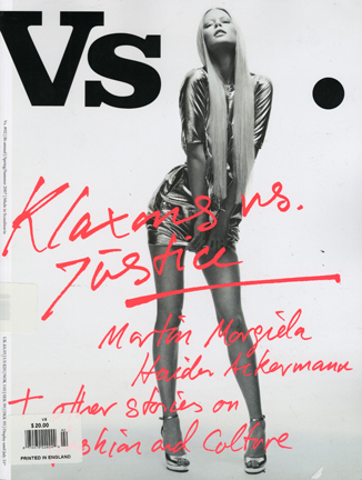
The message is not the medium and the proof is in Vs. magazine, a “large format and exclusive yet diverse way of showcasing fashion and culture. Scandinavian yet international. Reaching for the future yet holding on the classic goods.” Vs. has just published its second issue and it is indeed filled with “contrasts and contradictions,” as the name aptly states. Heavy glossy paper, large format, great photography, and excellent content make this magazine a “boutique” publication rather than a “supermarket” publication. Its hefty $20 cover price is worth every penny and a definite proof that when you present the relevant content in the relevant medium you can’t go wrong. Anyone that doubts the future of print, need not do anything but pick up a copy of Vs. and why print still reigns supreme when delivering that VIP factor: the visual impact of print. The magazine is both available in both English and Scandinavian languages.
Detroit has a new Ambassador (Hot and New this Week, take 6)
May 14, 2007Once a week, I highlight three new magazines on my web site Mr.Magazine™. This week the three new magazines are Ambassador, Gladiator and Kitu Kizuri. Read here about these new launches. To be considered for review on my web site, please send a copy of your first issue to Samir “Mr. Magazine™” Husni, Department of Journalism, The University of Mississippi, University, MS 38677.
Attention U.S. Newspapers: A MUST Read
May 13, 2007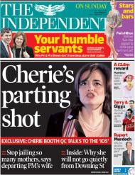
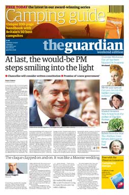
In today’s British The Independent newspaper, Peter Cole, a professor of journalism at the University of Sheffield in the UK, has written a great column titled “Newspapers may be changing but we will go on reading them On The Press: The industry has nothing to gain by talking itself down.” READ IT HERE. It is a call that I have been preaching for years in the United States Newspapers’ newsrooms, and as I mentioned in earlier blogs, to no avail. Read the article from the Independent here and keep in mind that if you (the newspaper editor and publisher) cannot survive the present, who cares about the future. We must survive the present and we must do something about it. Visit The Independent and The Guardian web sites and see how much you can learn. I have written about plenty of other examples, but none of them is in English…so for now read professor Cole’s article and do something about it…
Happy Mother’s Day
May 13, 2007Here is a hearty and happy wish for every woman who has conceived and given birth to a new magazine. Thanks for all the titles that you’ve brought to life, and all the best for a great Mother’s Day. Celebrate your day and continue to enjoy the labors of your love… As for the readers, celebrate Mother’s Day by buying a magazine today in honor of all the women who brought those titles to our world…
Good clutter vs. Bad clutter
May 12, 2007

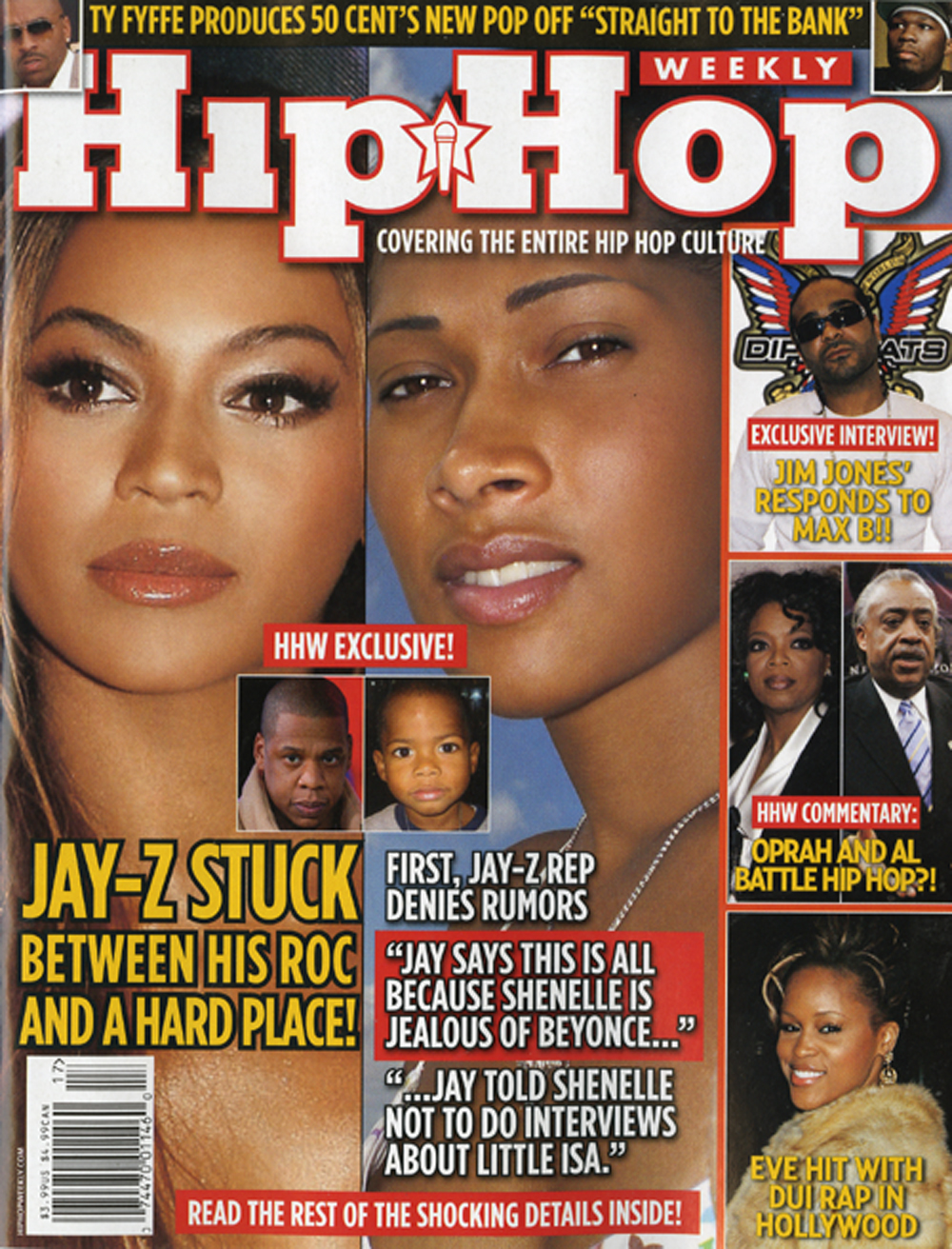
So what is the formula for good cover design? Well guess what, there is no such thing regardless what some may tell you. The variables are way too many and what makes one issue sells more than the other depends on the many variables that will need more than this space to list. However, one variable I know will work every time is that of repetition. The number one selling magazine on the newsstand per issue Cosmopolitan has been doing it for over 40 years. Use cover lines, with same themes in the same location. Men’s Health is doing the same. Some may say those two magazines are cluttered with cover lines (by the way, I call them sell lines), and I say but those cluttered covers sell magazines. We are in the business of designing covers to hang on a museum wall, we are in the business of selling magazines. However, if you want to be cluttered, you need to do so in all the right places. The upper left-hand corner is the most important real estate on a magazine cover… you ignore it and buyers will ignore you. Hip Hop Weekly uses the cluttered approach on its cover in all the wrong places… compare those three covers and judge for yourself…none will win an award for design, but two out of three will sell very well on the newsstand. You want to bet which two? Drop me a note.
There is nothing new under the “cover”
May 11, 2007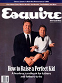

As you can see from the pictures above, good cover design repeats itself every now and then. Esquire has a history of great cover designs and now you have the opportunity to see all the covers of Esquire from 1933 until today by clicking here. I was browsing these covers this morning and the image on the November 1989 cover looked so familiar in its design to a magazine that I’ve just bought. Not to issue rush judgments, I reached into my stack of magazines for this month, and lo and behold the cover design of this month’s GQ looked a lot like the Nov. 1989 Esquire cover. Judge for yourself. By the way, I have always used Esquire’s covers in my classes as a great example of great men’s magazine cover designs together with those of Vogue’s as an example of great women’s magazine cover designs.
From one to 96 issues a DAY: Check out the G24 paper
May 11, 2007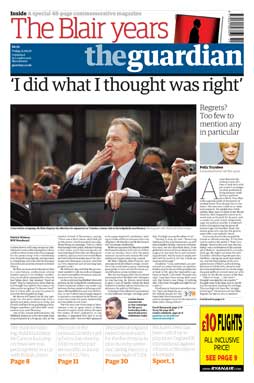
The (British) Guardian newspaper has added yet another innovative way to show how a newspaper can read, feel, and look like a magazine on a daily basis. The G24 daily magazine on the Guardian Unlimited newly revamped web site offers readers the opportunity to download and print, yes PRINT the pdf of five different sections that are updated every 15 minutes, yes UPDATED every 15 minutes. The sections offered are Top Stories, World, Media, (check it here media.pdf), Business and Sports. The family of The Guardian newspaper continues to grow and to provide readers/viewers a good, very good interactive paper that provides a link between the pixels on the screen and the ink on paper. Check it out here and note the content, the ads and the design of the G24 paper that publishes 96 times a day in five different sections. There are a lot of lessons to be learned here. Just keep in mind that all the planning for the future will not help if you can’t survive the present. When will our newspapers wake up and stop killing themselves…I keep on wondering which paper will be the first to take the lead and make us survive the present and help us look for a great future… Our industry needs a leader who is willing to look across the Atlantic and see what has been done with newspapers all across the world (including the one above). Our future is NOW… either CHANGE or DIE, there is no third option.
There is no nudity in NUDE
May 10, 2007
Washing on our shores in the United Stated is the first international issue of NUDE magazine, the British magazine with “100 pages of countercultural goodness.” The folks at NUDE tell the readers that the magazine was born in 2003 “as a 36-page magazine that was distributed primarily in London. However, as the magazine has grown, it’s scope has broadened in recognition of the fact that great artists, musicians, filmmakers and writers etc, come from all over the globe. As such, NUDE will continue to cover an eclectic mix of international mainstream culture, but from a very British perspective.” Well, NUDE will be a welcomed, but different, addition to the United States market. The square-sized magazine ushers an easy to follow design combined with lots and lots of “Music & Graphics & Hip Lit.” The handy sized magazine is worth every penny of its $6.99 cover price. One important final note about NUDE, you can expect a lot of things in this magazine, NUDITY is not one of them. Even with its name, the magazine goes “beyond the counter culture.”


 Mr. Magazine