“I wanted something that was unabashedly in print. First of all, I don’t think print journalism is dead; I think it’s actually coming back and it’s coming back in a way that only print can do. And that isn’t breaking urgent news on paper; we do that, we break news every day. We publish between seven and 11 stories a day on The Nation dotcom. Ken Klippenstein had a story about DHS monitoring protestors, tapping protestor’s telephone calls and reporter’s telephone calls that led to questions being asked in Congress, so we break significant news all of the time. But that isn’t what people turn to the print Nation for.” D.D. Guttenplan…
“It wasn’t a look to begin with, it was more of a tone of voice. The Nation has and continues to have a very strong personality. And before, where the design was shouting just a little too much, the tone has been brought down to a more level voice where it’s not exasperating the voice of the editorial all of the time. Also, our illustrations and our photography can often be quite aggressive, so the design is trying to balance that so that it doesn’t always heighten the drama to the magazine.” Robert Best…
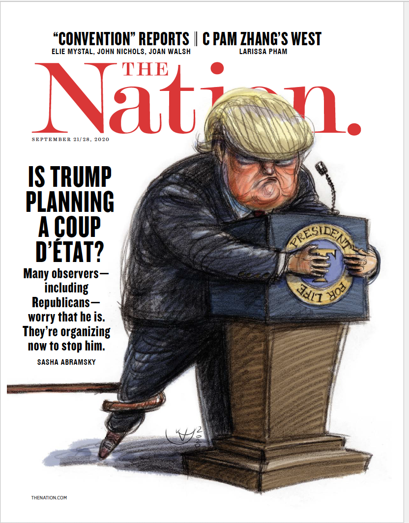
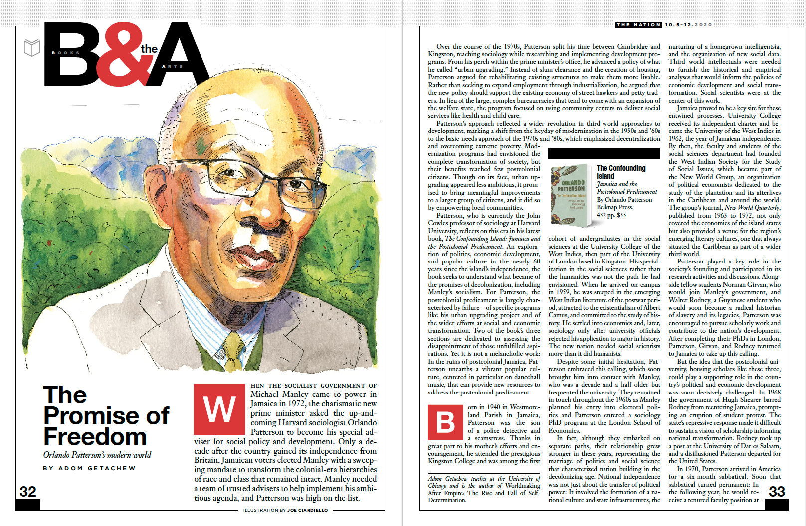
Founded by abolitionists in 1865, The Nation has chronicled the breadth and depth of political and cultural life from the debut of the telegraph to the rise of Twitter, serving as a critical, independent, and progressive voice in American journalism. D.D. Guttenplan is today’s editor and Robert Best, the brand’s creative director, and two of the people who helped redesign this legacy title.
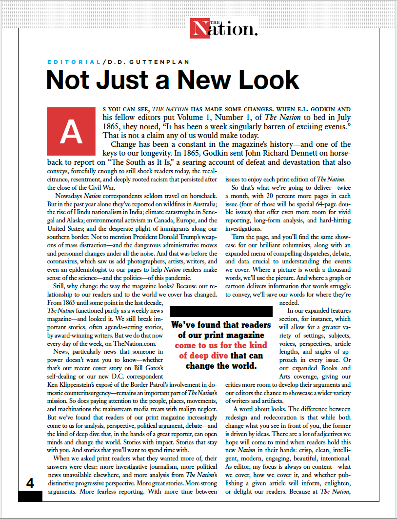
Recently, I spoke to both gentlemen about the new design that has brought a fresh new change to the magazine. Don Guttenplan said that with this new upgrade, which will be showcased in the October 5/12, 2020 edition, they asked print readers what they wanted more of, their answers were clear: more investigative journalism, more political news unavailable elsewhere, and more analysis from The Nation’s distinctive progressive perspective. More great stories. More strong arguments. More fearless reporting. With more time between issues to enjoy each print edition of The Nation. So that’s what The Nation is going to deliver—twice a month, with 20 percent more pages in each issue (four of those will be special 64-page double issues) that offer even more room for vivid reporting, long-form analysis, and hard-hitting investigations.
The print redesign was handled in-house by The Nation’s enormously talented creative director, Robert Best, and it will inform a digital overhaul in 2021. The idea behind the redesigned logo, marking the broader redesign, was to retain the history of the magazine’s logo, while bringing it forward: The classic logo type is now layered with a clean modern red square, and there is a strong contrast echoing the past and marking the next chapter. The new look is bold, eye-catching, and leans to the left—all appropriate for The Nation.
And now I hope you enjoy the Mr. Magazine™ interview with D.D. Guttenplan, editor and Robert Best, creative director, The Nation.

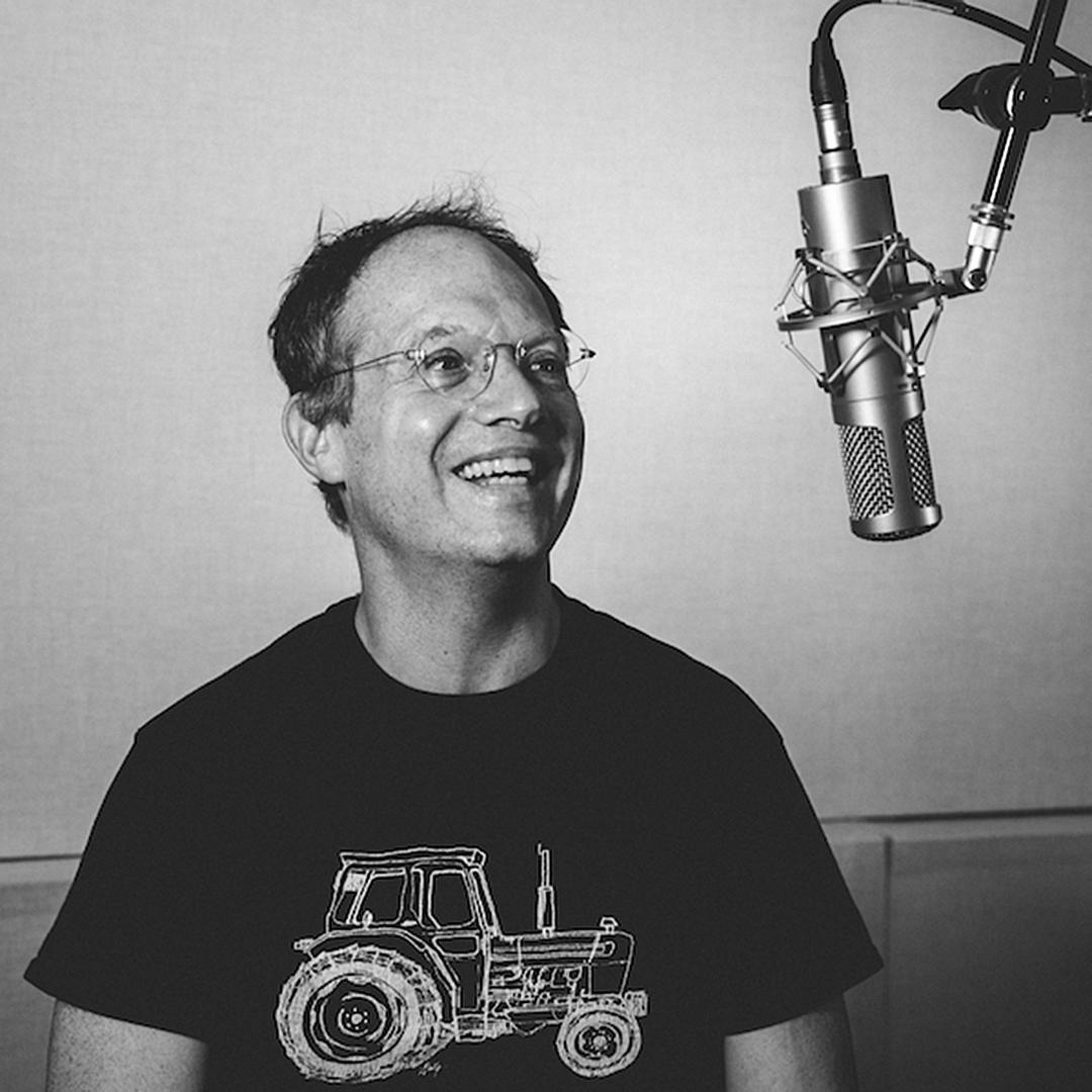
D.D. Guttenplan
But first the sound-bites:
On why the redesign and changes with The Nation now (D.D. Guttenplan): One of the things that I did when I took over was to take stock, and that means both looking at our journalism in terms of content and looking at everything we do, from how many pieces we publish a day on the web to what we’re putting in print. And I think I told you when we spoke last, when I first took over, that it was very important for me that we be clear on what we’re doing with print and what we’re doing with the web and what they are each for. And that they serve distinct purposes.
On what Robert Best was thinking when it came to a new design for a magazine with a more than 150-year-old history (Robert Best): It wasn’t a look to begin with, it was more of a tone of voice. The Nation has and continues to have a very strong personality. And before, where the design was shouting just a little too much, the tone has been brought down to a more level voice where it’s not exasperating the voice of the editorial all of the time. Also, our illustrations and our photography can often be quite aggressive, so the design is trying to balance that so that it doesn’t always heighten the drama to the magazine.
On their process or approach to the redesign (D.D. Guttenplan): Robert and I decided that we were going to do this and we discussed it with the business side and Katrina (vanden Heuvel), editorial director and publisher of The Nation, so everybody was onboard. Then we created a working group, a print redesign working group, which had people from editorial, but it also had people from business and circulation, We would meet regularly. Of course, that was still in the days when you could meet face to face.

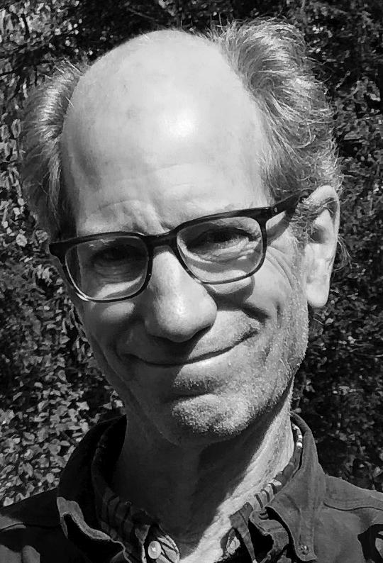
Robert Best
On their process or approach to the redesign (Robert Best): I’ve been doing this a long time and I want to solve problems. And I want things to look the way they should look based on those problems getting solved. One of the problems with The Nation was the paper wasn’t the best paper, so part of the design solution has to be something that whitens the paper visually. And that is the use of darks and lights, the contrast that I’m creating throughout the design. From the front of the book, there is a very small dot pattern that’s, if you called it a one to 10 spectrum, it would be the one. And all the black bars and the heavy black type would be the 10. And that’s what gets that high contrast level, because we have a lot of text, but we still needed to be something that people want to approach.
On whether the all-cap “N” they took from the logo all the way to the inside pages was part of the visual magnet to stop a reader before keeping them on the page (Robert Best): As far as using it on the logo, they both sort of worked hand-in-hand in how they came to the issue. The logo was as you said history, and retaining that history, while sort of layering it onto this modernistic look of the red square, where it becomes something else, yet you remember where it came from. On the inside, the drop-caps were again sort of a…our colors are black and red obviously throughout the magazine, and that just sort of brings a modern quality to a drop-cap and is a good starting point.
On what role they feel journalism can play now in our world of division and the pandemic (D.D. Guttenplan): I don’t think it’s our job to offer people false hope and I also don’t think it’s our job to be Chicken Little; I think it’s our job to tell people the truth. And I suppose part of that is when you know what you’re talking about you don’t have to shout, so in that sense I very much appreciated Robert’s metaphor which he’s used throughout changing our tone of voice a bit. The Nation is not a consumer magazine, so we’re never going to write about the best pizza parlor in Chicago, but we may write about things you can do to make your vote actually count or this is what you can do to get involved on Election Day. We can give people useful information certainly. So, our role is to do that and to tell people the truth.
On the human being The Nation would be if it were suddenly struck with a magic wand that produced that person (D.D. Guttenplan): It’s not a he or she, it’s they. It’s always going to be a “they.” I think one of the things that makes The Nation different from any other magazine is our genuine openness to debate. It’s not that we’re necessarily contrary and provocateurs, we’re not here as the line, here is the correct thing to think. The Nation is one way to think about it, but within the progressive frame that we’re all committed to as a magazine. There are other ways to think about it, and here are some of them, so The Nation is never one person knocking on your door. It’s not me; it wasn’t Katrina before; it wasn’t Victor Navasky before that.
 On whether they believe there is a good exchange of ideas in our country or it’s just everyone shouting at everyone else (D.D. Guttenplan): Everybody is clearly shouting everyone, that’s what Twitter is for. (Laughs) I feel like there are magazines that matter, and that’s becoming increasingly true during the pandemic because people are spending more time at home. One of the things that you can do at home is read. And we want to be part of that; we want to be a part of people’s intellectual lives. Part of the political life of the country as we have been for 155 years.
On anything they would like to add (Robert Best): It’s ideas and a new voice, like we talked about. And what we’re finding now as we finish up the second issue is finding a familiarity to that voice and knowing that it’s not going to stay the same. It will start moving left and right, and that’s an exciting time. It’s invigorating to have a certain sense of feeling a little off balance, because we’re not used to it. And that’s going to bring fresh ideas and content, so that we’re not resting on what we’re used to.
On what keeps them up at night (D.D. Guttenplan): What keeps me up at night is trying to find a way through this pandemic to keep The Nation relevant and keep my staff happy without being able to meet face to face. That has been a challenge. It’s a challenge for all of us, but it is what keeps me up at night. How to manage when we can’t actually be together in a room. Robert and I have very good rapport, so we were able to do this even though we were very far apart geographically.
On what keeps them up at night (Robert Best): What keeps me up at night – well, since Don is in England right now, it’s not the nights, it’s the mornings. (Laughs)
And now the lightly edited transcript of the Mr. Magazine™ interview with D.D. Guttenplan, editor and Robert Best, creative director, The Nation magazine.
 Samir Husni: We know change is the only constant in journalism and the media business, but why change The Nation now?
D.D. Guttenplan: There are a couple of reasons. One of the things that I did when I took over was to take stock, and that means both looking at our journalism in terms of content and looking at everything we do, from how many pieces we publish a day on the web to what we’re putting in print. And I think I told you when we spoke last, when I first took over, that it was very important for me that we be clear on what we’re doing with print and what we’re doing with the web and what they are each for. And that they serve distinct purposes.
My view then was that our print magazine was not clear about why we were still in print; why we are on paper. What kind of experience do we want people to have and what kind of experience do our subscribers want? The second part of that equation, what kind of experience do our subscribers want is important, because those are the people at this point in our funding model, who pay our salaries. In other words, we could imagine a world in which The Nation was supported by supporters who donate because of the wonderful things we publish on the web and that would be a different model, but that isn’t the model we’re in. The model we’re in is where the bulk of our revenue comes from subscriptions. Not all of the subscriptions are print, but the majority of them are print.
So, I needed some time to find out from our print subscribers just what it was they wanted and that meant talking to our businesspeople, talking to circulation; designing a questionnaire, getting it out, getting responses. So part of this was I always felt that we needed to change but we weren’t able to change until we had data. And some of that data is what do our subscribers want.
When the data came back it was very clear what they wanted. And you probably know this already because you pay a lot of attention to magazines, but if you look at the cover of The Nation and then you look at the cover of, for example, The Atlantic or Harper’s, they are on slick paper and we are not. They’re on coated stock and we aren’t. The reason for that is because our readers have always been very clear, they want our money to go into the journalism. It’s not that they don’t care how it looks, they do care. I’m sure they appreciate good design as much as I do, or almost as much as I do, since I think I appreciate the design enormously. I certainly appreciate my good fortune in having a genius like Robert Best on staff, because we couldn’t have done this otherwise.
 It’s very important that you know this was all done in-house. We did not go to some consultant and ask how can we look better? This was done under the lead of someone who has been working on designing, had his hands on our product for seven years. He is very deeply immersed in what we do.
Our subscribers said that what they wanted was stories with more impact; stories that could go deeper; stories that you’re happy to spend more time with; more investigative reporting; more in depth analysis, and they were at the very least not fussed about whether it came every week or every other week. Again, this wasn’t a thing that was widely noticed, but The Nation hasn’t published 52 issues a year in a very long time.
We had this rhythm of going biweekly in the summer, biweekly at Christmas, but I was also getting complaints from people saying they didn’t get their issue. Then I would go to circulation and ask what happened to that person’s issue and they would say they received their magazine, it’s just that we went biweekly. And they didn’t realize that and thought they had missed an issue.
So, there was this message that they wanted more; they wanted a bigger canvas. And they would be very happy to have more time to read what we were giving them. All of those things together led to this shift where we’re quite regular twice a month and predictable. And where there is more time between issues than there was some of the time, because some of the time we were already publishing on this schedule, but now we’re on this schedule all of the time. And now each issue is bigger, we added 20 percent length to each issue, so the features well got four extra pages, the front of the book section, which is editorials, comments, and short pieces got two pages; the books and the arts section got two extra pages, and we also have these four double issues, four times per year, of 64 pages. The next issue that comes out, the fall book issue will be one of those double issues and it will be 64 pages.
 In terms of total pages, published in the course of a year, there’s not that much change. And of course, that means we’re not actually saving much money doing this; we’re saving money on postage, but in terms of publishing costs it’s pretty much a wash. But we are able to go deeper and to give people more. What I wanted in that case was a design that people would be happier to spend more time with. I felt in my gut that our previous versions were done at a time when the Internet and social media were transforming journalism and leading a lot of people to think that it was dying.
I wanted something that was unabashedly in print. First of all, I don’t think print journalism is dead; I think it’s actually coming back and it’s coming back in a way that only print can do. And that isn’t breaking urgent news on paper; we do that, we break news every day. We publish between seven and 11 stories a day on The Nation dotcom. Ken Klippenstein had a story about DHS monitoring protestors, tapping protestor’s telephone calls and reporter’s telephone calls that led to questions being asked in Congress, so we break significant news all of the time. But that isn’t what people turn to the print Nation for.
It was thinking about what people turn to a print magazine for and what we need to change to meet those needs and desires and to create a product that people will be happy spending more time with. And hopefully be more happy to pay for. We want more subscribers.
 Samir Husni: Robert, what was your thinking when it came to a new design for a magazine with more than a 150-year-old history? You don’t want to touch the DNA, yet you want to give it a new look. Was it just a new look or was it what Don said about taking a deeper dive into journalism and presenting it in a way that only print can do?
Robert Best: It wasn’t a look to begin with, it was more of a tone of voice. The Nation has and continues to have a very strong personality. And before, where the design was shouting just a little too much, the tone has been brought down to a more level voice where it’s not exasperating the voice of the editorial all of the time. Also, our illustrations and our photography can often be quite aggressive, so the design is trying to balance that so that it doesn’t always heighten the drama to the magazine.
Samir Husni: How did you use the data that was collected to see what readers wanted from a print magazine to create the new design? What was the process, the approach?
D.D. Guttenplan: Robert and I decided that we were going to do this and we discussed it with the business side and Katrina (vanden Heuvel), editorial director and publisher of The Nation, so everybody was onboard. Then we created a working group, a print redesign working group, which had people from editorial, but it also had people from business and circulation, We would meet regularly. Of course, that was still in the days when you could meet face to face.
The Nation has a very nice conference room, I miss it, with a view over 8th Avenue, and we would meet in there. Actually, in early February I got a couple of bulletin boards on legs and people would put up pages from magazines that they liked or things that they thought worked well.
So, we had those meetings and those meetings continued on Google Chat regularly even after we closed our office on March 17. And the group was chaired very capably by Rose D’Amora who is our managing editor. Everybody had input and we came up with what was called a strategic document for the redesign. And that was what Robert and I steered by.
There’s an important point that I want to make. Very early in this process Robert made a distinction between a redecoration and a redesign and I’m going to let him explain it to you. Because of that distinction, we thought it was very important for people to talk about what they wanted the print magazine to do. What were our what’s? So we spent a lot of time in these meetings asking people what it was they wanted to see in the new version; what they wanted it to do. Not how they wanted it to look, but what kinds of things they wanted to create space for.
For example, we have a piece in this issue called “The Argument” where someone makes a strong polemical statement. That was one of the “what’s” that came out of these meetings. We have a thing in this issue called “The Leak” where Ken Klippenstein takes a document that has been leaked to him and he annotates it in a way that shows readers what is significant about this document. That was also one of the “what’s.”
But I think it’s very important that you hear from Robert because he is very eloquent about why he didn’t want us to talk about how it should look and the distinction between a redecoration and a redesign.
Robert Best: I’ve been doing this a long time and I want to solve problems. And I want things to look the way they should look based on those problems getting solved. One of the problems with The Nation was the paper wasn’t the best paper, so part of the design solution has to be something that whitens the paper visually. And that is the use of darks and lights, the contrast that I’m creating throughout the design. From the front of the book, there is a very small dot pattern that’s, if you called it a one to 10 spectrum, it would be the one. And all the black bars and the heavy black type would be the 10. And that’s what gets that high contrast level, because we have a lot of text, but we still needed to be something that people want to approach.
As far as the “what’s,” I really believe people want to feel familiar with the magazine; want to expect certain things, that when they go to it, they go to those things first. I was at New York Magazine for years and our research said that best bets, there were certain intelligencers, certain pages that people looked forward to. The features are the extra stuff, the things that they don’t expect, and that’s great.
Creating brands for the magazine that heightens the writers and heightens the series like “The Leak” will become something that when you mention it people will say, oh yes, that’s the piece that was in The Nation magazine. So we wanted brands that can be parts of conversations.
Samir Husni: I’ve noticed also from the all-cap “N,” you took that theme from the logo all the way to the inside pages, was that part of that visual magnet to stop a reader before keeping them on the page?
Robert Best: As far as using it on the logo, they both sort of worked hand-in-hand in how they came to the issue. The logo was as you said history, and retaining that history, while sort of layering it onto this modernistic look of the red square, where it becomes something else, yet you remember where it came from. On the inside, the drop-caps were again sort of a…our colors are black and red obviously throughout the magazine, and that just sort of brings a modern quality to a drop-cap and is a good starting point.
 Samir Husni: Tell me more about the need in this day and age for the type of journalism The Nation offers. What role do you feel journalism can play now in our world of division and the pandemic?
D.D. Guttenplan: We live in a very polarized country and we live in very perilous times. If you think about what has been in the national conversation during the last week, we don’tknow whether we’re going to have a second wave of the pandemic that will be even worse than the first. We know that America has squandered a lot of the experience we could have had in the first wave, in terms of preparing. There is still not testing on demand, there’s still not adequate testing provisions, there is still not national provisions of PPE, there is no track and trace infrastructure in place; all the things that other countries have done, we haven’t done. So, we’re all living with uncertainty as to what is going to happen with our physical health now.
One of the things that occurred to me in March was we all have opinions about the Coronavirus, but you know what they say about opinions… everybody has one. So, I wanted someone who I knew would know what they were talking about, so I reached out to an epidemiologist, Gregg Gonsalves, who is at the Yale School of Public Health and who now writes a column for us every two weeks or so. But it’s online; I think he’s been in print once. But the pandemic is one big element of uncertainty.
Whether the results of the presidential election are going to be disputed, and we don’t know if there will be a peaceful transition of power that the Constitution takes for granted, but doesn’t actually guarantee. So, there is a lot of uncertainty.
I don’t think it’s our job to offer people false hope and I also don’t think it’s our job to be Chicken Little; I think it’s our job to tell people the truth. And I suppose part of that is when you know what you’re talking about you don’t have to shout, so in that sense I very much appreciated Robert’s metaphor which he’s used throughout changing our tone of voice a bit. But also nobody wants to spend two weeks with somebody shouting at them from their coffee table or from their kitchen table or from wherever you keep the things that you read and don’t throw away the same day. You don’t want the magazines shouting at you and you don’t want them to be so time-tied that they’re disposable. You want them to have things that you feel you’ve learned something from or that have made you think or have been useful for your life.
The Nation is not a consumer magazine, so we’re never going to write about the best pizza parlor in Chicago, but we may write about things you can do to make your vote actually count or this is what you can do to get involved on Election Day. We can give people useful information certainly.
So, our role is to do that and to tell people the truth. One of the things I wanted from the design and this is where I think Robert has succeeded brilliantly is I wanted our pages to be sticky. I wanted people flipping through it to think this is something they would want to read. And for them not to feel like the magazine was something that had already seen yet again. I mean, you want a certain amount of predictability, where people come to you for certain voices, our columnists are wonderful and we have a great rotation and an amazing diversity of voices, but in the rest of the magazine I want people to be able to be surprised. And I want there to be a variety of different kinds of sticky articles so that people will want to spend time with it, because that’s the thing, we’re all competing for readers’ time.
I feel like what print can do is it can give you a lean-back, time-to-think-about-it, explaining complexity, living with complexity depth that you can’t get from a screen.
D.D. Guttenplan
Samir Husni: If I could give you a magic wand to strike this new The Nation magazine with and a human being suddenly popped out, who would it be? Can you describe that person?
D.D. Guttenplan: It’s not a he or she, it’s they. It’s always going to be a “they.” I think one of the things that makes The Nation different from any other magazine is our genuine openness to debate. It’s not that we’re necessarily contrary and provocateurs, we’re not here as the line, here is the correct thing to think. The Nation is one way to think about it, but within the progressive frame that we’re all committed to as a magazine. There are other ways to think about it, and here are some of them, so The Nation is never one person knocking on your door. It’s not me; it wasn’t Katrina before; it wasn’t Victor Navasky before that.
The Nation is more like Christmas carolers coming to your door; it’s more of a group. And some people hate them, but some people like them and they usually sing more than one carol. (Laughs)
Samir Husni: Robert, are you the leader of that Christmas caroling group? (Laughs)
Robert Best: (Laughs too) No, I’m in the back row.
Robert Best
Samir Husni: Do you feel we have a good exchange of ideas in the country or everybody is shouting at everyone else?
D.D. Guttenplan: Everybody is clearly shouting everyone, that’s what Twitter is for. (Laughs) I feel like there are magazines that matter, and that’s becoming increasingly true during the pandemic because people are spending more time at home. One of the things that you can do at home is read. And we want to be part of that; we want to be a part of people’s intellectual lives. Part of the political life of the country as we have been for 155 years.
And I also think that was Robert said is true; a tremendous amount of work and thought went into this first redesigned issue. But that’s just the first one. There’s a lot of modularity and flexibility so that we can move things around within a structure. One of the things that I think Robert is so brilliant at is using visual hierarchies to organize people’s reading experiences.
I used to use this word a lot with my staff, but I stopped because they started making fun of me, which is intentionality. But I think there is a lot of intentionality in this design. It’s very considered. We have discovered the features of this new house that we’ve built and what we can do with it, and then we take that to our digital and we redesign that too. That will be the next phase, which will probably be about a year off. And getting to know the house will undoubtedly shape that. Digital is a different thing than print, so it will be its own thing. But we now have a visual vocabulary that we’ll want to carry over when we do the digital redesign.
Samir Husni: Is there anything else either of you would like to add?
D.D. Guttenplan: One of the things that Robert told me and the staff when we were starting this was that the difference between a redesign and a redecoration was that a redesign is driven by ideas. Robert, would you like to elaborate on that?
Robert Best: It’s ideas and a new voice, like we talked about. And what we’re finding now as we finish up the second issue is finding a familiarity to that voice and knowing that it’s not going to stay the same. It will start moving left and right, and that’s an exciting time. It’s invigorating to have a certain sense of feeling a little off balance, because we’re not used to it. And that’s going to bring fresh ideas and content, so that we’re not resting on what we’re used to. The redesign is just beginning, actually. And it will continue with good content, good thinking, excitement and enthusiasm.
Samir Husni: My typical last question; what keeps you up at night?
D.D. Guttenplan: What keeps me up at night is trying to find a way through this pandemic to keep The Nation relevant and keep my staff happy without being able to meet face to face. That has been a challenge. It’s a challenge for all of us, but it is what keeps me up at night. How to manage when we can’t actually be together in a room. Robert and I have very good rapport, so we were able to do this even though we were very far apart geographically.
Maintaining that kind of rapport with every member of my editorial team takes a lot. And that’s what keeps me up at night. It used to be so easy in The Nation’s office. When I opened my door I could see Robert sitting at his desk. I could walk over and ask him what do you think about this or that? And that was true with everyone in the office. I might not be able to see them directly in my office, but I knew they were there. But now it’s harder.
Robert Best: I’d like to say that working with Katrina over the years, and now Don, these are two editors that have always trusted me and the entire staff. They trust us and let us have our own voice. And that makes for a really great place to work.
What keeps me up at night – well, since Don is in England right now, it’s not the nights, it’s the mornings. (Laughs)
Samir Husni: Thank you both.

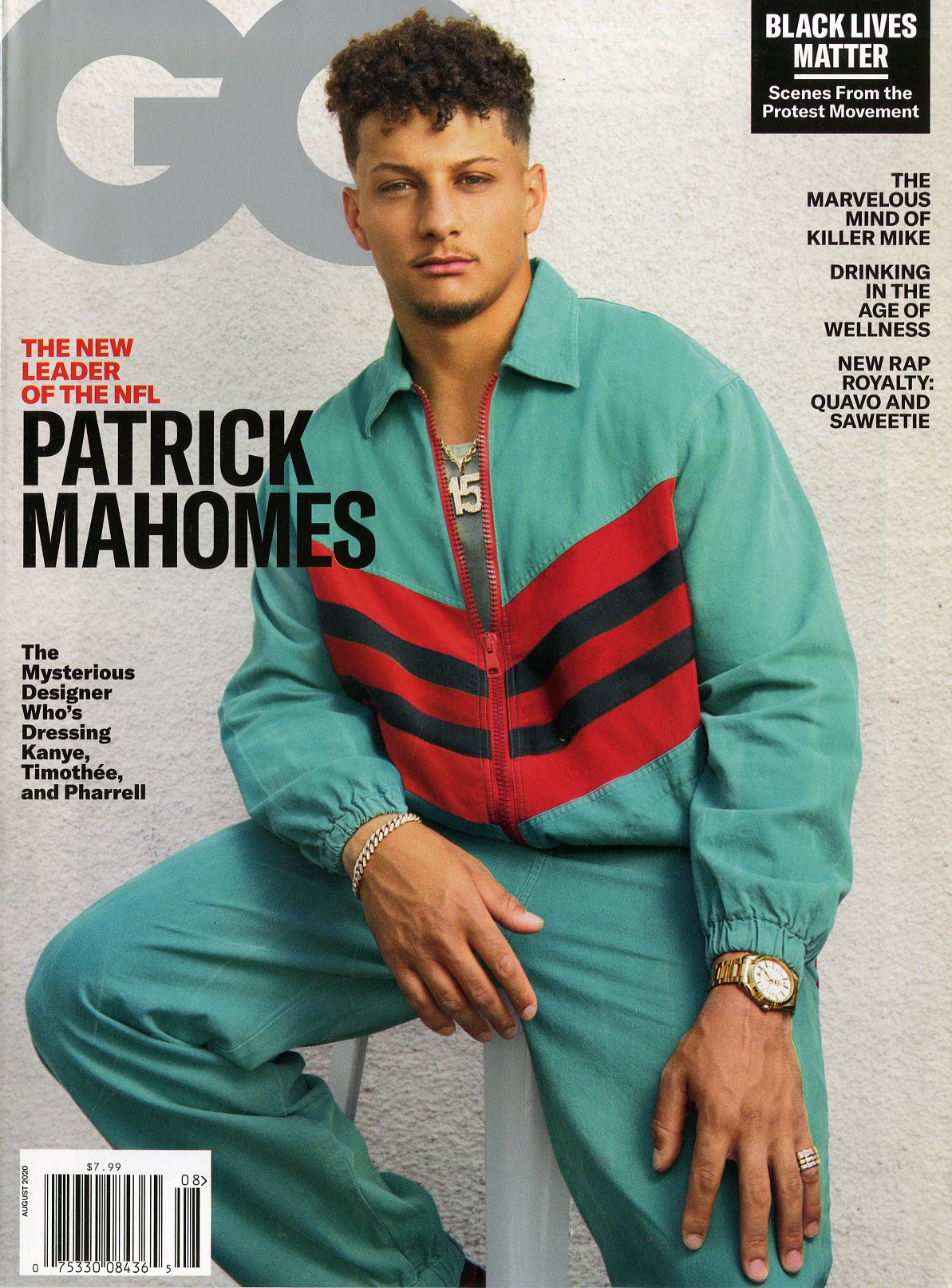
As I write this in late June, the past couple of weeks have proved fairly tumultuous for people working in the predominantly white UK magazine industry. In the wake of George Floyd’s killing in the US and the subsequent Black Lives Matter protests around the world, there has been a lot of belated hand-wringing and understandable brow-beating, as well as some unhelpful, imprudent sabre-rattling.
We’re little more than halfway through 2020 and it’s already hard to grasp the biblical change that have tossed us around and spat us out into this alternate reality. I read something recently that made some sense to me. It was a quote by Lenin. He said, “There are decades where nothing happens, and there are weeks when decades happen.” I don’t know about you, but the past four months feel like centuries have happened.
…Welcome to the special “Change Is Good” issue of GQ. It is a response to the wildly varied and overlapping forces of change – social, political, cultural, technological, economic—we are experiencing. The issue is intended as an instrument of inspiration and hope…