“We’re not even sure that it’s the best format (print), but it’s where our heart is taking us. And I’m always a firm believer in following your gut instinct and following your heart. To be very transparent, the magazine has not taken off financially at all, but I feel like if we’re stubborn and we study our audience a little better, the magazine will definitely take us there. There’s this aspect of archives that doesn’t exist online and in digital magazines that we’d like to retain with this print magazine.” Maya Moumne…
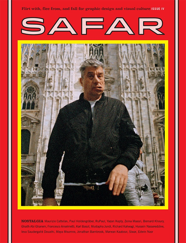
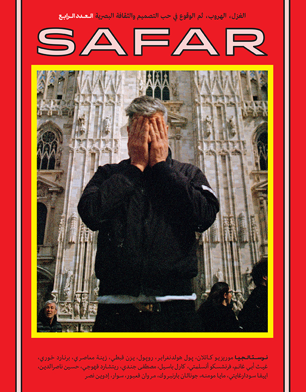
An independent magazine that focuses on the visual beauty and technique of graphic design in the Arab world is something worth talking about, as graphic design becomes more and more important and prominent in the Middle East. Safar magazine is published both in English and in Arabic in each issue (something done intentionally to attract a wider audience). And with each of its themed issues, the founders, Maya Moumne and Hatem Imam, invite a diverse set of contributors to talk about graphic design in their own individual voices as the theme allows.
On a recent trip to Lebanon, I spoke with Maya Moumne, one of the brand’s founders, and we talked about the unique aspects of the magazine, from the intriguing content of a print publication all about graphic design, a very rare thing in the Arab world, and the public talks between esteemed people in the cultural sphere, that is an extension of the magazine.
The magazine was born from an embryo started by Maya and Hatem in the form of Studio Safar, a graphic design company, mainly commission-based, that indulged their passion for design and print. It’s a lovely magazine and a very welcomed breath of fresh air to graphic design enthusiasts around the globe.
So, I hope that you enjoy this glimpse into the world of graphic design through the eyes of a very passionate young woman who is both an entrepreneur and an artist with a very important mission and dream, the Mr. Magazine™ interview with Maya Moumne, cofounder, editor in chief and creative director, Safar magazine.

But first the sound-bites:
On the story of Safar magazine: In 2012, my partner and I started a design studio called Studio Safar. It was mainly in a commission-based context. Throughout, with the type of work we were doing, my partner and I realized that we already had a passion for print and it had always been our dream to delve into the publishing realm. So we decided to start a magazine on graphic design because there were no magazines in the area that tackled graphic design specifically. And certainly none that were available in Arabic. When we started we called it Journal Safar and the format of the magazine was very different from the current one that you have seen. It was more like a journal that was published by the Studio.
On the magazine’s tagline, “flirt with, flee from, and fall for graphic design and visual culture”: Say, we’re designing a publication; the role of the graphic designer cannot only be to design the page given the photography and the text, the designer’s role is really enacting the way that you read the publication or that you receive the content. You give me an article and you tell me that this is the text and these are the images. I can design this article in five different ways and in each one of these different ways, you will receive the content in a different manner. You’ll understand the content differently. So, the rule of the designer really is to flirt with the viewer. What we’re trying to do with the magazine is get people to flirt with this idea of design being an agent of cultural production, and getting them to fall for it, and also getting them to flee from misconceptions around design or trends around design.
On why she and her partner, Hatem Imam, decided print would be the best format for the magazine: We’re not even sure that it’s the best format, but it’s where our heart is taking us. And I’m always a firm believer in following your gut instinct and following your heart. To be very transparent, the magazine has not taken off financially at all, but I feel like if we’re stubborn and we study our audience a little better, the magazine will definitely take us there. There’s this aspect of archives that doesn’t exist online and in digital magazines that we’d like to retain with this print magazine. And for that reason the magazine is completely translated into English and Arabic in one publication or one document for the sake of having this material there five to ten years down the line. In Arabic, the dictionary of graphic design terms does not exist because graphic design is a very new field.
On where her journey began: My family moved to Canada many years ago and they stayed there for about eight years, but they eventually moved back to Lebanon. I was very young when they moved back to Lebanon, and when everyone asks me where I was raised, I say that I was raised in Beirut but the first half of my childhood was in Montreal, Canada. But the rest of my life, such as character-building, interest-building, everything, was in Beirut, Lebanon and nowhere else.
On what got her hooked on graphic design: The infinite possibilities. The fact that a graphic designer can be someone who is so well-informed about a musical project because they have to design a printed ephemera or an online ephemera around that musical project. And the fact that a graphic designer can be so well-informed about helping cybersecurity because they’re working with a cybersecurity company on their communications strategy. It’s really the infinite possibilities.
On the future of graphic design in the Arabic world since it’s a relatively new field: I can tell you from working based out of this region that people are turning more toward hiring graphic design agencies versus advertising agencies, and that’s been a really big shift and accomplishment in understanding the value of graphic design versus advertising. More and more advertising agencies are closing and more and more graphic design agencies are opening. I’m pretty confident that the times will change and graphic designers will be given much more agency than they are right now.
On the eclectic mix of stories and articles in the current edition and what made them decide to bring such a diverse group of individuals together in one issue: Most of the time the articles that we pick could really be a midnight project; I wake up at 3:00 a.m. and think, I really want to learn more about this or that. And then I’ll think, who’s a good designer? Whose research has touched on that? Or whose research is based on that? I’ll contact them and if they’re interested, then they’ll write an article about that. Other ideas will come really whimsically, almost accidentally.
On the biggest stumbling block they have had to face: I would have to say that it’s the finances. Every other part of it was a lot of hard work, but a very enjoyable process. I wouldn’t call it a stumbling block.
On what she would hope to have accomplished with the magazine one year from now: There’s a lot that I hope to accomplish with the magazine, but there are two things that I will mention in this interview. One of them is graphic designers will understand and learn that their role isn’t just to design what clients tell them to design; their role is much more important than that. They are actually cultural producers. That is one thing I would like to achieve with the magazine in one year.
On where people can go to get a copy of the magazine: For now, our Instagram account is the best way because we’re in the process of distributing the last issue to the distribution company and to bookstores around the world. And while we have one centralized link where people can just visit online to purchase the magazine from, they’re going to have to contact us and we can tell them where they can go online and what bookstores they can get it from based on what city they live in.
On anything she’d like to add: I’d like to elaborate a bit more on the last answer I gave and say that for example, with the launch of this last issue, an organization with so much history and so much prestige like Onassis Culture, based in Athens, took a particular interest in us and partnered with us to create the launch event of our last issue. And the launch event wasn’t just a matter of selling the magazine and partying and drinking, it included a series of public talks between Paul Holdengräber, who is someone that I have so much respect for and I was star struck when I met him, and we conducted a talk between three people in an auditorium with a stage and an audience, to talk about matters that are related to cultural production, nostalgia and design.
On what someone would find her doing if they showed up unexpectedly one evening at her home: Definitely having a glass of wine, it relaxes me. Definitely reading relaxes me, and definitely watching a movie relaxes me.
On the biggest misconception she thinks people have about her: I don’t know and I don’t really care what misconceptions people have about me.
On what keeps her up at night: It’s funny that you ask that because I actually do wake up in the middle of the night thinking about work. There are two main things: what’s the next step, which is always on my mind, what am I going to do next, let’s do this or do that. And the second one is how am I going to pay the bills.
And now the lightly edited transcript of the Mr. Magazine™ interview with Maya Moumne, cofounder, editor in chief, and creative director, Safar magazine.

Samir Husni: Can you tell me the story of Safar?
Maya Moumne: Yes, of course. In 2012, my partner and I started a design studio called Studio Safar. It was mainly in a commission-based context. So, if an art institution wants to design an identity, they’ll hire us, and if a publisher wants to have a book designed, he or she will contact us and we’ll design the book for them. And we have worked with art institutions, clients mainly in the cultural sector, some musicians, some corporate agencies and such.
Throughout, with the type of work we were doing, my partner and I realized that we already had a passion for print and it had always been our dream to delve into the publishing realm. So we decided to start a magazine on graphic design because there were no magazines in the area that tackled graphic design specifically. And certainly none that were available in Arabic. When we started we called it Journal Safar and the format of the magazine was very different from the current one that you have seen. It was more like a journal that was published by the Studio.
In the last issue we decided that in order to make the publication more accessible, and to change this misconception of graphic design being something that is only service-oriented, we need to reach a larger audience, so we changed the name from Journal Safar to Safar alone, hoping that with the coming years the magazine will overpower the Studio. We’re hoping that people will recognize Safar as the magazine and not just the Studio, which is currently what’s happening.
We’ve also changed the type of articles that exist in the magazine that we publish. Before they were a bit more abstract than they are right now. We’re going more in the direction of content that is not just from graphic designers, and that’s the only way that we can disrupt that misconception.
Samir Husni: Your tagline is that you want to “flirt with, flee from, and fall for graphic design and visual culture.” Can you expand a little bit on that?
Maya Moumne: Of course. Everything that we do comes from our personalities, my partner and I, Hatem Imam. And also from the nature of the type of work that we do at the Studio and the culture that exists there. Every project that we take on, especially the commissioned ones, there is always a phase where we are trying to provoke the client, evoke the client, and we try to get them to question the nature of their own business. We feel very strongly that the rules of the graphic designer, in any given project, are so essential.
Say, we’re designing a publication; the role of the graphic designer cannot only be to design the page given the photography and the text, the designer’s role is really enacting the way that you read the publication or that you receive the content. You give me an article and you tell me that this is the text and these are the images. I can design this article in five different ways and in each one of these different ways, you will receive the content in a different manner. You’ll understand the content differently. So, the rule of the designer really is to flirt with the viewer.
What we’re trying to do with the magazine is get people to flirt with this idea of design being an agent of cultural production, and getting them to fall for it, and also getting them to flee from misconceptions around design or trends around design.
Samir Husni: Has anyone asked you or your partner, Hatem, whether you both have lost your minds, doing a print magazine in this digital age?
Maya Moumne: Yes, we have been asked that for sure.
Samir Husni: So, why did you decide print is the best format to flirt, flee and fall for graphic design?
Maya Moumne: We’re not even sure that it’s the best format, but it’s where our heart is taking us. And I’m always a firm believer in following your gut instinct and following your heart. To be very transparent, the magazine has not taken off financially at all, but I feel like if we’re stubborn and we study our audience a little better, the magazine will definitely take us there. There’s this aspect of archives that doesn’t exist online and in digital magazines that we’d like to retain with this print magazine. And for that reason the magazine is completely translated into English and Arabic in one publication or one document for the sake of having this material there five to ten years down the line. In Arabic, the dictionary of graphic design terms does not exist because graphic design is a very new field.
Samir Husni: I read a bit of your bio; how did your journey start, is it from Lebanon to Canada back to Lebanon?
Maya Moumne: My family moved to Canada many years ago and they stayed there for about eight years, but they eventually moved back to Lebanon. I was very young when they moved back to Lebanon, and when everyone asks me where I was raised, I say that I was raised in Beirut but the first half of my childhood was in Montreal, Canada. But the rest of my life, such as character-building, interest-building, everything, was in Beirut, Lebanon and nowhere else.
Samir Husni: What got you hooked on graphic design?
Maya Moumne: The infinite possibilities. The fact that a graphic designer can be someone who is so well-informed about a musical project because they have to design a printed ephemera or an online ephemera around that musical project. And the fact that a graphic designer can be so well-informed about helping cybersecurity because they’re working with a cybersecurity company on their communications strategy. It’s really the infinite possibilities.
And where I learned about graphic design was at AUB (American University of Beirut). Their graphic design program is quite particular because it’s not a technical program at all. In fact, a lot of it is critiqued for being very theoretical and not practical enough. But I think that the big theoretical part of their graphic design program is what enables the graphic designer to graduate from this degree and really delve into any field that they want.
Samir Husni: As you look at the entire subject of graphic design in the Arabic world and the Middle East, and as you said, it’s a brand new field, where do you see graphic design going and moving five years from now?
Maya Moumne: I can tell you from working based out of this region that people are turning more toward hiring graphic design agencies versus advertising agencies, and that’s been a really big shift and accomplishment in understanding the value of graphic design versus advertising. More and more advertising agencies are closing and more and more graphic design agencies are opening. I’m pretty confident that the times will change and graphic designers will be given much more agency than they are right now.
If we look at the ladder of design, design includes architecture, product design, interior design, industrial design , urban design and graphic design. I’m sure I’m missing a few more, but on that ladder graphic design is on the very bottom of it. They’re paid less than any other designer on the ladder and they’re also given much less importance. In Lebanon, for example, there are a lot of design festivals or design biannual for fashion designers, product designers and industrial designers, but there really isn’t much for graphic designers. And there are no programs that help graphic designers start new projects or apply for master’s degrees, such as financial aid and that sort of stuff.
But I’m pretty sure it’s going to change with time, and if anything that’s the mission of the magazine. I’d like to have a second compartment to the magazine, which is an online platform in addition to the print one, that would be an authority on graphic design.
Samir Husni: As I look at the current issue and I see the eclectic mix of articles and stories, from discussing posters for old movies to drag queens, to an interview that you did in Italy with Maurizio Cattelan. What was the thinking behind putting all of these different subjects together, yet they are all connected through graphic design and visual culture?
Maya Moumne: First and foremost, we started the theme as Nostalgia, and the theme of the last issue being about nostalgia too, in particular. And we try also to not let all of the articles discuss the technical aspect of graphic design just to be able to blur the lines a bit between what technical graphic design is and what visual culture is. And we feel that they fall hand in hand with each other. For example, the article on the print chimera that came with the Lebanese film posters in the ‘70s, ‘80s. and ‘90s. This was about how the history of film production leaves out all of the print aesthetics that came with the films. And all of that printed material was what made the films understandable for people and helped them to learn about the films.
If you read about the history of film production in a certain region, these texts on that history usually leave out the print part, the design part of it. And this article talks about that in particular. So, in that sense, it’s an article that’s related to nostalgia and it’s related to graphic design. And it talks about things that we like to read about.
Most of the time the articles that we pick could really be a midnight project; I wake up at 3:00 a.m. and think, I really want to learn more about this or that. And then I’ll think, who’s a good designer? Whose research has touched on that? Or whose research is based on that? I’ll contact them and if they’re interested, then they’ll write an article about that. Other ideas will come really whimsically, almost accidentally.
Samir Husni: What was the biggest stumbling block that you faced when you decided to launch the print magazine and how did you overcome it?
Maya Moumne: I would have to say that it’s the finances. Every other part of it was a lot of hard work, but a very enjoyable process. I wouldn’t call it a stumbling block.
Samir Husni: If you and I are having this conversation a year from now, what would you hope to tell me you had accomplished with the magazine?
Maya Moumne: There’s a lot that I hope to accomplish with the magazine, but there are two things that I will mention in this interview. One of them is graphic designers will understand and learn that their role isn’t just to design what clients tell them to design; their role is much more important than that. They are actually cultural producers. That is one thing I would like to achieve with the magazine in one year.
And the other thing is to prove everyone wrong in showing that a magazine about graphic design can reach people who are not only graphic designers, and that it can make money.
Samir Husni: If someone wants to get a copy of Safar, how would they do that?
Maya Moumne: For now, our Instagram account is the best way because we’re in the process of distributing the last issue to the distribution company and to bookstores around the world. And while we have one centralized link where people can just visit online to purchase the magazine from, they’re going to have to contact us and we can tell them where they can go online and what bookstores they can get it from based on what city they live in.
Samir Husni: Is there anything that you’d like to add?
Maya Moumne: I’d like to elaborate a bit more on the last answer I gave and say that for example, with the launch of this last issue, an organization with so much history and so much prestige like Onassis Culture, based in Athens, took a particular interest in us and partnered with us to create the launch event of our last issue. And the launch event wasn’t just a matter of selling the magazine and partying and drinking, it included a series of public talks between Paul Holdengräber, who is someone that I have so much respect for and I was star struck when I met him, and we conducted a talk between three people in an auditorium with a stage and an audience, to talk about matters that are related to cultural production, nostalgia and design.
These public talks are a very important extension of the magazine, it’s not just about it being a print magazine but it’s about a cultural exchange and dialogue. And that’s what I would like to add.
Samir Husni: If I showed up unexpectedly at your home one evening after work, what would I find you doing? Having a glass of wine; reading a magazine; cooking; designing; watching TV; or something else? How do you unwind?
Maya Moumne: All of the above. (Laughs) Definitely having a glass of wine, it relaxes me. Definitely reading relaxes me, and definitely watching a movie relaxes me.
Samir Husni: What is the biggest misconception people have about you?
Maya Moumne: I don’t know and I don’t really care what misconceptions people have about me.
Samir Husni: My typical last question; what keeps you up at night?
Maya Moumne: It’s funny that you ask that because I actually do wake up in the middle of the night thinking about work. There are two main things: what’s the next step, which is always on my mind, what am I going to do next, let’s do this or do that. And the second one is how am I going to pay the bills.
Samir Husni: Thank you.

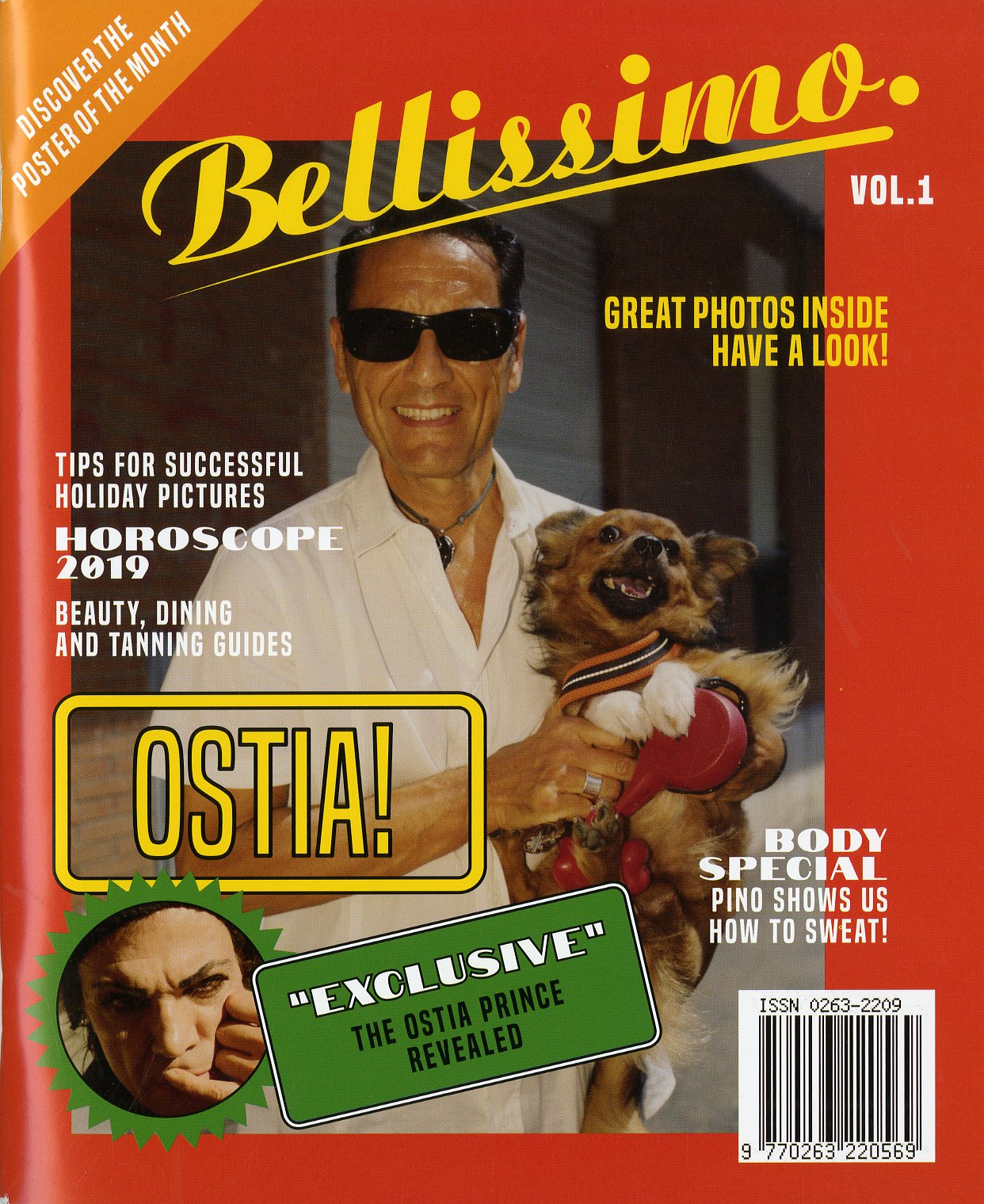 Bellissimo is from two London-based photographers, Paolo Zerbini and Ivan Ruberto, and according to its creators: it is dedicated to glorify the understated. The first issue takes us on a hidden tour of the beach of Rome, Ostia, and showcases photographs of places not commonly known, but amazingly unique. It’s a great new title.
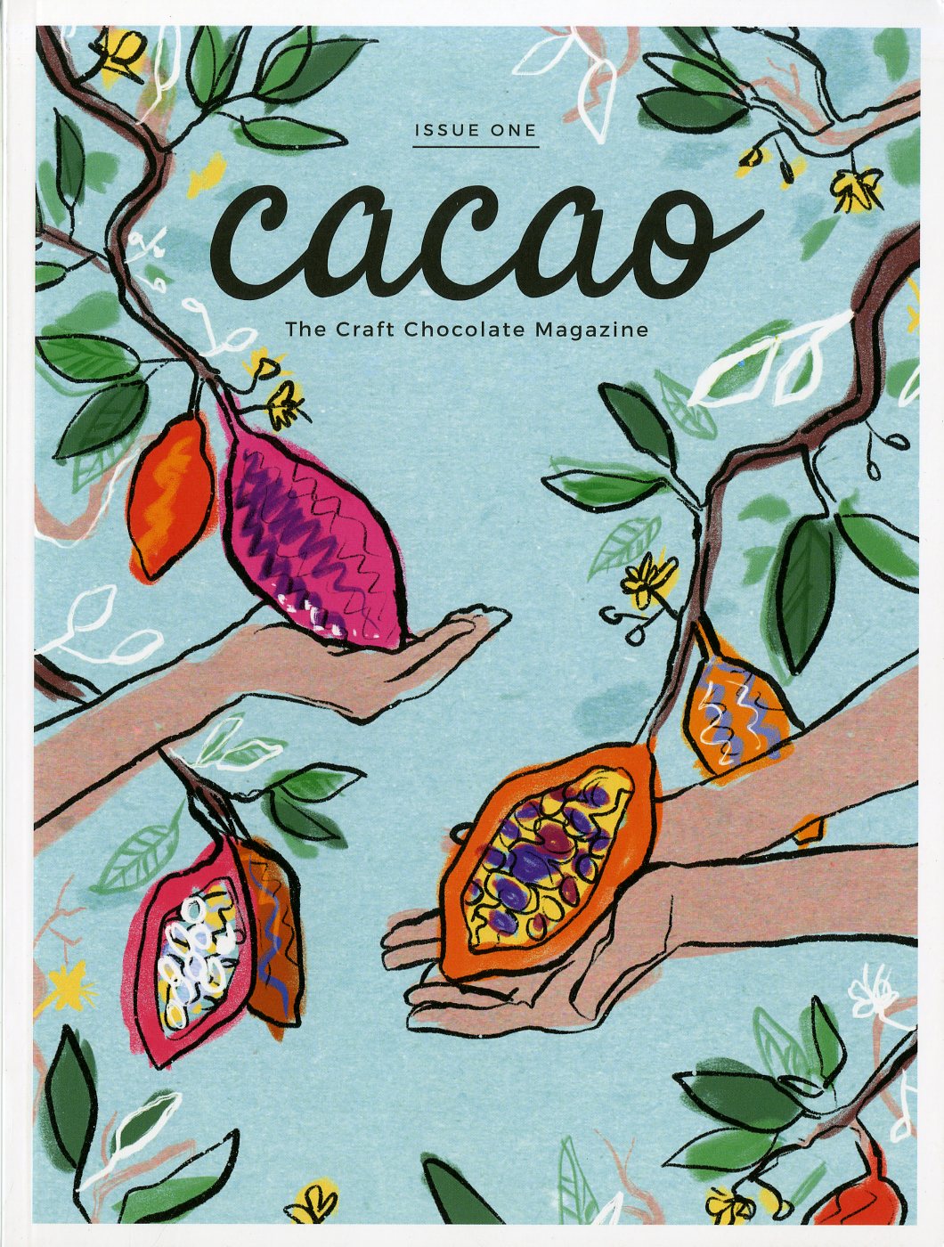 Cacao Magazine is the first international print magazine fully dedicated to craft chocolate. And much like the chocolate making process itself, the layout of the magazine follows the “bean-to-bar” sequence. This new title was born in Berlin and its first issue is dedicated to the craft chocolate enthusiasts of Germany. Mr. Magazine™ is looking forward to issue two. Yummy.
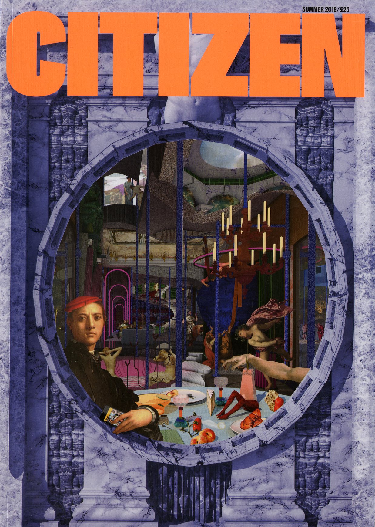 Citizen is a new quarterly magazine for everybody engaged in the challenge of creating the future city. Published by the London School of Architecture, the magazine’s mission is to allow people living in cities to have more fulfilled and more sustainable lives. It’s beautifully well done and very well received here in Mr. Magazine’s™ world.
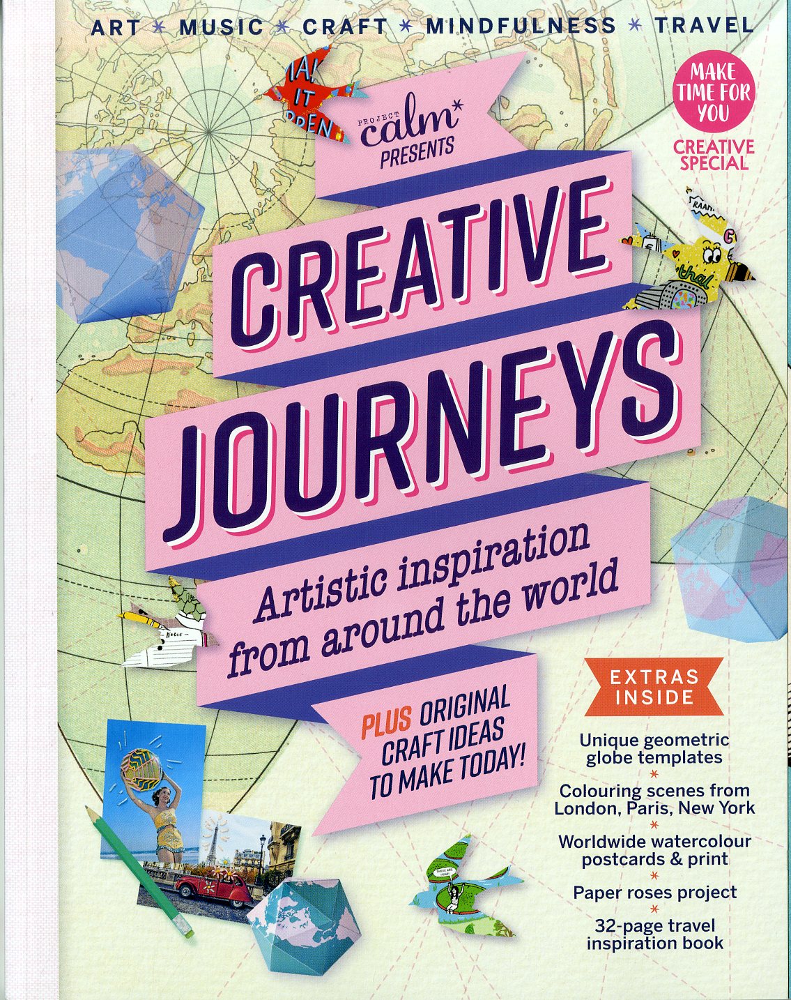 Creative Journeys is a new title from the creators of Project Calm magazine, our friends over in the U.K., and is filled with creative ideas and craft projects inspired by travel. It’s packed with artistic inspiration from around the world and you can read about art, music, mindfulness, maps, photography and prints.
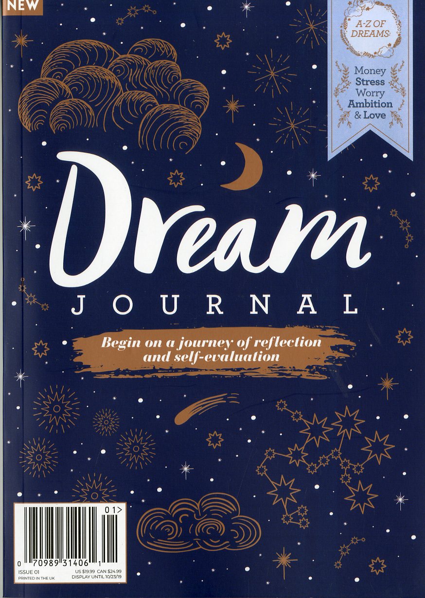 Dream Journal is another new magazine from Future pic, a global multi-platform media company based in the U.K., but with offices in Australia in the U.S. The magazine was born to guide you on a path to reflection, self-evaluation and being more mindful. Learn more about what dreaming is and use the dream diary to record and reflect on your dreams.
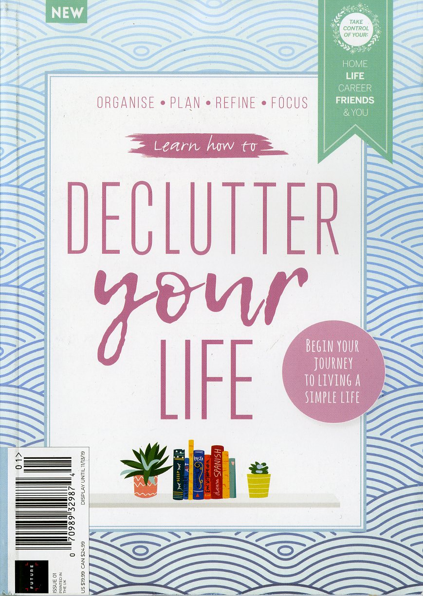 Learn How to Declutter Your Life is from the same folks who brought you the Dream Journal and is an interactive decluttering guide created to help one organize and simplify their life. And don’t we all need that?!
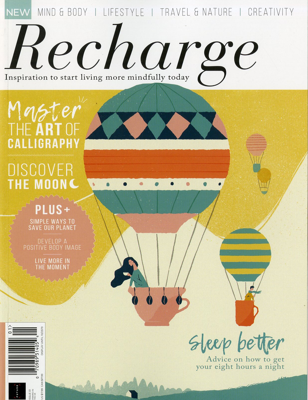 Recharge magazine is the third new title from Future pic and teaches us that it’s all too easy to get caught up in the busyness of our everyday lives and the demands placed upon us, whether by family members, friends, colleagues or clients. We have to Recharge, else we burn out.
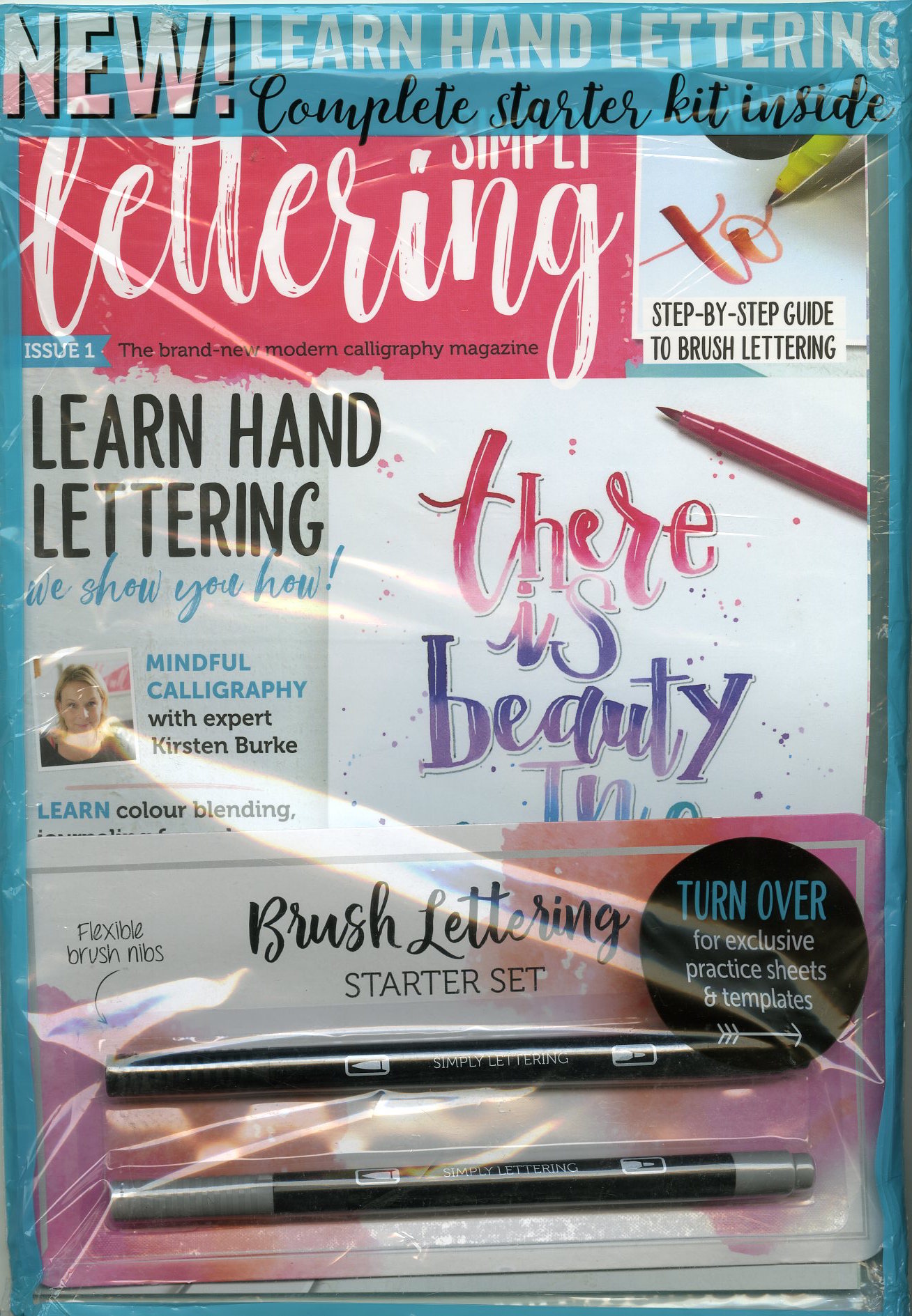 Simply Lettering is another British title for anyone interested in modern calligraphy, from complete beginners to seasoned experts. The first issue comes complete with a brush lettering starting kit and practice sheets and templates. Some more me-time is waiting.
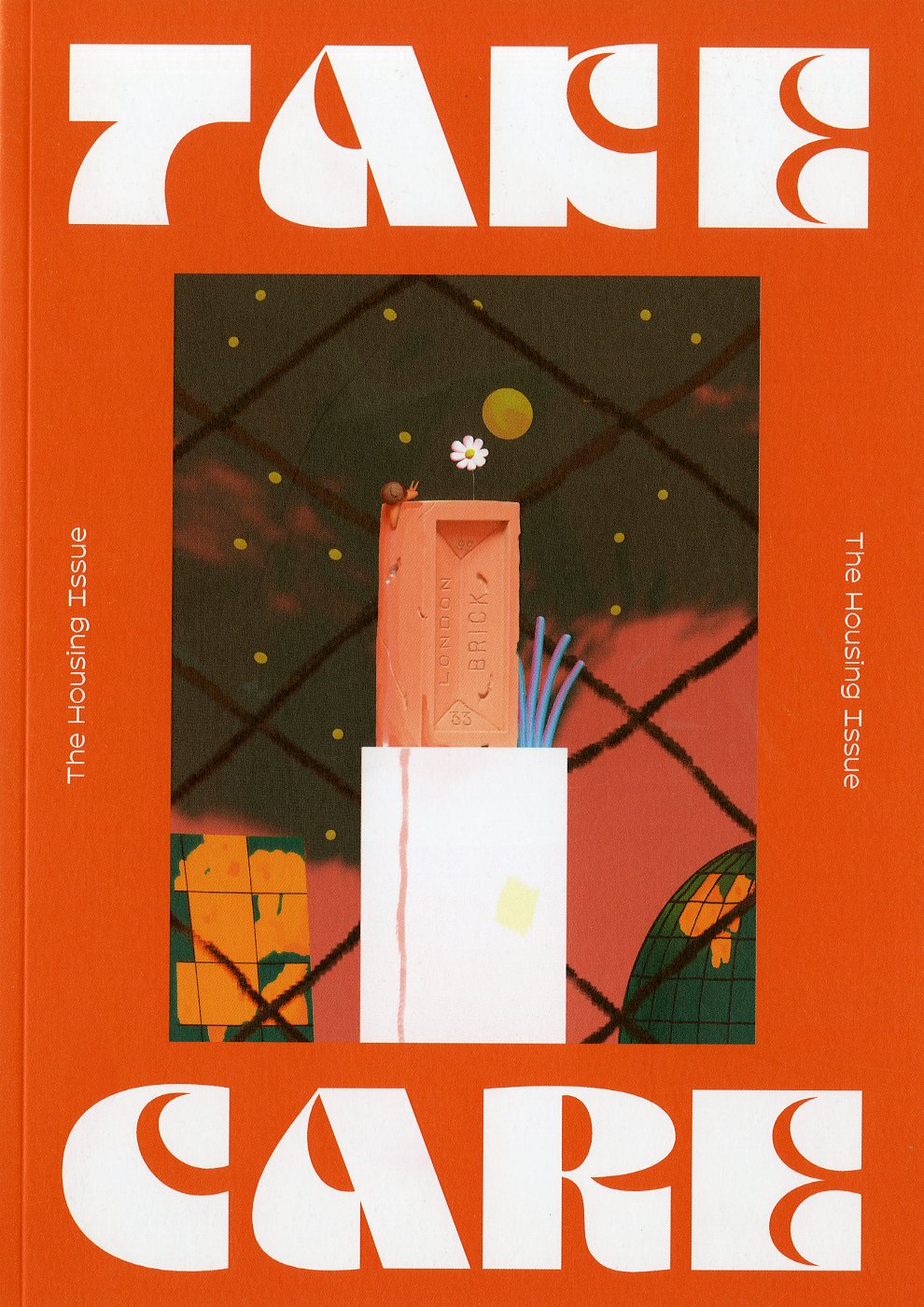 Take Care magazine is a collection of creative responses to the U.K. housing crisis, ranging from art and literature to journalism. Five friends who were between London and Glasgow created the magazine: Sarah Bethan Jones, Charlotte Fountaine, Frances Gordon, Lewis Gordon and Romany Rowell. It came to life through Kickstarter and the niche title is only shipping to the United Kingdom for now.
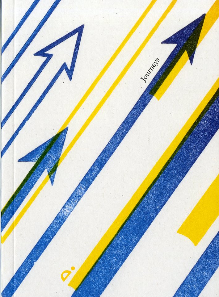 Tortoise Quarterly is a new magazine from Tortoise Media in England. Tortoise Media was another Kickstarter success story and was started to slow down the news. They do no breaking news; just what drives today’s news stories. The launch issue of its magazine is called “Journeys,” and is very proud of its slow news ways – translation – Tortoise Quarterly loves its print format.
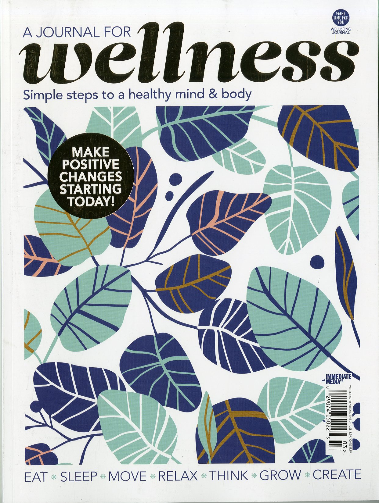 (A Journal for) Wellness is one more new title from the same folks across the pond that gave us Creative Journeys and Project Calm. This beautiful journal covers some key areas in your day-to-day living – Eat, Sleep, Move, Relax, Think, Grow and Create – to help you improve, develop or just explore your wellbeing.