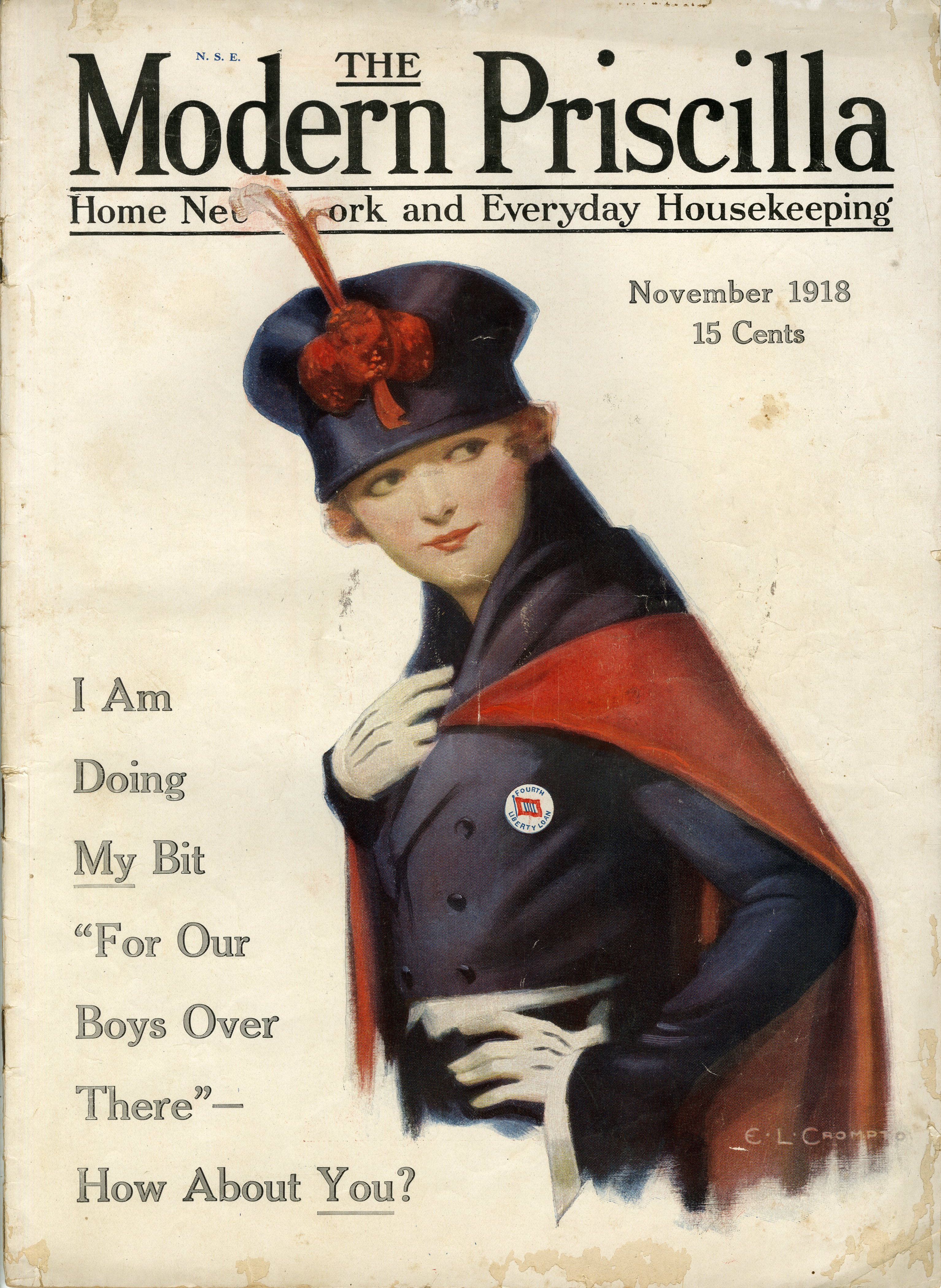
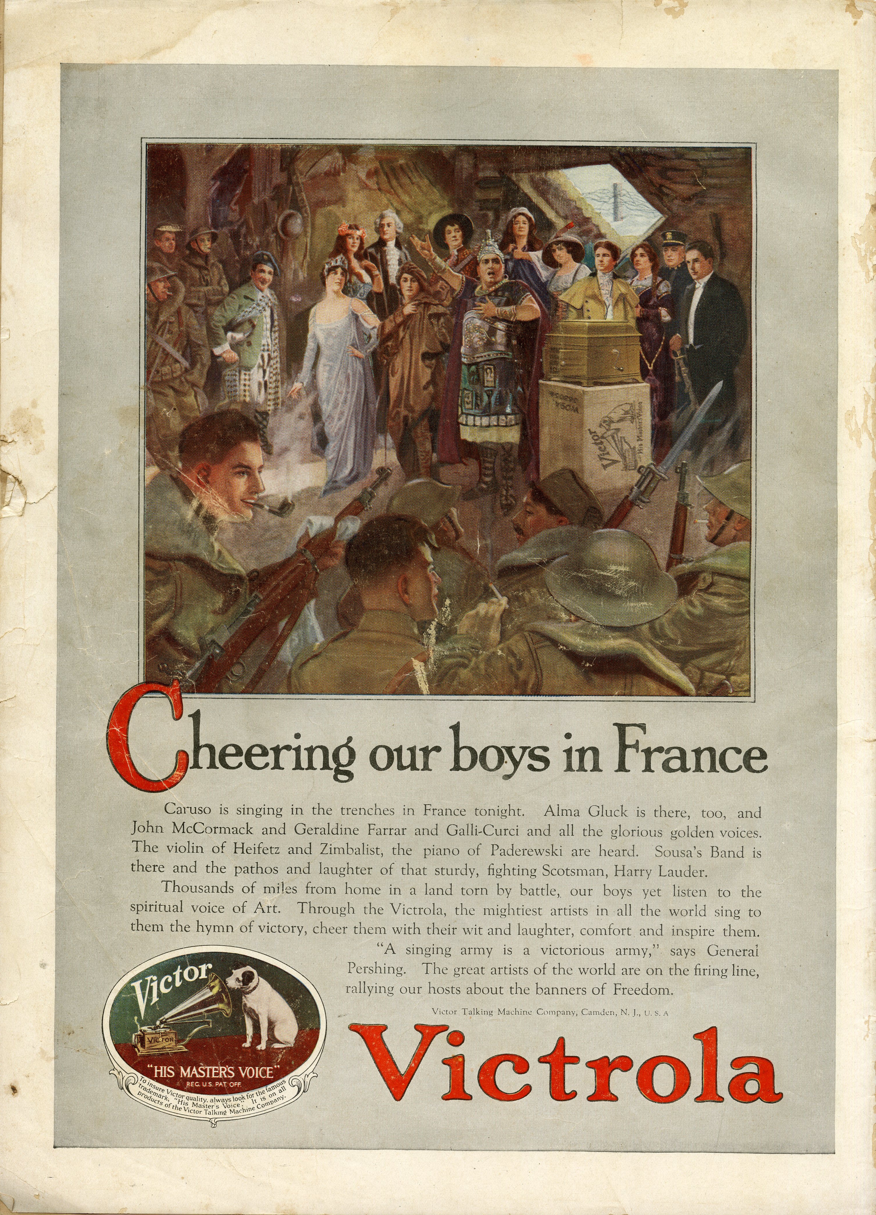
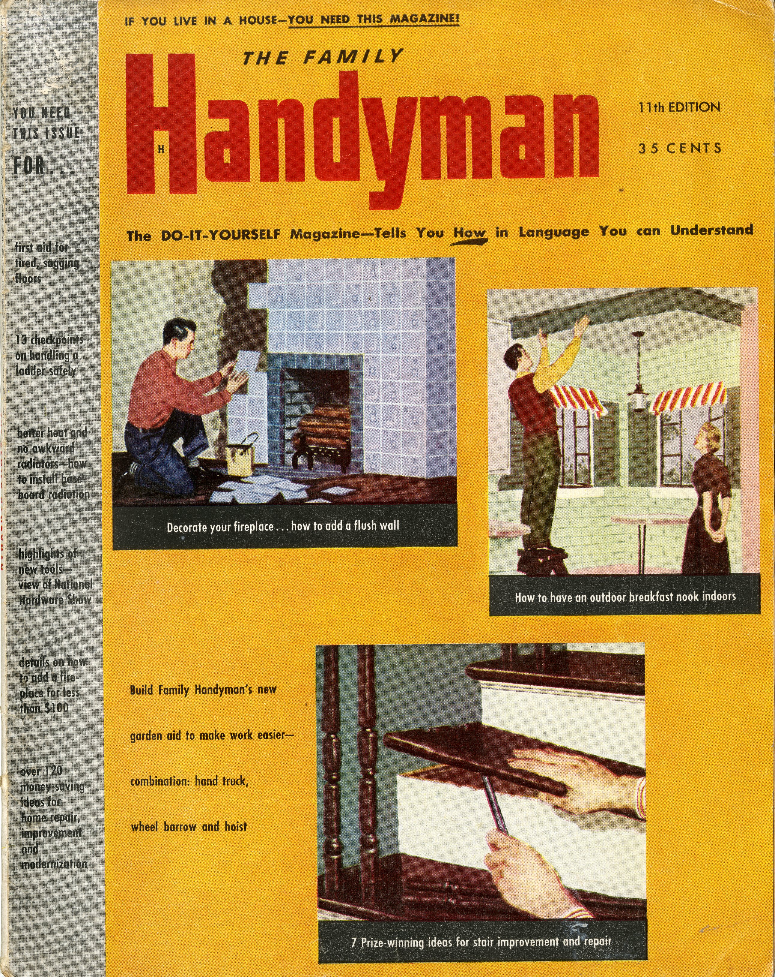
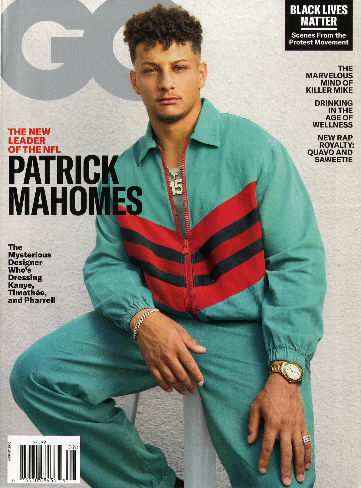
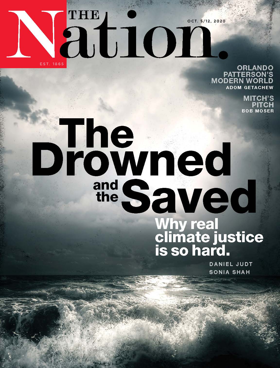
From an article in The Modern Priscilla magazine from November 1918. The more things change, the more they stay the same. The country is in the midst of World War One and a pandemic at the same time, yet folks were continuing to give thanks… A great and gentle reminder. Have a wonderful Thanksgiving y’all and remember the cover and the back cover of this magazine is from November 1918.
The first Thanksgiving Day celebrated by our ancestors was a day of rejoicing. The year had been plentiful, granaries were full, deliverance from famine was assured.
Thanksgiving Day this year means this and more. All our lives we have taken the good things of our country as a matter of course. Some of the older ones worried a bit at the fast pace we are traveling, at the thoughtlessness of our youth, the wastefulness of our ways.
Nineteen months ago was came to us. We found that we had a flag whose honor we must protect, a country that we must preserve, an army that we must feed and clothe, and gallant Allies whom we must maintain.
The gayest and most careless of our young men were among the first to enlist. We found out that they cared after all. Some of them have made the supreme sacrifice. We have not forgotten, we shall not forget. To-day, we give thanks for that splendid manhood of America.
We at home have tried to do the things nearest at hand. Not the least of these has been the problem of food conservation. It has been good for us. We are thankful that there has been something definite for us to do…
“I believe the days of anonymous content are coming to an end. We have seen this uprising of content that was written by some voice in the sky that was telling people what to do; cook this for dinner tonight because the Internet told me to. People are looking to voices and brands that they trust, because I can go to YouTube and I can spend an hour looking at how to solve my problem and get five different answers for how to fix a running toilet. Family Handyman is an established brand that’s been telling people how to do things the right way for 70 years.” Nick Grzechowiak…
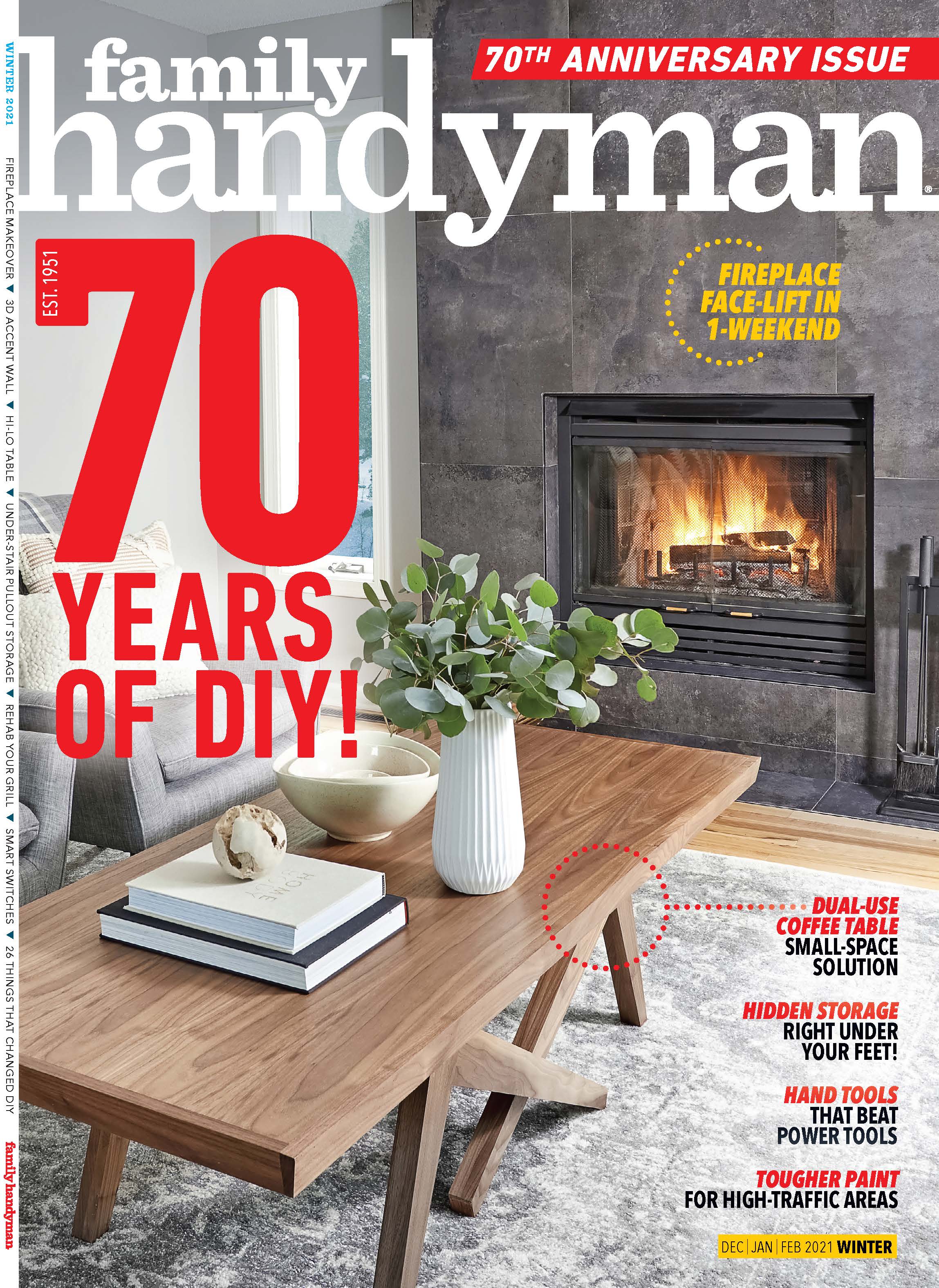
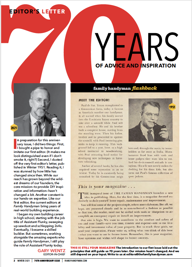
For almost 70 years, Family Handyman has guided generations of homeowners through DIY projects, from fixing things up to making their own way through renovations or repairs. Family Handyman launched in 1951, so 2021 marks its 70th anniversary. I spoke with Nick Grzechowiak recently, chief content officer of the brand, and we talked about this milestone celebration that is coming up. Nick is excited and very optimistic about the brand’s continued success in both print and online. Family Handyman strives to be the reader’s go-to destination for projects, renovations, and all things DIY for the home.
So, please enjoy the Mr. Magazine™ video cast with Nick Grzechowiak, chief content officer, Family Handyman.
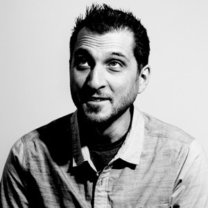
Nick Grzechowiak, Chief Content Officer, Family Handyman magazine.
But first here are the sound-bites:
On the magazine’s early statement that if someone lived in a house, they needed the magazine and whether or not 70 years later that was still true: Absolutely, I believe it is still true. For a lot of people their home is their largest investment. And I think what we’ve seen over the last eight months during this pandemic is that whether people have lost investments in the stock market or it’s a spouse losing a job or income, people are really looking back at their home as something they need to take care of and improve. And as a way to gain potential wealth.
On how he decides what content goes in the ink on paper magazine and what goes online: As a brand, Family Handyman really strives to meet our consumers wherever they are. Some people love picking up that tactile experience of the ink on paper. When we think about the lineups for the magazine, we really do a combination of what’s happening in the world; what are people seeing; what’s happening at new home showcases? Also, what are those tried and true things that people need to either update their skills on or learn that new skill? When I think about the website, the user on the website is such a different journey than the magazine. We’re delivering you the information in your mailbox or the newsstand, whereas on the website it’s really “in the moment.” When I think about the website content, you really have to think about that path people would follow.
Recreating the Letter From The Editor from the first issue of the magazine.
On the content from a 1953 edition of the magazine and whether those articles are timeless: One of the beauties of our magazine that started in the 1950s is that I really believe mid-century modern design is have its heyday. It has come back. People still like that look and feel. We still get requests for projects that we published back then, people who want that look again.
On what differentiates Family Handyman from Google or YouTube when it comes to finding out how to do something: I believe the days of anonymous content are coming to an end. We have seen this uprising of content that was written by some voice in the sky that was telling people what to do; cook this for dinner tonight because the Internet told me to. People are looking to voices and brands that they trust, because I can go to YouTube and I can spend an hour looking at how to solve my problem and get five different answers for how to fix a running toilet. Family Handyman is an established brand that’s been telling people how to do things the right way for 70 years. And in these days of anonymous content, a voice that is authoritative, trustworthy and comes to you with a mentoring tone as opposed to an almighty voice that’s telling you “this is what you need to do to your house” is really where I believe Family Handyman stands apart from what I call that anonymous content.
On what he would hope to tell someone he had accomplished when the brand’s 75th anniversary rolls around: One thing that is really important for us to keep our eyes on is to continue to evolve with what I’ll call the “modern homeowner.” To really make sure that we understand them, their relationships with their homes and what they want. I think it’s a fool’s mission to just go on autopilot and assume that what homeowners want today is the same thing they’d want in five years. And I think that’s what has really kept Family Handy man relevant is that we do research, we talk to homeowners and we are homeowners. We realize that what I wanted 10 years ago is different than what I want today.
On many magazines having the word “the” in their titles and why “The” Family Handyman became “Family Handyman” and dropped the word the: I think it’s a little bit more contemporary. As we have evolved our voice, I strive to have my editors take a mentoring tone. We’re not “The” only thing in the world. We realize that people aren’t living in a bubble, they’re consuming other things. And just to be more contemporary and to be that partner that can join them on that journey as opposed to being the almighty “The.”
On whether he can envision a day when there won’t be an ink on paper Family Handyman and it will be strictly digital: The magazine is an incredibly important part of our business today, as it was 70 years ago. We’re not letting our foot up on the gas when it comes to ink on paper. The nuance there is really with the consumer and making sure that we can meet them wherever they choose to consume.
On who the “Family Handyman” is today: That family handyman has evolved over time. If you look at our website numbers in the last six months, we’ve seen females outnumber their male counterparts visiting our website. Fifty-one percent of the traffic to our site is women, which is amazing. We’ve also seen it get younger. Millennials have grown over the last year visiting our site and as well readers of our magazine. We’ve seen an increase of millennials and females to our readership.
On how the pandemic has changed Family Handyman’s publishing operation: The biggest challenge for me personally was in the routing of pages of the magazine. I love getting my hands on the paper that has everyone else’s markups on them and passing it off to the next person; I love that process. I believe that’s one of the only things that has changed. We have a really strong culture at Family Handyman. We have a really collaborative and creative environment. We’ve been using technology like this to be able to communicate daily, sometimes hourly with what’s happening. We still do pinups. We still do magazine lineups where we have all the right people in the room. We still do the routing, it’s a little bit different, different putting a virtual Post-it on a PDF, but it’s still happening.
On anything he’d like to add: This idea of empowering and mentoring homeowners is going to continue to gain us an invitation into their homes. And going to continue to gain us that strength as a brand as the go-to resource for home improvement.
On what someone would find him doing if they showed up unexpectedly one evening at his home: First, you’d have to get past the dogs because they wouldn’t let you sneak up to the house. (Laughs) So that would be the first thing. After a long day at work, what you’re going to find me doing is, I enjoy reading and I enjoy music. One of my favorite things has been, I’ve hooked up a 1970 record player in the living room and have it connected to my home sound system. I’ve got two younger kids and we sit and listen to albums, which is a really fun way, very similar to print, where you can be there in the moment with something you can touch. That’s probably what you’d catch me doing.
On what keeps him up at night: Making sure that we can stay ahead of what’s next. That we don’t put on the cruise control or the autopilot and assume that what people wanted yesterday is what they’re going to want tomorrow.
On what makes him tick and click: I love cooking outdoors and we’ve brought that back into Family Handyman. It was always a part of it, grilling. It’s one of my favorite hobbies, cooking. Whether it’s over a smoker or a grill or whatever, I love that.
And now, without any further delay, enjoy the Mr. Magazine™ video cast with Nick Grzechowiak, chief content officer, Family Handyman.
“What we did create was a beautiful fantasy-like image that had an incredible composition and color, everybody was wearing fashion, but to me the value of it was the sense of community…” Laura Brown
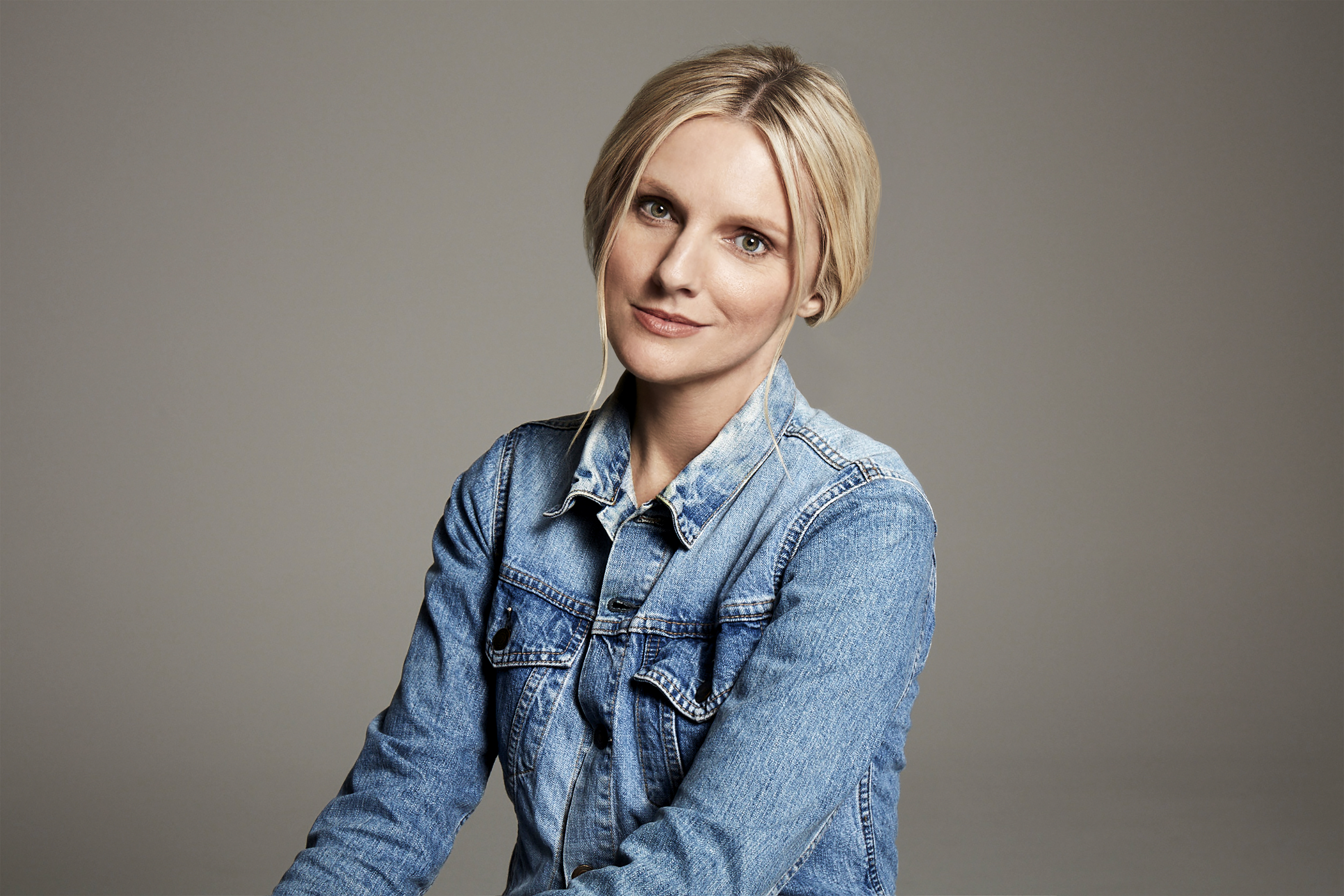
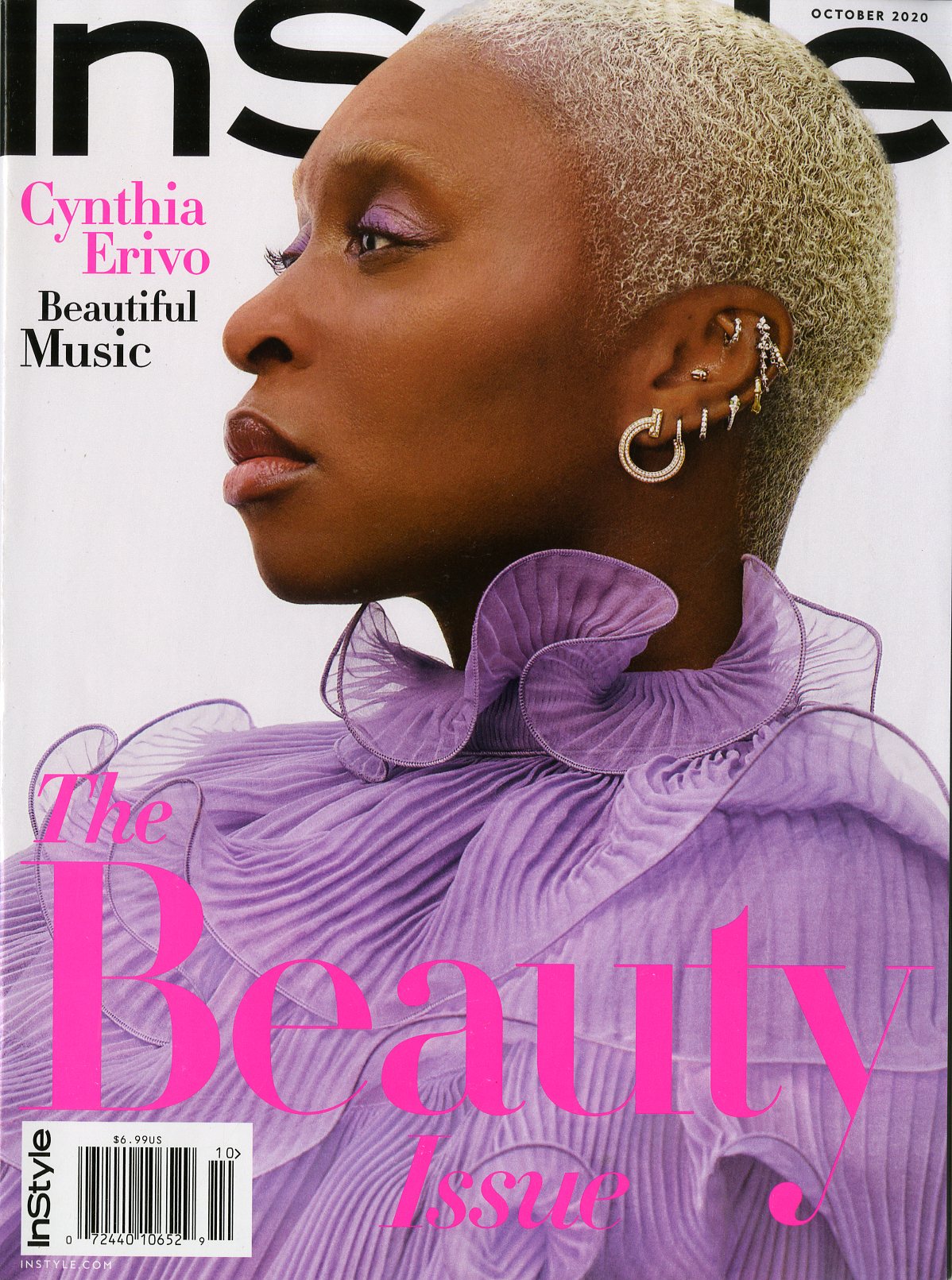
Laura Brown is a force to be reckoned with and by association, so is the InStyle brand. Laura brings her passion, drive and incredible humor and vision to the InStyle platforms as only she can. I spoke with her recently and we had a fantastic conversation that was both informative and delightful. Just as Laura herself is. So, please enjoy the Mr. Magazine™ video cast with Laura Brown, editor in chief, InStyle.
Laura Brown, editor in chief, InStyle magazine
But first here are the sound-bites:
On how InStyle has managed to retain its regular frequency of once a month even during a pandemic: It was a business decision made by fiscal folks. Our strength is our consistency, but for me, and I don’t determine how often we publish, but for me it was an editorial decision to be consistent and also it became a matter of stubbornness and pride that we kept going. And even though sometimes my team would give me some accessory layouts or something and I would ask what issue that was for and they’d say October and I’d be “another one,” (Laughs) it was a real point of pride for us.
On how she sees the DNA of InStyle reflected since she became editor in chief: When I got here, InStyle was a vastly different magazine. It was quite quiet, there were a lot of things to shop for and buy and it was all nice-looking, but it didn’t have the most resounding voice. Number one, I personally, like to be in the mix, in the conversation, in the culture, in whatever way you can be. But more importantly, three months after I started Trump was elected. You can do a nice shopping magazine through the Obama years, that’s a different scenario, but when something changes like that, where it changes the tenor of this country and globally, we can’t stick our head in the sand and say here’s a lady in a ball gown. You just can’t because we are media.
On believing that the magazine has a larger role than just being an escape from reality: It can be all of that. For example, a way to illustrate reality plus fantasy plus community would be the cover we did in Brooklyn in the apartment building which had all of these artists who lived together and I wanted to replicate that beautiful Ormond Gigli picture “Girls in the Windows” from 1960, I think it was. That is one of my favorite fashion images and it’s one that makes me swoon. Of course, during a pandemic I had to see if we could even do it. What we did create was a beautiful fantasy-like image that had an incredible composition and color, everybody was wearing fashion, but to me the value of it was the sense of community in New York City.
On where she feels she creates the most impact, in print, online, on social media: Hopefully it works on a number of different levels. For example, the cover we did with Dr. Fauci, which was a newsy, reactive cover, has been responsible for the biggest web traffic we’ve ever had, the most highly-trafficked cover ever, so four billion impressions. Bigger than Jennifer Aniston, and that’s saying something.
On what makes her tick and click professionally: The most fulfilling thing for me or what makes me tick is people. The most gratifying thing about this job is working with people that I admire, having them show up for us, and executing an idea that I’ve had together. And to have that trust and to really collaborate and then hopefully put an image in a story, adding to the culture that really says something.
On any stumbling blocks she may face: Just the mechanics of magazines, generally your page limits, your budget – we’re pretty good with the budget, I’ve never been someone who says there’s not enough money. I came from Harper’s Bazaar, we had to hustle, and I come from Australia where we really had to freaking hustle.
On whether she has to make some tough decisions in her role as editor, especially as she mainstreams the magazine to reach a larger audience: What’s interesting is our website. When I got there I was surprised that it was sort of coming from behind, I actually thought our website should have been at a bigger audience when I got here, so that has been an uphill climb. The last two site directors have done a great job and it’s on the up and up, so that was a bit funny, like the website had jetlag, because again it was this kind of benign place. When I first got here they didn’t use street-style pictures, it was just so weird. It wasn’t like “in the world,” so I think we’d been under dogging from that angle. Not of late, because we’ve been getting so much attention.
On what she would hope to tell someone she had accomplished with InStyle one year from now: I work with sincerity, creativity and decency that is all too rare. That is sometimes not so visible in an industry that is so often resting on its laurels. That got pulled up from its bootstraps obviously over the summer, but we were already there. What I’m most proud of is all of that, but also consistency.
On anything she’d like to add: It’s great. Everyone should subscribe and click. No, I hope anything I haven’t said is apparent when you read it.
On whether she considers herself a journalist first and an editor second or she doesn’t differentiate between the two: I don’t differentiate, but what I often say is I’m a producer. I’m a producer and a host. That’s what an editor is these days.
On what someone would find her doing if they showed up unexpectedly one evening at her home: After I’ve finished beating all my staff, (Laughs) I’m having a glass of wine and a bowl of spaghetti. And trying not to have a bowl of spaghetti every day. My ideal New York day, if I’m in town working, a good day in the office is really produce something great, the team is all batting 100 and I go for dinner at Barbuto restaurant, which is currently closed, at 6:00 p.m., get the Early Bird Special, have my spaghetti, have my wine, and go home, watch some Stephen Colbert, go to bed early. And then do it again.
On what comes to mind when she first opens her eyes in the morning: I go, “Okay.” I reach for the phone and kind of gird my loins, I guess. It’s very much like: Ready, Okay. Kind of like a cheerleader.
On what keeps her up at night: Tequila. (Laughs) I love tequila, but if I go out and have a couple of tequilas, I do find it hard to sleep. I particular in my own brain. My brain takes a lot of time to calm as I think any editor’s brain would.
And now, without any further delay, enjoy the Mr. Magazine™ video cast with Laura Brown, editor in chief, InStyle magazine.
“We’re inclusive in that anybody who cares about health and wellness, who wants to find out ways they can strengthen their body, their mind, their life; anyone who wants to find out how they can succeed physically, emotionally, socially, they should be able to see some part of themselves reflected in the content that we create across all of our platforms.” Richard Dorment…
“It’s expansive in the sense that we’re always looking to add new audience numbers, those who may not have necessarily seen themselves before or who maybe thought that Men’s Health was not a magazine for them. We want to make sure that they understand that we are.” Richard Dorment…
Richard Dorment, editor in chief, Men’s Health magazine
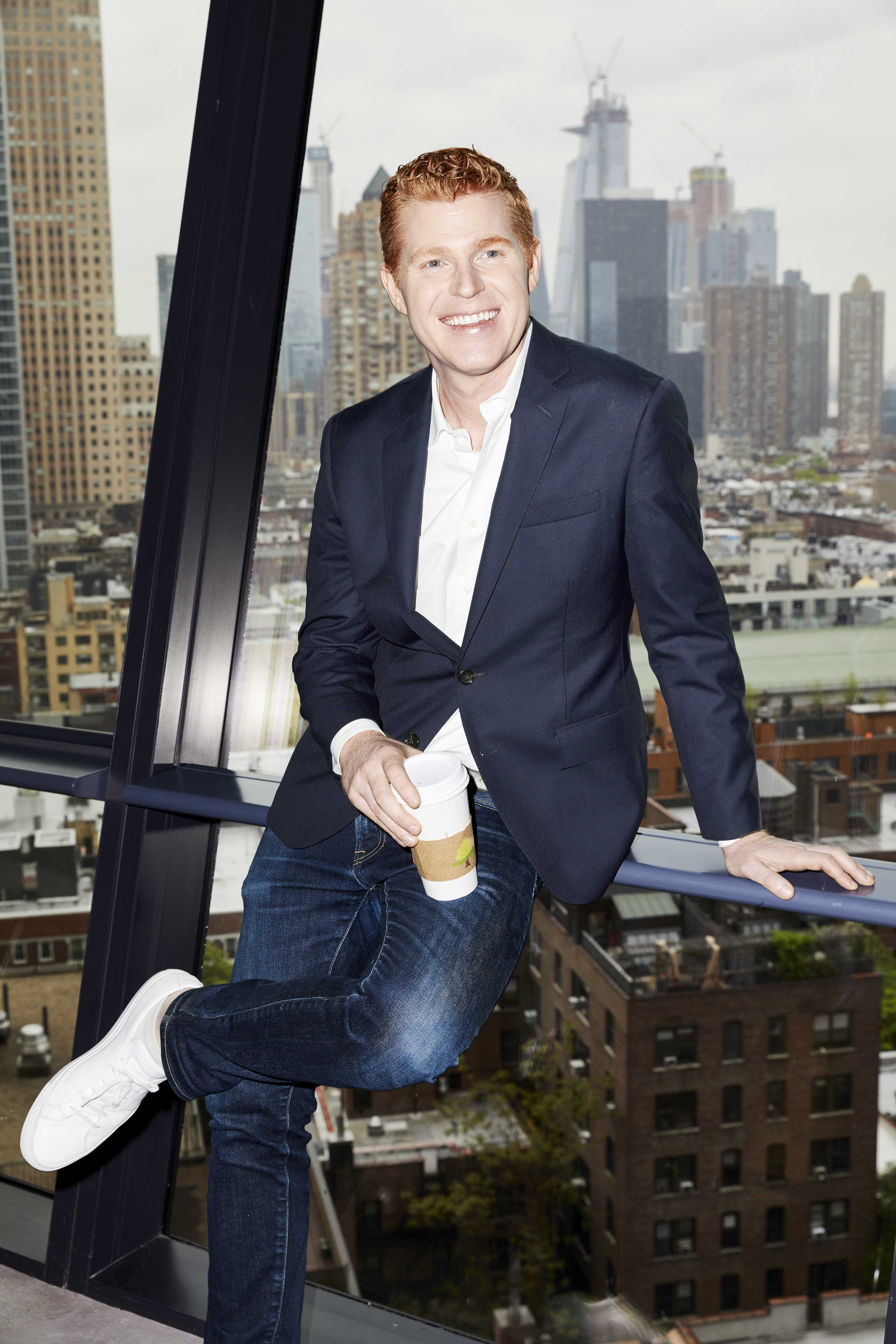
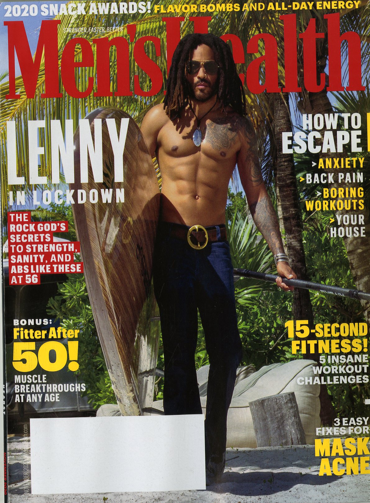
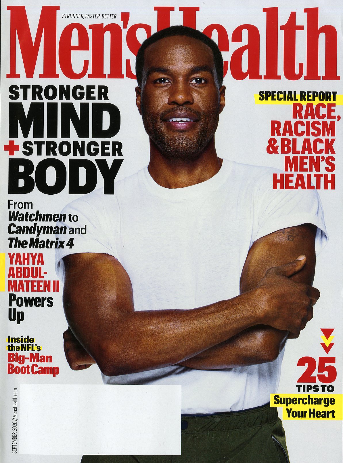
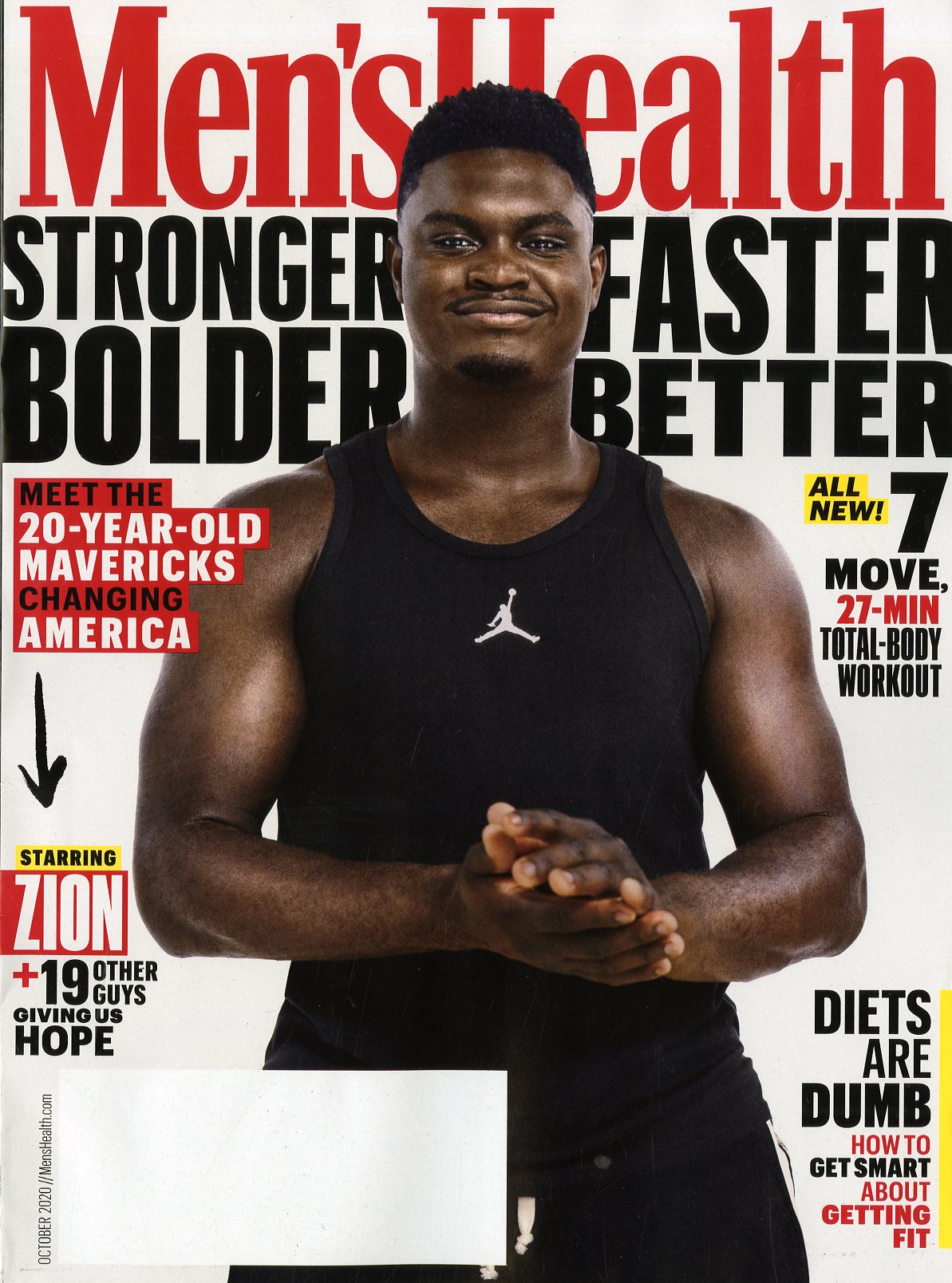
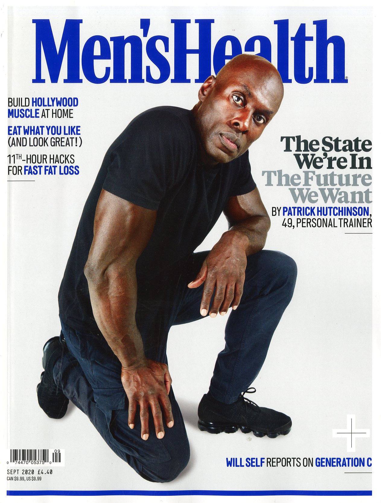
Men’s Health is the world’s largest men’s magazine brand, with multiple editions around the globe. The magazine covers a broad spectrum of men’s lifestyle topics such as fitness, nutrition, fashion, and sexuality. Richard Dorment is the editor in chief of Men’s Health, and oversees all editorial content across its print, web, social, and video platforms in the U.S.
I spoke with Richard recently and we talked about this global voice that is proud of its diversity and inclusion of all men, and vows moving forward to be even more open and welcoming to different cultures everywhere. According to Richard, the watch words for Men’s Health are inclusive, expansive and optimistic. And making sure that the audience understands that while change is inevitable, change can also benefit them if they understand and optimize themselves for it. Something Men’s Health strives to help them do as it redefines today’s health and wellness for all men.
So now, please enjoy the Mr. Magazine™ interview with Richard Dorment, editor in chief, Men’s Health.
But first the sound-bites:
On how Men’s Health is adapting to the changes in today’s magazine publishing environment: I think we’re doing okay. We’re about eight months into this bold, new experiment in producing all types of magazine media. And I think we’re doing okay. Like everybody, we had a very steep learning curve as we tried to figure out how to put out a monthly print publication and figure out how to collaborate as a team remotely. But I think we had a few things going for us that maybe some other brands didn’t.
On how easy or hard it was to execute many of the changes while working remotely: It’s hard to speak in relative terms because we’ve never done this before. We’ve never had a lot of these things, especially happening all at once. I will say that what made it easier was Men’s Health has a tremendous team of editors, writers and designers who are really good people, so that really helps. But they’re also really good at their jobs, so I think that also made it easier.
On how big of a responsibility he feels is to retain the current audience, while cultivating new audiences: That’s a really good questions. It’s not something that I spend a lot of time thinking about. I don’t really think about scale. And maybe I should, but the honest answer is, and I use these words at least 12 times a day so they may sound canned, which they sort of are but I’ve been using them for a long time and they are inclusive, expansive and optimistic. Those are the watch words of Men’s Health.
On someone who feels the diversity in the magazine is very one-sided and does not reflect the white reader anymore: That makes me very sad. I hate to lose audience members for any reason. But I think it’s incredibly important, particularly after the events that happened this past summer, which only enhanced what a lot of us already knew and were trying to accomplish and record, that we really make sure that when we are addressing our audience that we’re addressing all of our audience.
On how he makes the decision that something is for ink on paper, something else is for the web, and something else for social media: That’s probably the trickiest part of my job right now. In part because of the print component. We work with a three month lead time at least and it’s very hard to see around corners right now. It’s always been hard to see around corners for a monthly print magazine. Some people were better at it than others, but now it’s next to impossible, because I still don’t know who’s going to be president next year. I don’t know when there’s going to be a vaccine. I don’t know if people who are reading future us in March are going to be under some sort of lockdown. I just don’t know. And I don’t think anybody does.
On how he can ensure that if someone has the questions, Men’s Health is there to provide the answers, rather than some unknown entity telling them what to do: We think a lot about what’s called a EAT score, which is expertise, authoritativeness and trustworthiness. So that’s the acronym that we think of when we are thinking of creating content that people can trust. How do we anticipate and meet those expectations when it comes to a search? We have the Men’s Health advisory board, which is filled with dozens of world-renowned experts who are the best at what they do. And we make sure they’re front and center of every story that we do, because we have science-backed, expert-recommended content.
On how Men’s Health’s global network of communication works: Like most brands with a global presence, there is a patchwork of relationships, some of them are wholly-owned by the Hearst Corporation, some of them are licensed out, it really depends. But I think the overall relationship is that we’re aware of what the other brands are doing. They typically take more from us than we do from them, but we are constantly in search of content that would work for us. Then we can incorporate it into what we do.
On a typical day in his professional life: My day is filled, like a lot of people, with Zoom meetings and I try to carve out some time to be thoughtful and creative. That’s really the hardest part for me, finding that time to be creative and letting my mind wander and discover new things, just because I feel like we’re all so busy and stressed and we’re distracted by everything. So, that’s the biggest challenge for me.
On whether he is seeing fatigue from so much screen time, since his team is not able to get together in person and collaborate: I don’t know if it’s fatigue, because I still think people are really energized and focused, but I think it’s much harder in an intensely collaborative medium like magazines. I think the reason why a lot of us got into magazines in the first place as opposed to writing full-time, which is an incredibly isolated experience, I think all of us in magazine media got into this because it’s so intensely collaborative. You cannot make a magazine by yourself. You cannot edit a magazine story or publish it by yourself. So I think a lot of us are missing that sense of human contact, that spontaneity, that serendipity, which comes from in-person collaboration.
On what makes him tick and click during the day: The initial gut thing that I want to say is success, but when I see things working, like when I get a great story and I’m reading a great draft or seeing great images or we see that a story we published online is really resonating with the audience or a video is really performing well on YouTube, that motivates me to keep going.
On anything he’d like to add: I’m really grateful that I get to work at a place like Men’s Health. It’s more relevant and more necessary than ever because of everything that’s happening in the world, not just with the global pandemic, but with the social justice movement, with the ongoing evolution in our understanding of male/female relationships that really started in earnest three years ago with the beginning of the Me Too Movement.
On what someone would find him doing if they showed up unexpectedly one evening at his home: Reading helps me unwind, for sure. I try to stay off-screen after 8:00 p.m. for both physical and mental reasons, it’s better to be off of them. So, yes, I’ve been reading a lot lately. And that has helped to focus and ground me a little bit, particularly since our bedtime ritual with three kids lasts like six and half hours. So by the time I’m actually done I’m kind of like a squeezed-out sponge. At that point I just need to feel a little bit more grounded and clear-eyed and clear-headed and reading certainly does that for me.
On what keeps him up at night: The state of our country, to be honest. Like a lot of people, most people maybe, the sense of division and mistrust and rancor is really upsetting to me, particularly someone who tries to be optimistic and tries to be expansive and inclusive and see the best in people and in the world. And I don’t see that reflected in a lot of headlines, at least in what I see as headlines in social media content. But again, that’s not necessarily real life.
And now the lightly edited transcript of the Mr. Magazine™ interview with Richard Dorment, editor in chief, Men’s Health.
Samir Husni: You write in your November column in Men’s Health that those people who can adapt to change will excel and succeed. How well are you adapting to change in this magazine publishing environment that’s taking place today?
Richard Dorment: I think we’re doing okay. We’re about eight months into this bold, new experiment in producing all types of magazine media. And I think we’re doing okay. Like everybody, we had a very steep learning curve as we tried to figure out how to put out a monthly print publication and figure out how to collaborate as a team remotely. But I think we had a few things going for us that maybe some other brands didn’t.
First of all, we are a fully integrated team as far as print, digital, video and social. All of our platforms are working hand in glove. So, we were really able to hit the ground running and pitch in wherever needed, all of us doing everything as we were previously.
Also, we’ve been pretty good with technology from the get-go, as far as using Zoom and Slack as production tools. We have some staff who works full-time from Pennsylvania, so it was sort of second nature to us in certain respects. So, I think there were a few things that we had going for us. And more importantly, we knew that we needed to change really quickly.
As a health and wellness publication, particularly back in March at the dawn of this global pandemic, our audience was really turning to us for clear, reliable, actual information that they could use to weather these extreme changes in pretty much every aspect of their lives. So, we knew that we needed to come up with a way to give them those answers, both in an internal production way and in a journalistic editorial way.
It’s been challenging and thrilling. I think it’s worked or it’s working. As I said in that letter, the ultimate performance skill right now, as far as high performance, is the ability to adapt to change.
Samir Husni: As you are adapting to change, in your September letter to the readers, you talked about expanding the definition of health or redefining health as it impacts everything. And as we all know, we didn’t only have the Coronavirus, we had the social changes and the social injustices. How was taking all of that remotely, without having your team sitting down with you, how easy or hard was it to begin executing those changes?
Richard Dorment: It’s hard to speak in relative terms because we’ve never done this before. We’ve never had a lot of these things, especially happening all at once. I will say that what made it easier was Men’s Health has a tremendous team of editors, writers and designers who are really good people, so that really helps. But they’re also really good at their jobs, so I think that also made it easier.
Because of how we positioned our brand editorially over the past two and a half years since I started, where we were really focusing on health at a 360 degree proposition, the whole body, whole mind, whole life. And because we had been so deeply entrenched in that thinking, we were ready to execute and to report on and inform about all of those aspects.
So, yes, you have a global pandemic over here and you have hard science, Coronavirus-related news that we had to cover. Mental health, obviously, it was a huge concern for our audience right now, they’re feeling isolated and overwhelmed, anxious and angry, all of these things that they need help processing and understanding. Perhaps, they didn’t have the vocabulary, particularly with men, or the awareness to talk about this before.
Then with life, it’s like where do you begin? Whether it’s working from home, working out from home, socializing, parenting, partnering, all of these things are radically different than they were 10 months ago. So because we were already well positioned to report on all of those things, we were already doing that before 2020, we were really able to put our backs into the coverage in 2020 and I think it has paid off so far.
Samir Husni: Men’s Health being the largest circulated men’s magazine that we have in the world now, how big of a responsibility do you feel is on your shoulders to retain the current audience, while cultivating new audiences? Can big become bigger?
Richard Dorment: That’s a really good questions. It’s not something that I spend a lot of time thinking about. I don’t really think about scale. And maybe I should, but the honest answer is, and I use these words at least 12 times a day so they may sound canned, which they sort of are but I’ve been using them for a long time and they are inclusive, expansive and optimistic. Those are the watch words of Men’s Health.
We’re inclusive in that anybody who cares about health and wellness, who wants to find out ways they can strengthen their body, their mind, their life; anyone who wants to find out how they can succeed physically, emotionally, socially, they should be able to see some part of themselves reflected in the content that we create across all of our platforms.
It’s expansive in the sense that we’re always looking to add new audience numbers, those who may not have necessarily seen themselves before or who maybe thought that Men’s Health was not a magazine for them. We want to make sure that they understand that we are.
And optimistic, I think that’s the whole ballgame, because I think particularly these days there is so much divisiveness. There’s a lot of bad news in the air and you don’t necessarily want to be delusional or Pollyannaish, but at the same time you want to make sure that our audience understands that a lot of the change is inevitable, but a lot of the change could also benefit them if they understand and optimize themselves for it.
I’m feeling really good about the work that we’re doing and we have a lot more to do, particularly on the inclusiveness front, but we’re very much on the right path for the journey I believe.
Samir Husni: I received an email from a journalist that I know and he told me he does not see himself reflected in Men’s Health anymore and he is cancelling his subscription once it runs out. He is Caucasian and has been a subscriber to the magazine for many years. He feels the diversity in the magazine is very one-sided and does not reflect the white reader anymore. What would you say to him?
Richard Dorment: That makes me very sad. I hate to lose audience members for any reason. But I think it’s incredibly important, particularly after the events that happened this past summer, which only enhanced what a lot of us already knew and were trying to accomplish and record, that we really make sure that when we are addressing our audience that we’re addressing all of our audience.
And that when there are parts of our audience whose specific concerns and specific challenges, particularly in the health sphere, are not being addressed by the mainstream media and are not being prioritized by national health policy, it’s really important for us to be advocates for them. The fact that we weren’t doing it before fell squarely on me, but in 2020 and moving forward that will not be the case anymore. As I said in one of my editor’s letter, we cannot claim to be advocates for men’s health if we are not advocates specifically for the health of all of our audience and that’s Black, Indigenous, Latina, Asian and others. We really have to be foresworn and faithful advocates for everybody.
It bums me out that maybe there are some white readers who don’t see themselves in the conversation, but I think they can still benefit from that knowledge. And from understanding what their fellow Americans are going through, particularly when it comes to things like the devastatingly disproportionate life expectancy of Black men, the elevated risk of cancer, all of these things, it’s really important that we’re aware of them so that we can fix them together. And if some folks are not willing or able to have those conversations or be a part of that conversation, be part of that change, that striving toward being better, faster, stronger, then there’s nothing I can do about that. But at the end of the day, I certainly don’t regret the conversations. The only thing I regret is that we weren’t able to do more sooner.
Samir Husni: As you’re looking at all of the platforms that Men’s Health is available on, how do you make the decision that something is for ink on paper, something else is for the web, and something else for social media? Is it easy for you and your team to decide?
Richard Dorment: That’s probably the trickiest part of my job right now. In part because of the print component. We work with a three month lead time at least and it’s very hard to see around corners right now. It’s always been hard to see around corners for a monthly print magazine. Some people were better at it than others, but now it’s next to impossible, because I still don’t know who’s going to be president next year. I don’t know when there’s going to be a vaccine. I don’t know if people who are reading future us in March are going to be under some sort of lockdown. I just don’t know. And I don’t think anybody does.
The best that we can do is really try to focus on people’s lived experiences and anticipate what they may be thinking about and dealing with as best we can during that time. So when printed, it’s really just using our imaginations and using whatever signals we can, either through historical data or what we had done before that succeeded, to create a print product that will be vital and relevant for an audience come March or April.
For web content, for site content specifically, we’re always thinking about what type of story this is. Is it a certain story, because again, I think the tricky part about being a digital content creator right now is finding an audience. We’re all fighting tooth and nail for the 24 hours in everybody’s way and their attention. So, you really have to have a plan for finding that audience.
Before we commission any story we always think about how the audience will find the story, because we’re not in the business of creating content that no one is going to find. It’s not a good business at all; it’s not a good editorial model. Are they going to find it through search? Is this something that we know they’re interested in by analyzing the data or analytics? That’s one type of story.
Is it a social story? Is this something someone will consume in their social state and want to share with their friends and get a conversation going? Or is it a newsletter story, which tends to be longer reads, something that people put aside for the weekend when they have more time. These are all the considerations that we take into account when we are thinking about greenlighting digital content.
There are different things we think about for each platform. I didn’t even touch on video, which is a growing animal. It’s not a gut thing at all. I sort of wish, no I don’t know that I wish I was one of those ‘80s magazine editors who put their finger up in the air and sort of guessed which way the wind was blowing. There is not a lot of gut instinct going on here at all. We try to be deliberate as we considerate it with the known and the unknown.
Samir Husni: Today, we are bombarded by information. And in my circle people are always saying, just Google it or do this search or that. How can you ensure that if someone had the questions, Men’s Health is there to provide the answers, rather than some unknown entity telling them to do this or that?
Richard Dorment: I can get really geeky into the science of search right now, particularly the way we think the Google algorithms work. But Men’s Health is what’s called a “Your Money, Your Life” publication, YMYL. And we’re held to a different standard than most other types of content that’s circulated on the web. And that’s because we deal with Your Life and Your Health. That’s really something that Google, to their great credit, takes into account when they are recommended a ranking content on a search.
We think a lot about what’s called an EAT score, which is expertise, authoritativeness and trustworthiness. So that’s the acronym that we think of when we are thinking of creating content that people can trust. How do we anticipate and meet those expectations when it comes to a search? We have the Men’s Health advisory board, which is filled with dozens of world-renowned experts who are the best at what they do. And we make sure they’re front and center of every story that we do, because we have science-backed, expert-recommended content.
We also stay away from unsubstantiated claims. We stay away from a lot of the junk science that’s circulating both on social media and on search engines. Because of that, we tend to be rewarded by the Google algorithms. So, the more that we can lean into our heritage and our legacy as an expert-backed brand, the better chances we have of people finding our content, particularly through search channels.
Samir Husni: How do you utilize that network of Men’s Health all over the world? Are you always the feeder or always the sender, or you’re also the receiver? How does that network of communication work?
Richard Dorment: Like most brands with a global presence, there is a patchwork of relationships, some of them are wholly-owned by the Hearst Corporation, some of them are licensed out, it really depends. But I think the overall relationship is that we’re aware of what the other brands are doing. They typically take more from us than we do from them, but we are constantly in search of content that would work for us. Then we can incorporate it into what we do.
It’s important to remember though that American audiences aren’t British audiences, or any other audience that would be our international counterparts. We have to be constant of the fact that the American audience has certain curiosities with certain interests that maybe aren’t shared. We’re not going to do stories on rugby players here necessarily, not because we don’t love rugby, but it’s not really an American sport. It’s little, sort of cultural differences like that that differentiate whether or not we would pick up their content and vice versa.
Samir Husni: What is a typical day for you, editor in chief of the world’s largest men’s magazine? How busy are you?
Richard Dorment: I’m pretty busy, but I’m also a parent of three children under the age of 10, and a partner of a very hardworking lawyer. And a person who is living in lockdown, we’re sort of quasi-restricted. So, it’s a lot, but it’s never really off. I enjoy telling this story, a few weeks ago I was finally able to carve out some time where I could get away, I hadn’t taken a vacation all year. When in 2020 is a good time to take a vacation, right? (Laughs) And where would you even go?
But I found a silent meditation retreat in Upstate New York. There was no real website and I found it through a friend. For three days it would have been totally quiet. I wouldn’t have spoken, I wouldn’t have been spoken to. There would have been 15 minutes of screen time at night where I could have checked in on emergency things. But that was really it, and I was so excited. From a mental and social point of view, I needed a break from the world. Stop the world I want to get off.
Two days before I was supposed to go there was a COVID scare at one of my kid’s schools and because it was the first one of the year I think the school, to their great credit, was very aggressive in trying to contain it. So, the kids couldn’t go to school and because of that our babysitter couldn’t come in. It just sort of went to hell very quickly. I couldn’t go and put off my silent meditation retreat, because you can’t really plan anything right now. So, that’s an example of where my headspace is now. The idea of three days of silence is like a rocking good time for me.
My day is filled, like a lot of people, with Zoom meetings and I try to carve out some time to be thoughtful and creative. That’s really the hardest part for me, finding that time to be creative and letting my mind wander and discover new things, just because I feel like we’re all so busy and stressed and we’re distracted by everything. So, that’s the biggest challenge for me.
I have a great team. They are some of the best and smartest people that I’ve ever worked with. I have a lot of great support from my colleagues and my bosses, so we’re making it work. As we are still unsure about whether things are going back to “normal,” the old cliché rings true, that the only way out is through, so we’re all just getting through it. And that’s the best we can do right now.
Samir Husni: Are you seeing fatigue from so much screen time, since you’re not able to get together in person and collaborate?
Richard Dorment: I don’t know if it’s fatigue, because I still think people are really energized and focused, but I think it’s much harder in an intensely collaborative medium like magazines. I think the reason why a lot of us got into magazines in the first place as opposed to writing full-time, which is an incredibly isolated experience, I think all of us in magazine media got into this because it’s so intensely collaborative. You cannot make a magazine by yourself. You cannot edit a magazine story or publish it by yourself. So I think a lot of us are missing that sense of human contact, that spontaneity, that serendipity, which comes from in-person collaboration.
We’re doing great without it, but I think it’s harder without it. I do think people miss it. And as we look to 2021 and as we’re trying to be creative and bold and ambitious with our plan, particularly for the first half of the year, I can only speak for myself, but it is a little bit more challenging to feel the juices flowing when you’re not sure of anything. I have a dollhouse behind me in my office right now, so it’s a little trickier. (Laughs) But I am fiercely optimistic about 2021 anyway.
Samir Husni: Once you get out of the bed, what makes you tick and click during the day?
Richard Dorment: The initial gut thing that I want to say is success, but when I see things working, like when I get a great story and I’m reading a great draft or seeing great images or we see that a story we published online is really resonating with the audience or a video is really performing well on YouTube, that motivates me to keep going.
Like what we’re doing is working and resonating with an audience, particularly when it comes to data returns, where people only care about traffic, I think there is a debate you can have there about whether or not that’s healthy. For me when I see what we’re doing is resonating with the audience or I can anticipate what we’re doing is going to resonate with the audience, whether again, it’s a first draft or images, that’s really exciting to me.
Samir Husni: Is there anything you’d like to add?
Richard Dorment: I’m really grateful that I get to work at a place like Men’s Health. It’s more relevant and more necessary than ever because of everything that’s happening in the world, not just with the global pandemic, but with the social justice movement, with the ongoing evolution in our understanding of male/female relationships that really started in earnest three years ago with the beginning of the Me Too Movement.
I think a brand like ours with the authority that we bring, the sense of empathy and accessibility that we bring, I’m really proud to work for a brand that’s trying to, not just be a part of, but is leading these conversations. If we’re helping move these conversations forward, if we’re helping inspire and inform every generation of men, from 18 to 80-year-olds, then I think that’s enough to get me out of bed every morning. I’m really proud of the work that we’re doing and the success we’ve had this year, in particular. And I am really optimistic for where we’re going in the New Year.
Samir Husni: Let’s assume there’s no COVID-19 and I show up unexpectedly at your home one evening after work, what would I find you doing? Having a glass of wine; reading a magazine; cooking; watching TV; or something else? How do you unwind?
Richard Dorment: Reading helps me unwind, for sure. I try to stay off-screen after 8:00 p.m. for both physical and mental reasons, it’s better to be off of them. So, yes, I’ve been reading a lot lately. And that has helped to focus and ground me a little bit, particularly since our bedtime ritual with three kids lasts like six and half hours. So by the time I’m actually done I’m kind of like a squeezed-out sponge. At that point I just need to feel a little bit more grounded and clear-eyed and clear-headed and reading certainly does that for me.
Samir Husni: My typical last question; what keeps you up at night?
Richard Dorment: The state of our country, to be honest. Like a lot of people, most people maybe, the sense of division and mistrust and rancor is really upsetting to me, particularly someone who tries to be optimistic and tries to be expansive and inclusive and see the best in people and in the world. And I don’t see that reflected in a lot of headlines, at least in what I see as headlines in social media content. But again, that’s not necessarily real life.
Middle of the night thoughts are sort of infamously not rational, so that’s where my head is at. What are we doing in the country with the people and how can we do better.
“Going into Playgirl, it’s very intentionally diverse because I think as you approach the idea of what space a modern feminist publication could occupy, one of the things that I’ve thought a lot about, and I think this is what the tagline on the cover speaks to, is the idea that rather than offering the feminist point of view, what if we offer a feminine point of view? And what does that look like? What are the ideals that are lifted up? What are we celebrating? What are we putting forward with this magazine?” Skye Parrott…
Skye Parrott, editor in chief of the newly relaunched Playgirl magazine. Photo by Kat Slootsky
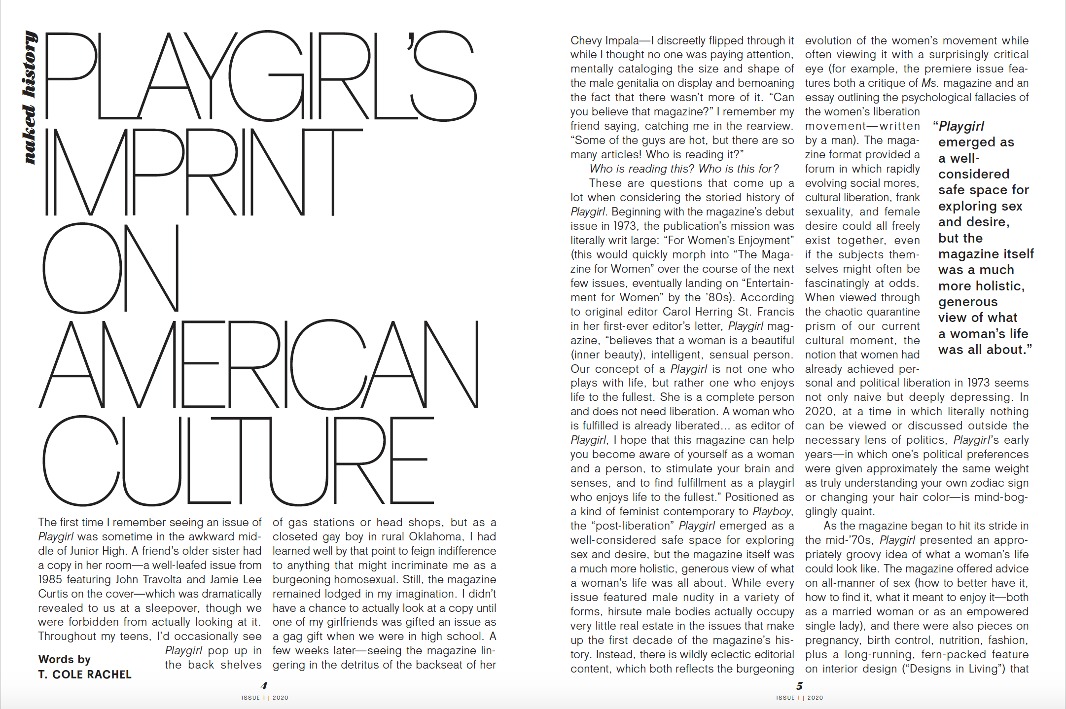
From the ashes, Playgirl has been reborn with a new, more feminine viewpoint, but with its indelible history intact. The former Playgirl had its last issue in 2015 and the difference between that Playgirl and today’s Playgirl is palpable. With a new publisher/owner and a new editor in chief, the magazine is ready to tackle today’s issues, including injustices and the pandemic, with a steadfast head on its shoulders and a fresh new voice in women’s magazines.
Skye Parrott is the new editor in chief, formerly cofounder and creative director of Dossier, an arts and fashion magazine, known as a platform that championed young creatives and helped to launch the careers of many photographers, fashion designers, and artists. Today, Skye is bringing her talents and creative vision to Playgirl.
I spoke with Skye recently and we talked about this new, modern-day Playgirl magazine. She was excited about the new direction, yet recognized the value of the title’s history, knowing that nudity and sexuality had always been a part of the magazine, but according to Skye it’s all about the approach to those topics and the way you execute them.
“I think we’ve looked at sex and sexuality and the body very differently in this magazine than how it was approached previously.”
The articles are there and very substantive, with the subject matter very topical for the world of today. The magazine has beautiful photography, yet stories that are compelling and on point with the issues we are facing currently. It’s a rebirth of a brand that many have been waiting for.
So, I hope that you enjoy this Mr. Magazine™ interview with Skye Parrot, editor in chief, Playgirl Magazine (relaunched). It was a delightful conversation about a title that should open up many more dialogues.
And once again, in 2020 Playgirl magazine returned to the newsstands as an upscale coffee-table like magazine
But first the sound-bites:
On why she accepted the role of editor in chief to bring Playgirl back to print and where it fits in the marketplace today: I was introduced to the publisher, who is a young man from a publishing family. He’s the great-grandson of Eugene Meyer, who owned the Washington Post for many years. The opportunity to buy the magazine sort of fell into his lap. He didn’t have any personal experience in publishing, but he saw it as an interesting and incredible opportunity. From the beginning it seemed like an incredible opportunity to me as well. To take this iconic, feminist magazine and to reimagine it for today’s world seemed very exciting. The moment seemed really right to do something interesting with it that could be meaningful. And I think that’s what we achieved in terms of the marketplace.
On whether it was intentional that she created a magazine that is so diverse and seems to be a coffee table book for an adult female who can have both a feast for her eyes and a feast for her brain: I wish you could see that I’m really smiling right now because that’s exactly what I hoped to create with this. Dossier was an incredibly diverse publication as well. And it was quite a long time ago in terms of the life of a magazine. Dossier launched in 2007/2008 and so diversity has always been very central to the work that I look to do. I’m from New York originally and I see diversity as a very central piece of the conversation. For lack of a different way of saying it, I find it quite boring to see the same person repeated in various iterations again and again and to only share one point of view. I don’t find that to be very interesting personally and I’ve never looked to replicate that in the publications that I’ve done.
On whether she thinks the nudity in the magazine is a plus or a negative: I was thinking about this the other day. If I were starting the magazine from scratch, there are things that would have probably been a little bit different about it than Playgirl. But when you’re relaunching something and you have a title that has a history, I think you have to also look at the history of that title and think about how to include that history in what you’re making today. And Playgirl obviously has a history of being very much interwoven with sex and I think that is a conversation that you have to have in the magazine, otherwise it doesn’t make sense. It’s just the name Playgirl slapped onto a magazine that has no relationship to the history.
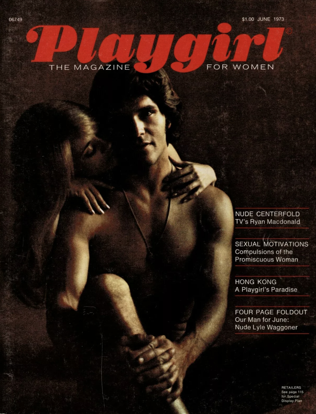
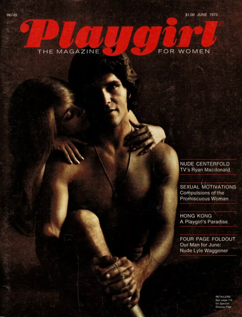
June 1973 saw the launch of Playgirl as The Magazine For Women and continued publishing until 2015
On the gorgeous photography and the meaty reading material in the magazine and whether the pictures are bait to get people to actually sit down and discover other things in the magazine: I’ve never really thought of it that way. For me the approach to the magazines that I have done has always been informed by what I want. When I founded Dossier, one of the big conversations that we had then was why did something have to be one or the other? Why does it have to be we have The New Yorker, but it’s all words or we have these beautiful fashion magazines, but there’s nothing of any substance in them. What if you had these things together because people are multidimensional, just because you like to look at beautiful pictures doesn’t mean you don’t want to read something as well.
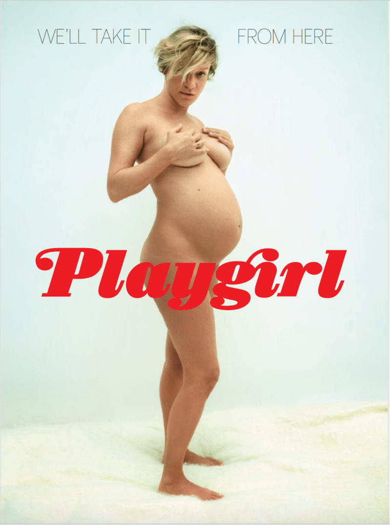
On how she decided on a naked, pregnant Chloë Sevigny for the cover: A lot of making a good magazine is taking advantage of the luck of what is available at the time it’s available. So, it was quite lucky that Chloë Sevigny was pregnant and that she was quite open to doing this cover and when that became clear, that she was open to doing it, it seemed to me like a no-brainer that we would put her on the cover. That having been said, I think from the beginning it was very clear that what we wanted to do with the cover was to look at female power in a different way.
On one criticism and one positive piece of feedback she has gotten since the first issue has been out: I’d start first with the criticisms, because I would love it if we could get some, but unfortunately in the world right now, I feel like those criticisms, you get them in person from people, and right now there’s just no in person. So, the feedback I’ve gotten has been only positive about it. I would love to share the critiques because there’s always room to make something better and to do more, but the feedback I have gotten has been really enthusiastic.
On whether she thinks magazines as a whole play a role similar to a Paradise Island or an Island of Clarity as they used to refer to The Wall Street Journal since many other platforms bombard the audience with only bad news:That’s a very interesting question. I can only speak to the kinds of magazines that I’ve looked to make and the kinds of magazines that I’ve looked to make are not trying to provide a Paradise Island, they’re not trying to sugarcoat anything. But what I look to do with Playgirl and what I think that we accomplished pretty well is to address the world as it is in a way that’s honest and vulnerable, but also has humor and hope.
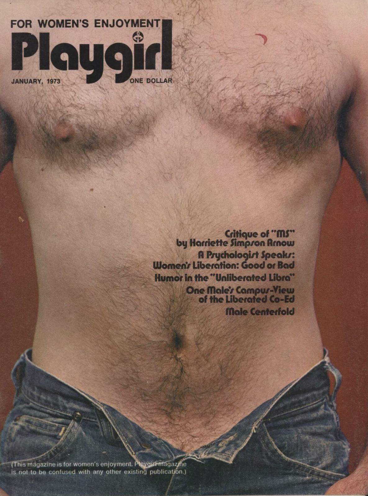
In January 1973 Playgirl returned as a magazine for Women’s Entertainment, but stopped publishing after one issue.
On what she would hope to tell someone Playgirl had achieved in one year: As far as the magazine goes, I don’t know what the future holds for it, to be frank. The pandemic has changed the calculus a little bit for the publisher and he hasn’t got our schedule yet for the second issue. Ideally, when you do a biannual magazine, you immediately start working on the next issue, but that’s not the case for Playgirl. So, I really don’t know. But what I hope is the experience of reading it will have given people stuff to think about, will have given people enjoyment and maybe will have added something to the conversation about life and the world and the human experience.
On the magazine being more of a luxury item with its $20 cover price: Absolutely. It’s quite a niche product, but that’s also my background. With Dossier, we tried very hard to keep the cover price reasonable, we worked to do so, but ultimately a $20 magazine is a bit of an indulgence. The hope is with the magazine at that price, it is something you keep and look at it a little more like a book. So, when you said it looked like a coffee table book, I hope that’s what it is because at $20 it should be something that you want to hold onto.
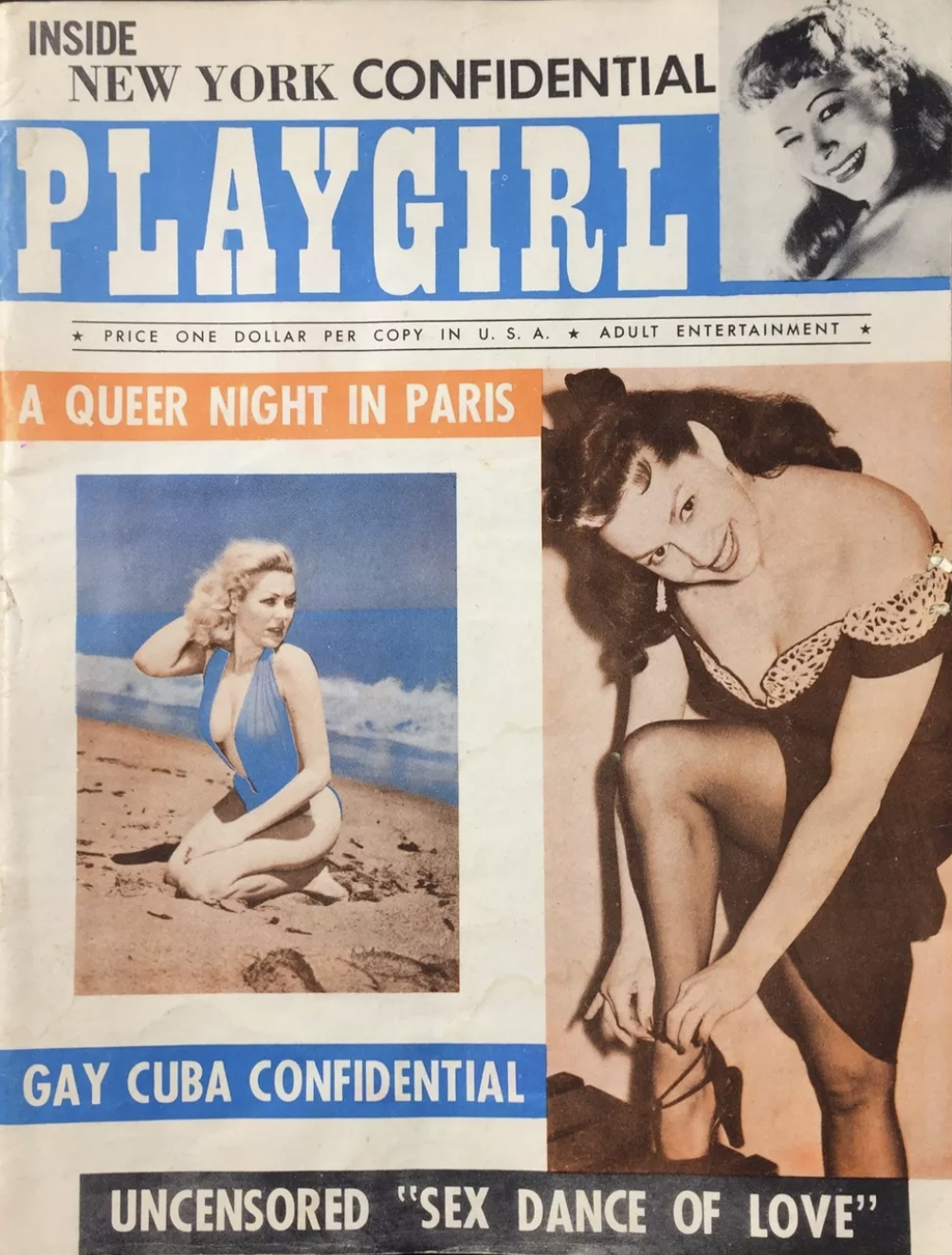
The original Playgirl magazine circ. 1955 was a men’s magazine
On what someone would find her doing if they showed up unexpectedly one evening at her home: I’ll mention it again, I have three young children, so my evenings end quite early. In a world where there isn’t COVID-19, I’m not sure what it would be, but with the pandemic right now what I’ve been watching is The Great British Baking Show on Netflix. (Laughs) It’s very soothing, there’s no drama. The drama comes from the cooking. Everyone is very kind to one another and it’s very British. There are lots of good manners and that’s how I’ve been unwinding right now. And cooking, I’ve done a little cooking. My husband has been doing a lot of cooking.
On shuttling between New York and Mexico: I’ve been living for the last two years in a tiny little town in Mexico called Sayulita. I’ve been going back and forth. I actually produced the entire magazine remotely. I built the team remotely, led the team remotely; I was in New York for some meetings, but almost the entire magazine was produced remotely, which was actually true for Dossier as well. It was a remote team then also.
On what keeps her up at night: I don’t know if you want to know the answer to that right now. (Laughs)
And now the lightly edited transcript of the Mr. Magazine™ interview with Skye Parrott, editor in chief, Playgirl.
Samir Husni: When you bring a print magazine back to print in this day and age, everybody takes notice. But why specifically did you accept the job as editor in chief to bring Playgirl back and how do you place it in today’s marketplace among all the other magazines out there?
The original Playgirl magazine was a men’s magazine circ. 1955
The very launch of Playgirl magazine as a women’s magazine Jan. 1973
The first issue of Playgirl magazine as entertainment for women June 1973
The relaunch of Playgirl in 2020 after it ended its print run from 1973 to 2015.
Playgirl magazine through the years, from what started as a men’s magazine in 1955 to a women’s magazine in 1973 – 2015 and its relaunch in 2020.
Skye Parrott: Those are excellent questions. I was introduced to the publisher, who is a young man from a publishing family. He’s the great-grandson of Eugene Meyer, who owned the Washington Post for many years. The opportunity to buy the magazine sort of fell into his lap. He didn’t have any personal experience in publishing, but he saw it as an interesting and incredible opportunity. We were introduced about two years ago by mutual friends. He was familiar with Dossier and that’s how I came into the picture.
From the beginning it seemed like an incredible opportunity to me as well. To take this iconic, feminist magazine and to reimagine it for today’s world seemed very exciting. The moment seemed really right to do something interesting with it that could be meaningful. And I think that’s what we achieved in terms of the marketplace.
I wasn’t concerned about the readership for it. To me the readership seemed quite clear. A lot of my work has been questions of gender and more and more as my work has gone on I feel like a female audience has been who I’ve been interested in communicating to and about. So, Playgirl seemed like a real opportunity to do that in terms of the actual economics of magazines. As we both know, those can be really trickier. I think magazines on their own are not a very good stand-alone business, that’s quite clear, but they’re quite an effective marketing tool for another business.
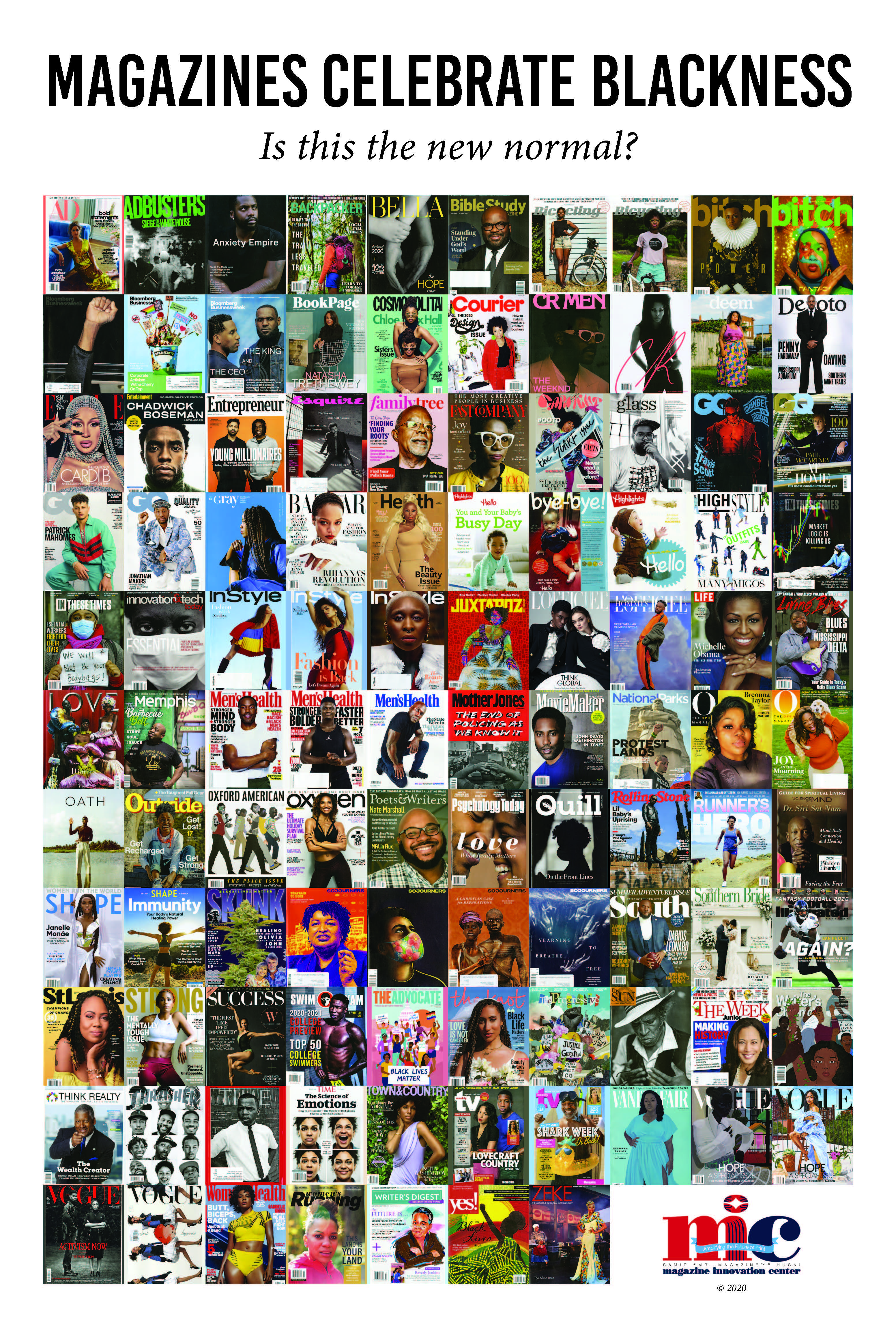
Samir Husni: Was it intentional that diversity is all over the magazine, gender is all over the magazine, size is all over the magazine? Even before magazines were celebrating Blackness and after the murder of George Floyd, and I know the magazine was in the making even before the pandemic, was it intentional that you created a magazine that seems to me to be a coffee table book for an adult female who can have a feast for her eyes but at the same time have a feast for her brain?
Skye Parrott: I wish you could see that I’m really smiling right now because that’s exactly what I hoped to create with this. Dossier was an incredibly diverse publication as well. And it was quite a long time ago in terms of the life of a magazine. Dossier launched in 2007/2008 and so diversity has always been very central to the work that I look to do. I’m from New York originally and I see diversity as a very central piece of the conversation. For lack of a different way of saying it, I find it quite boring to see the same person repeated in various iterations again and again and to only share one point of view. I don’t find that to be very interesting personally and I’ve never looked to replicate that in the publications that I’ve done.
Going into Playgirl, it’s very intentionally diverse because I think as you approach the idea of what space a modern feminist publication could occupy, one of the things that I’ve thought a lot about, and I think this is what the tagline on the cover speaks to, is the idea that rather than offering the feminist point of view, what if we offer a feminine point of view? And what does that look like? What are the ideals that are lifted up? What are we celebrating? What are we putting forward with this magazine?
The idea, as I spoke a little about in the editor’s letter, is that there have been a lot of magazines made for women that still goes through this kind of male gaze. So, what if we make a magazine for women that’s really about the female gaze in a much broader sense? And for me, diversity, community, celebrating different kinds of bodies, looking at the experience of being female in different ways, for me those are hyper-feminine. And those are things that I look to do with the magazine.
Samir Husni: Do you think you would have been able to do that without the nudity? I mean, do you think the nudity in the magazine is a plus or a negative?
Skye Parrott: I was thinking about this the other day. If I were starting the magazine from scratch, there are things that would have probably been a little bit different about it than Playgirl. But when you’re relaunching something and you have a title that has a history, I think you have to also look at the history of that title and think about how to include that history in what you’re making today. And Playgirl obviously has a history of being very much interwoven with sex and I think that is a conversation that you have to have in the magazine, otherwise it doesn’t make sense. It’s just the name Playgirl slapped onto a magazine that has no relationship to the history.
But I think the way that we approach sex, I hope, is from a very different point of view than how the magazine approached it when it first launched in the ‘70s, and certainly in later iterations when it was called Playgirl but it was basically a magazine for gay men. I think we’ve looked at sex and sexuality and the body very differently in this magazine than how it was approached previously.
Samir Husni: As I flip through the pages, yes, you gave me some gorgeous photography and you name the age and I found it there, but there is also some heavy-duty reading material. There is solid-type pages. What are you trying to achieve? Are you using the images as bait to get people to the magazine and once there, they sit down and discover there is a lot of different things in there?
Skye Parrott: I’ve never really thought of it that way. For me the approach to the magazines that I have done has always been informed by what I want. When I founded Dossier, one of the big conversations that we had then was why did something have to be one or the other? Why does it have to be we have The New Yorker, but it’s all words or we have these beautiful fashion magazines, but there’s nothing of any substance in them. What if you had these things together because people are multidimensional, just because you like to look at beautiful pictures doesn’t mean you don’t want to read something as well.
And I think having done that for so many years at Dossier, I never considered a different approach. I’m a huge reader myself and I have been my entire life. So, even though I come out of a visual background, reading is a massive part of my life. So the idea of creating something that didn’t have a high level of literary content never crossed my mind.
Samir Husni: You’re a mom and you combined the image of motherhood with Playgirl’s first cover. How did the idea of that first cover for the relaunch, having a pregnant, naked woman on the cover, how did that come about? It’s a bit of a throwback to the Vanity Fair cover with Demi Moore. What was your thinking behind that? Did you want to send a shockwave to the audience? I’m intrigued to know how you decided on that cover.
Skye Parrott: A lot of making a good magazine is taking advantage of the luck of what is available at the time it’s available. So, it was quite lucky that Chloë Sevigny was pregnant and that she was quite open to doing this cover and when that became clear, that she was open to doing it, it seemed to me like a no-brainer that we would put her on the cover.
That having been said, I think from the beginning it was very clear that what we wanted to do with the cover was to look at female power in a different way. And I think the reason this cover became something that we absolutely wanted to do was because putting a naked woman on the cover who is pregnant is really a strong statement about the basis of female power.
I think putting a naked woman on the cover in a sort of sexual pose is one thing, putting a naked man on the cover is something else, but putting a naked woman who is pregnant on the cover is saying that this power in women is somewhat very different than where we’re used to seeing it as a society. And for me, that was a statement that really lined up with what we were doing with the magazine.
Samir Husni: I know the first issue of the magazine has very limited availability, but what has been the feedback you’ve received? I saw your interview with Monocle and the WWD review, but besides the media people, what has been one criticism your circle has given you and what was one positive about the relaunch?
Skye Parrott: I’d start first with the criticisms, because I would love it if we could get some, but unfortunately in the world right now, I feel like those criticisms, you get them in person from people, and right now there’s just no in person. So, the feedback I’ve gotten has been only positive about it. I would love to share the critiques because there’s always room to make something better and to do more, but the feedback I have gotten has been really enthusiastic.
I’ve heard a lot that it was like a breath of fresh air at this moment, that it made people feel joy and hope when they saw it and consumed it. I’ve heard that from a number of women, that it felt very fresh and very “right now” in a positive way. I love to hear that. Obviously, you make magazines hoping that you’re going to give people a certain experience and that you’re bringing something good into the world. And so to hear that has been the case is beyond satisfying.
I’ve gotten just a lot of very positive feedback. I haven’t heard a lot of critique yet, but I expect I will. Certainly, there’s always room to make things better.
Samir Husni: As a magazine editor, with almost all the other platforms bombarding the audience with bad news, murders, demonstrations, social injustices, you name it, do you think the magazine as a whole plays a role similar to a Paradise Island or an Island of Clarity as they used to refer to The Wall Street Journal?
Skye Parrott: That’s a very interesting question. I can only speak to the kinds of magazines that I’ve looked to make and the kinds of magazines that I’ve looked to make are not trying to provide a Paradise Island, they’re not trying to sugarcoat anything. But what I look to do with Playgirl and what I think that we accomplished pretty well is to address the world as it is in a way that’s honest and vulnerable, but also has humor and hope.
And I think the magazine does that very well. There’s a lot to talk about and I hope this opens up discussions, but not in a way that’s so heavy people feel more hopeless, because I don’t believe the world needs more of that right now.
And as you noted, the magazine was finished in March and we were supposed to come out in April, but the publisher decided to hold it. We finally started to work on it again for two weeks in September and then it came out in October. So, when I went back to work on it in September I hadn’t looked at in six months and I had the sense that we were going to have to make big changes to it for the magazine to be appropriate in the world at that time. But much to my pleasant surprise, after I went through it, it didn’t need big changes. There were only very small changes.
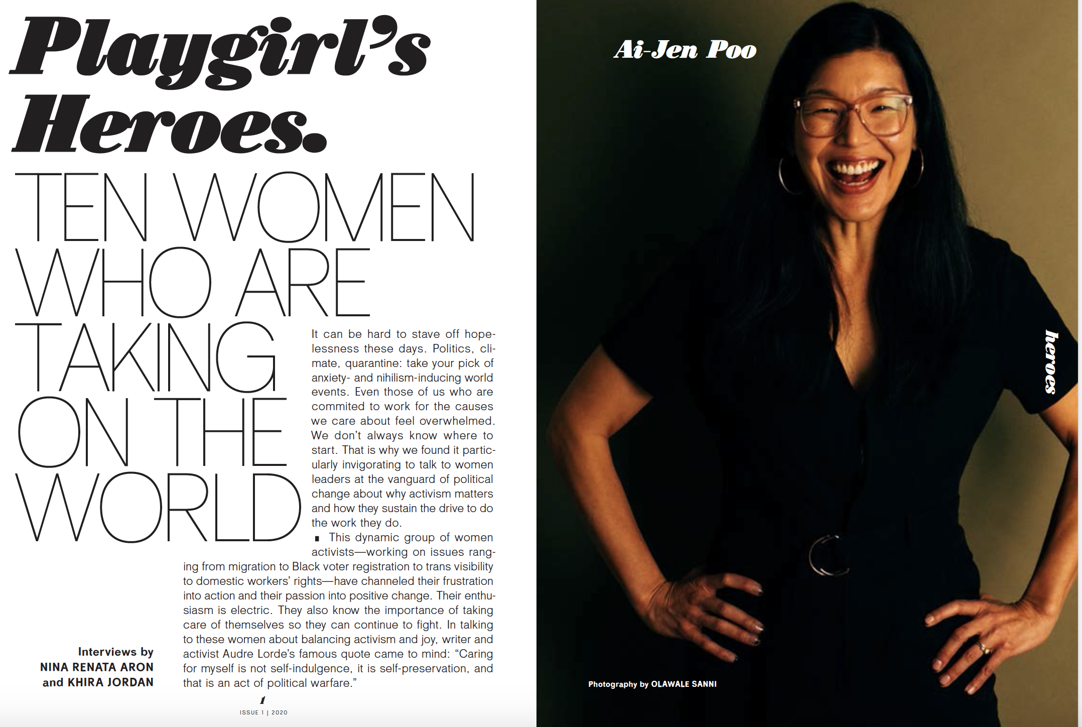
There was this portfolio at the core of it, which is about these feminist activists; we had already done that. We’d already talked about these women who are doing these really important things and how they’re doing them. We already had all of these first-person essays. I added only two first-person essays that I thought specifically looked at some aspects of what had been going on in the last six months in a very beautiful and thoughtful way.
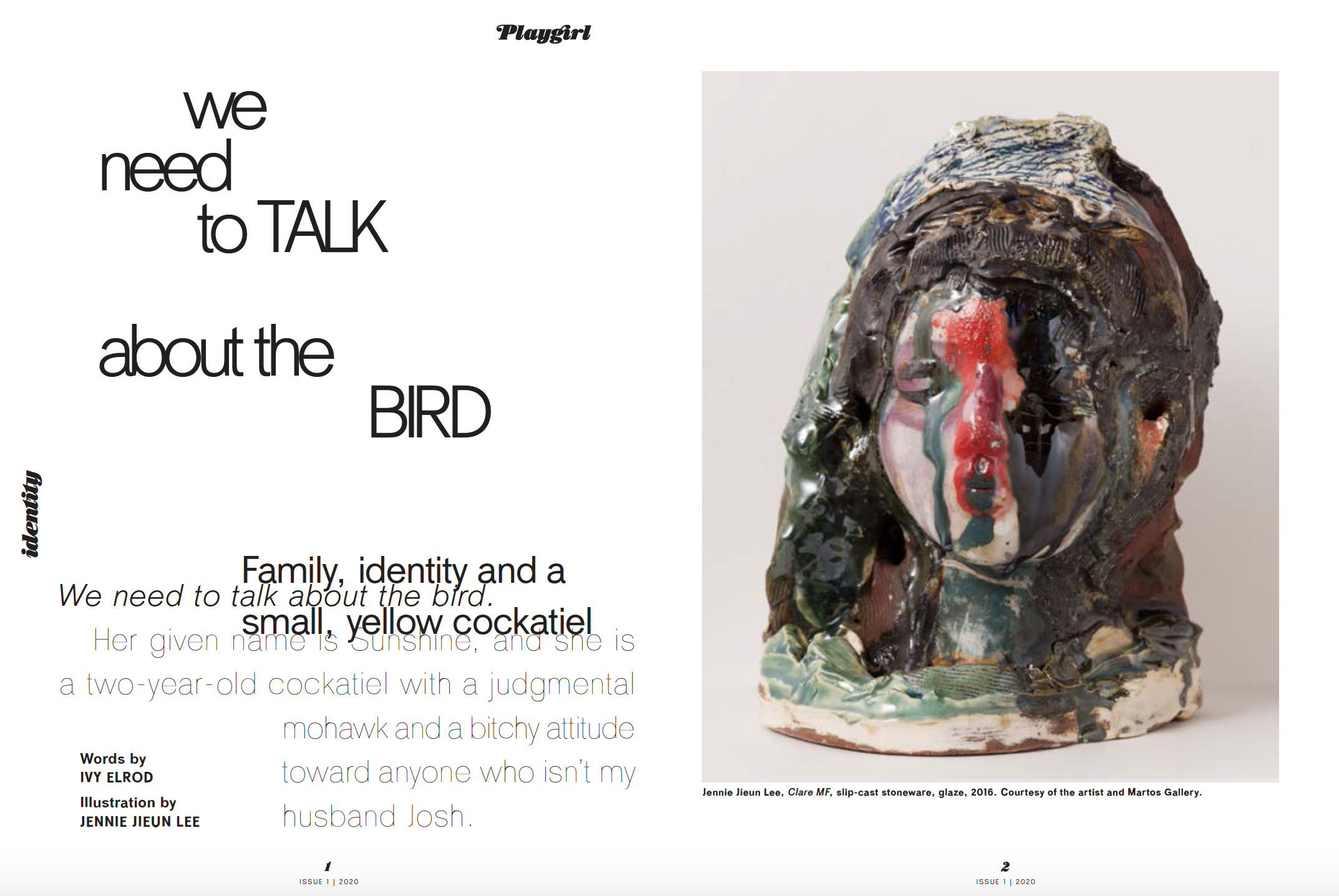
One of those was from a woman named Ivy Elrod who is quite a good friend of mine. She lives in Nashville and she wrote an essay called “We Need To Talk About The Bird.” And it’s wonderful. First of all, it’s incredibly funny and I think that’s really important. She’s also smart and she talks in it about the experience of parenting during the pandemic and the experience of being a biracial person and the experience of sort of reckoning with identity. And all of that is woven through the story. These are serious subjects to talk about, but to do so with humor and depth is really the trick.
That piece is really the tone that I hope is woven through the whole magazine. To talk about things that are important, but to find a way to do it that balances the heaviness and the lightness of life.
Samir Husni: If you and I are having this conversation one year from now, what would you hope to tell me you had accomplished with Playgirl?
Skye Parrott: I wish I knew. I can maybe imagine my life about a week from now, (Laughs) if I’m lucky. One year ago, I wouldn’t have imagined anything going on, so I wish I had the crystal ball to say that I could plan for anything a year from now, but I have no sense of what my life will look like. Or the world, for that matter. As you noted, I have three children and they’re in school. One of my younger children goes to school in a park, outside.
As far as the magazine goes, I don’t know what the future holds for it, to be frank. The pandemic has changed the calculus a little bit for the publisher and he hasn’t got our schedule yet for the second issue. Ideally, when you do a biannual magazine, you immediately start working on the next issue, but that’s not the case for Playgirl. So, I really don’t know. But what I hope is the experience of reading it will have given people stuff to think about, will have given people enjoyment and maybe will have added something to the conversation about life and the world and the human experience.
Samir Husni: You’ve made the magazine more like a luxury item with the $20 cover price.
Skye Parrott: Absolutely. It’s quite a niche product, but that’s also my background. With Dossier, we tried very hard to keep the cover price reasonable, we worked to do so, but ultimately a $20 magazine is a bit of an indulgence. The hope is with the magazine at that price, it is something you keep and look at it a little more like a book. So, when you said it looked like a coffee table book, I hope that’s what it is because at $20 it should be something that you want to hold onto.
Samir Husni: Let’s assume there’s no COVID-19 and I show up unexpectedly at your home one evening after work, what would I find you doing? Having a glass of wine; reading a magazine; cooking; watching TV; or something else? How do you unwind?
Skye Parrott: I’ll mention it again, I have three young children, so my evenings end quite early. In a world where there isn’t COVID-19, I’m not sure what it would be, but with the pandemic right now what I’ve been watching is The Great British Baking Show on Netflix. (Laughs) It’s very soothing, there’s no drama. The drama comes from the cooking. Everyone is very kind to one another and it’s very British. There are lots of good manners and that’s how I’ve been unwinding right now. And cooking, I’ve done a little cooking. My husband has been doing a lot of cooking.
Samir Husni: I read that you shuttle between New York and Mexico?
Skye Parrott: Yes. I’ve been living for the last two years in a tiny little town in Mexico called Sayulita. I’ve been going back and forth. I actually produced the entire magazine remotely. I built the team remotely, led the team remotely; I was in New York for some meetings, but almost the entire magazine was produced remotely, which was actually true for Dossier as well. It was a remote team then also.
I’ve been doing that for two years. We’re back in New York right now, but we may go back to Mexico for some time this winter. My kids are in school remotely, so it’s open.
Samir Husni: My typical last question; what keeps you up at night?
Skye Parrott: I don’t know if you want to know the answer to that right now. (Laughs)
Mike Blinder, editor and publisher of Editor & Publisher magazine interviewed me earlier in the week about publishing during a pandemic, journalism, diversity in magazines, and all things magazines. What follows is from Editor & Publisher website.
Dr. Samir Husni is “the country’s leading magazine expert,” according to Forbes magazine; “the nation’s leading authority on new magazines,” according to min:media industry newsletter; “a world-renowned expert on print journalism” according to CBS News Sunday Morning; and The Chicago Tribune dubbed him “the planet’s leading expert on new magazines.” It’s no wonder he is better known in the industry as Mr. Magazine.
As founder and director of the Magazine Innovation Center at the University of Mississippi’s School of Journalism and New Media, Husni decided he needed to find out how magazines, printers, designers, digital media, and other business executives were coping with COVID-19. His free new book, Publishing During a Pandemic, is online on Issuu and goes behind the scenes with the leaders of the magazine and magazine media, including Stephen Bohlinger, senior vice president group publisher of Better Homes & Gardens and Kent Johnson, CEO of Highlights for Children, recording their stories during the 2020 pandemic.
In this segment of E&P Reports, E&P publisher Mike Blinder goes one-on-one with Husni to gain what insights he learned through the new book as well as how he feels about the future of news publishing and the survival of printed media. He offers tons of advice and information that any news publisher (print or pure play) can use to serve their audiences better.
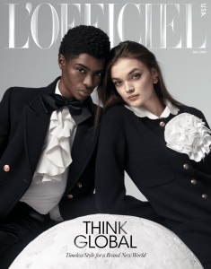
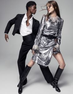
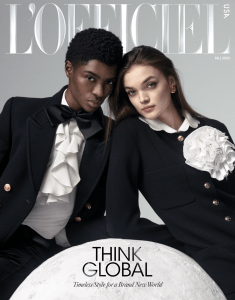
“I think that change has been in the making for a long time. The fact that now we are also very connected to our local communities, but at the same time very open to the world, thanks to the digital revolution and the Internet; I think the change is here to stay. I don’t think anybody can think about going back to the magazines that preexisted before. I’m lucky in that I have always worked in very open-minded and inclusive environments, thinking about The New York Times Magazine and W. And now I want to bring that message into L’Officiel, without losing the Frenchness of the brand.” Stefano Tonchi…
For a century now, L’Officiel has served as an official voice of fashion, beginning as an elegant base for French Couture in Paris and evolving into a collection of international publications. The very first issue, in Fall 1921, was already in 3 languages—French, English, and Spanish, and today L’Officiel publishes 31 editions with distribution in 80 countries. L’Officiel’s social media footprint is 21 million followers, including new growth across Italy, France, and China, among other markets and on digital L’Officiel has 40 million total page views across its global network in 2020 (up 12% vs 2019). Fashion, both past and present has always been the deciding voice for the brand.
With the launch of its very first global issue, L’Officiel seeks to foster a constructive, respectful dialogue across cultures and continents, races and genders. And no one better to lead that dialogue that the brand’s Chief Creative Officer, Stefano Tonchi. As the former editor of W, Stefano forged ahead with diversity and inclusivity as staunchly as he did with good fashion. And he is the epitome of fashion, on both sides of the Atlantic.
I spoke with Stefano recently and we talked about this great new journey before him with L’Officiel and how he wants to create “a unique and global voice” that emphasizes its Eurocentric and French sensibility and point of view, but bring new audiences into the fold too. Such as Americans who want to find that global voice to speak to their communities. It’s an intriguing challenge that Stefano is more than up for.
So, please enjoy the Mr. Magazine™ interview with a man who knows good fashion and knows his way around that world, Stefano Tonchi, contributing global chief creative officer, L’Officiel.
But first the sound-bites:
On how he approached launching the very first global issue of L’Officiel, a brand that is known worldwide and that is 100 years old: First of all I did a little bit of research and tried to understand what the DNA of this brand is. How it was started and how it had been run by almost the same family for the last century. It has really always been a magazine focused on the industry of fashion and that was something that was very small and insular in the 1920s and the 1930s. It became a part of popular culture by the 1980s and the 1990s. And today it’s a very powerful part of the media, I would say, within communications. It’s a place that so many people are using to send political and social messages. So fashion is much more than just clothes, for sure. It’s always been, but today more than ever.
On his decision to have one black and one white on the cover of the first global issue of L’Officiel: I work with a creative director that has been in the communications and advertising industries; he is a very talented Brand-man, as I would call it. We also talked about a brand that doesn’t speak only to the U.S. market; it talks to many different markets. Places where the ratio issue is lived a different way. So, I wanted to bring a message of inclusivity and a message of elegance and calm. That’s why I thought to have two young talents, racially different, was the right message for this cover.
On the biggest challenge he’s had to face since coming to L’Officiel: When you start working with a brand that has a long history, somehow that history is very pleasant, but can be a real problem as well, because the past brings a lot of memories and a lot of stories, so you have to be considerate. It’s like when I went to work for Esquire, so many times I would think, when you have a brand with so much history, the past can become your enemy, because you can never be at that same level of that past.
On whether they will continue to publish L’Officiel in English: Yes. We are going to have the U.S. edition as a print product eight times per year, focusing on different themes. But it is a brand that believes in digital for every day too, so we have a website that is in the process of being redesigned and relaunched with a new digital director, Josh Glass. So that will be what we have in the U.S. And the same kind of structure will be in France and in Italy, where they will also have eight print issues per year. And most of the content of these issues is created in communion together. We have a lot of editorial meetings with the people in France and Italy.
On which role he thinks L’Officiel will play globally, an initiator or a reflector of culture and people: Probably in the U.S. more of an initiator, in terms of the American audience not being really used to consuming global content, especially when it doesn’t come from Los Angeles or New York. It doesn’t have the same resonance in their lives. Our audience is an audience that loves Paris, is interested in a certain kind of European lifestyle and point of view. So that’s what makes L’Officiel’s audience to begin with. But at the same time, we want to also tell stories that are relevant to people in the U.S., so you always have this balance between some continents that are more global and some that are more national.
On what he thinks the future holds for L’Officiel: I think the production of digital content will be increasing, geared toward digital communication. People are going to use and get more and more of their media information from their phones and from other digital outlets. So we will create more content with an integration also of product and messages from the advertisers in different ways. The relationship between editorial and advertisers is changing, that’s for sure.
On why he thinks a reader would pick up L’Officiel over another fashion brand: I think the reason to go to L’Officiel is because the audience wants to have a more global point of view, a more international point of view. For sure someone who is attracted by L’Officiel is already somebody who is looking at Europe, thinks about Paris and a very bordered cultural experience. Someone who thinks about Europe as a reference point and wants to incorporate that knowledge and news into their feeds.
On anything he’d like to add: Visually, I’ve tried to bring a certain kind of elegance and quietness to the design. I didn’t want to surprise too much. I really wanted to establish again this idea of something elegant, clean, understandable, common ground, and from there maybe start an innovation and a revolution.
On what keeps him up at night: These days I have a lot of problems sleeping, because I have to talk so much with Europe and China. China keeps me up because usually my meeting with the Chinese partners are at 4:00 a.m. because of the 12 or 13 hour time difference. It’s a time schedule problem.
And now the lightly edited transcript of the Mr. Magazine™ interview with Stefano Tonchi, chief creative officer, L’Officiel.
Samir Husni: As a content creator and curator, you’re now at a magazine that has a century under its belt. Next year L’Officiel will celebrate 100 years. How did you approach launching the very first global issue for this brand that’s known worldwide?
Joshua Glass, Stefano Tonchi, Anthony Cenname, photo by Emily Soto
Stefano Tonchi: First of all I did a little bit of research and tried to understand what the DNA of this brand is. How it was started and how it had been run by almost the same family for the last century. It has really always been a magazine focused on the industry of fashion and that was something that was very small and insular in the 1920s and the 1930s. It became a part of popular culture by the 1980s and the 1990s. And today it’s a very powerful part of the media, I would say, within communications. It’s a place that so many people are using to send political and social messages. So fashion is much more than just clothes, for sure. It’s always been, but today more than ever.
I looked at that history and looked at how this brand, this publication, always wanted to be international. The first issue in 1921 was already in French, English and Spanish. So they always had the idea of talking with the world from Paris.
Now the magazine, especially in the last 20 years, has been expanding and opening outposts all over the world. Some are owned by the company and some are licenses. They are in Ukraine, in Turkey, China, Korea, Argentina, Brazil, and Mexico. I think it will be in Chile very soon. So, they kept that kind of international vision.
I came in and I was asked to handle all of these different identities together that the magazine has developed over all of these years, especially internationally. And I’m trying to create for them a common ground and a common language, especially visually. But not colonizing from Paris or from New York, but really involving all the editors in this process. At least right now, the ones who are closer to me and that I can work with daily for the magazines that are totally owned by the holding. That means France, Italy, Brazil, the U.S. and a few others. And then talking to the other companies and the editors in chief in those countries.
So, for me, it’s very important to define global as almost a collaboration, as a common space to work in and not as creating content in Paris or New York, then distributing it on a global scale.
Samir Husni: We know that things are changing in the magazine world, and for the first time, in at least my history of tracking magazines, there is so much diversity in magazine covers. You name the magazine, from fashion to Bible study magazines, to sports; all of them have this amazing cover diversity. You had been doing a lot of that in W. In fact, W was probably one of the most diverse magazines when it was under your tenure. Why do you think the time is now for such diversity? Or do you think this is just a blip on the radar and everything will revert back once this pivotal moment in time ends?
Stefano Tonchi: I think that change has been in the making for a long time. The fact that now we are also very connected to our local communities, but at the same time very open to the world, thanks to the digital revolution and the Internet; I think the change is here to stay. I don’t think anybody can think about going back to the magazines that preexisted before. I’m lucky in that I have always worked in very open-minded and inclusive environments, thinking about The New York Times Magazine and W. And now I want to bring that message into L’Officiel, without losing the Frenchness of the brand.
It’s very easy sometimes to think about global as being something that is very bland with no identity. So, it’s like how can you create an identity that has a relevance in the local community as much as it has a global appeal? And that’s really the challenge.
Samir Husni: I see that for your first cover you went with two people, one black and one white. Can your share your thinking behind that decision for this first global issue?
Stefano Tonchi: I work with a creative director that has been in the communications and advertising industries; he is a very talented Brand-man, as I would call it. We also talked about a brand that doesn’t speak only to the U.S. market; it talks to many different markets. Places where the ratio issue is lived a different way. So, I wanted to bring a message of inclusivity and a message of elegance and calm. That’s why I thought to have two young talents, racially different, was the right message for this cover.
Samir Husni: Since you took this position at L’Officiel, what has been the biggest challenge you’ve had to face and how did you overcome it? Or has it been a walk in a rose garden for you?
Stefano Tonchi: When you start working with a brand that has a long history, somehow that history is very pleasant, but can be a real problem as well, because the past brings a lot of memories and a lot of stories, so you have to be considerate. It’s like when I went to work for Esquire, so many times I would think, when you have a brand with so much history, the past can become your enemy, because you can never be at that same level of that past.
So, a brand with 100 years of history, you have to kind of restart. It’s almost like you have to find a common ground from where you can erect a new building. So, the challenge has been to put together a new team. And I had really just started to think about what to do when we went into lockdown in most of the west. And it was really difficult to communicate and to try and hire people to do projects, talk to photographers remotely.
But we did it and I was surprised in a good way that we were able to put together this magazine totally remotely. I still have not seen a print issue. That is the first time in my life. I’ve seen only the digital reproduction. All the decisions were made onscreen. All the assignments were made onscreen and all the editing and all the photography. So, it was a very interesting process, because mentally we are used to first putting together the print issue and then distributing it digitally. This was like reverse print. We created something that was totally digital with a digital strategy behind it and then we will see the print version as almost like an added value. Something very special. Something that was the final result and came after.
The old idea of how to rethink a magazine has to do with having a digital strategy. We need to think in a way that isn’t about a monthly. I said that a long time ago at W. about how you have to move away from a monthly or weekly kind of publishing schedule. We have to focus more on larger themes and create almost like platforms where you put together your content and you distribute it in different ways. L’Officiel has a platform for women’s wear, one for men, art, and one for entertainment. And they all live at the same time. They find moments when some of this content is published into an actual print product, but they all live more as platforms focused on specific thematics.
Samir Husni: Are you going to continue publishing L’Officiel in English?
Stefano Tonchi: Yes. We are going to have the U.S. edition as a print product eight times per year, focusing on different themes. But it is a brand that believes in digital for every day too, so we have a website that is in the process of being redesigned and relaunched with a new digital director, Josh Glass. So that will be what we have in the U.S.
And the same kind of structure will be in France and in Italy, where they will also have eight print issues per year. And most of the content of these issues is created in communion together. We have a lot of editorial meetings with the people in France and Italy. We put together a schedule of the stories we want in the issue and we use the resources where they are, so if we’re doing a story about a French designer, the French team will take care of it. If we’re doing a story about someone in the U.S., the American team will handle it. So we use our contributors all around the world.
It’s also a financial solution, in terms of one of the biggest problems for magazines that operate on a global scale is the duplicating of the resources, such as having two fashion directors, three editors in chief, two IT directors and so on. We are trying to use the best resources where they are. For L’Officiel, we have very strong digital and technical teams that are based in Italy. We have a very strong fashion and visual team based in Paris, casting director, fashion production. We have journalistic and pop culture features that are based in New York. So, we take the best from the company and try not to duplicate the jobs.
Samir Husni: You’ve always been a force for inclusion and glo-local, bringing the global to the local communities. Do you think the magazine audience at large, regardless of the platform, is going to find more of that mentality, that they are going to engage more with magazines like L’Officiel because it will reflect their own personalities or do you feel you will be more of an initiator than a reflector?
Stefano Tonchi: Probably in the U.S. more of an initiator, in terms of the American audience not being really used to consuming global content, especially when it doesn’t come from Los Angeles or New York. It doesn’t have the same resonance in their lives. Our audience is an audience that loves Paris, is interested in a certain kind of European lifestyle and point of view. So that’s what makes L’Officiel’s audience to begin with. But at the same time, we want to also tell stories that are relevant to people in the U.S., so you always have this balance between some continents that are more global and some that are more national.
In Europe, especially between France and Italy, there is much more of a community of cultural references, so there is a lot of content that they share. But they still have very specific features that are of that market. And don’t forget, everybody has a different language too.
Samir Husni: As you move forward and settle into this position, and hopefully the pandemic will be behind us, along with the elections, and as we move toward a new spring, what do you think the future holds for L’Officiel?
Stefano Tonchi: I think the production of digital content will be increasing, geared toward digital communication. People are going to use and get more and more of their media information from their phones and from other digital outlets. So we will create more content with an integration also of product and messages from the advertisers in different ways. The relationship between editorial and advertisers is changing, that’s for sure.
I think what is very interesting and what will be driving the future is how much can we know about our readers. Data managing is really one of the big issues here. We did a little bit of an experiment in our own small world, our L’Officiel world. We created a portfolio with the most wanted accessories from the fashion season. We asked readers on Instagram 300 questions and we got 600,000 responses. The questions were like what kind of product do you like; what do you like from one brand and what do you not like from another brand. And we collected a lot of information that we read and analyzed. We put together a feature with the 12 greatest accessories for the season chosen by our readers.
So, it’s a combination of data, editorial choices, because don’t forget, the first selection is by the editors. I’m going to create a series of questions and that is already an editorial decision, what kind of questions. So, it’s not really user-generated content, it is editorial-generated content. But the users, the audience, have the opportunity to express their opinions. And then you have again the editors who are going to look through this material and analyze it, and then bring out things from the analytics, but also from the feelings behind it. So, it’s a combination of data and editorial knowledge. That’s what is interesting. How will we combine it? And that’s something that only a magazine brand can do.
Samir Husni: If you could give me only one reason a reader might pick up the print magazine, L’Officiel, or go to the website or the social media outlets you have out there, from an array of other fashion magazines and digital sites, what would that reason be? Why will they choose L’Officiel instead of another fashion brand?
Stefano Tonchi: I think the reason to go to L’Officiel is because the audience wants to have a more global point of view, a more international point of view. For sure someone who is attracted by L’Officiel is already somebody who is looking at Europe, thinks about Paris and a very bordered cultural experience. Someone who thinks about Europe as a reference point and wants to incorporate that knowledge and news into their feeds.
So, in a sense it’s a little less U.S. centric and more globally centric, but it’s also the new position that we have to take as Americans. I’m American and I think if America wants to play the game on a global scale, they have to start to listen to global voices. They can’t just dictate the conversation, that was the past. The future is going to be a dialogue with the rest of the world if America wants to talk about the global field in the future.
Samir Husni: Is there anything you’d like to add?
Stefano Tonchi: Visually, I’ve tried to bring a certain kind of elegance and quietness to the design. I didn’t want to surprise too much. I really wanted to establish again this idea of something elegant, clean, understandable, common ground, and from there maybe start an innovation and a revolution. But I think it’s nice when we can find that kind of visual common ground with understandable typography and images in a language that explains what you’re looking at. We have sometimes been taking too much for granted. And I think it’s nice to step back before going too far, so we know where we are.
Samir Husni: My typical last question; what keeps you up at night?
Stefano Tonchi: These days I have a lot of problems sleeping, because I have to talk so much with Europe and China. China keeps me up because usually my meeting with the Chinese partners are at 4:00 a.m. because of the 12 or 13 hour time difference. It’s a time schedule problem.
Change is taking place right before our very eyes, important changes in the world and in the world of magazines and magazine media. From A to Z, magazines are celebrating blackness like they never have before. Some are asking if this is the new normal, and some are lamenting about what took magazines so long to discover people of color in general and blacks in particular? Blacks have appeared on covers of magazines in the past, but they were few and far between. Yet, in the last few months I was able to buy more than 100 magazines with blacks and/or Black Lives Matter statements adorning their covers. Change is taking place and change is good as the folks at GQ magazine stated in their global editorial (see below)…
I have decided that a picture is still worth a 1,000 words. So I assembled all the 106 magazines I bought or acquired in the poster below followed by excerpts from three magazine editorials.
What follows are few excerpts from editors’ letters of three selected magazines ….
2020 IS NOT CANCELLED – IT’S GAME-CHANGING
By Toby Wiseman, editor in chief
UK Men’s Health magazine
As I write this in late June, the past couple of weeks have proved fairly tumultuous for people working in the predominantly white UK magazine industry. In the wake of George Floyd’s killing in the US and the subsequent Black Lives Matter protests around the world, there has been a lot of belated hand-wringing and understandable brow-beating, as well as some unhelpful, imprudent sabre-rattling.
Editors have rightly been examining their consciences, reflecting on unconscious attitudes towards diversity, as reflected through their brands in past years, and how best to address them in the immediate future and beyond. Some have realised that they have work to do and have pledged as much. Others have been guilty of rather cack-handed, disingenuous responses.
IT’S BEEN A LOT
By Ben Cobb, editor in chief
UK LOVE magazine
We’re little more than halfway through 2020 and it’s already hard to grasp the biblical change that have tossed us around and spat us out into this alternate reality. I read something recently that made some sense to me. It was a quote by Lenin. He said, “There are decades where nothing happens, and there are weeks when decades happen.” I don’t know about you, but the past four months feel like centuries have happened.
…Meanwhile we had a magazine to make… The industry shutters had come down, Lockdown was in full effect: there were no clothes to shoot, no talent to work with. Think, think. Rethink. We had the freedom now to do something different. Nature had triggered its reset button and so should we. It was time for photographers to turn their cameras inwards and explore their immediate worlds. Time to produce heartfelt projects that reflected this once-in-a-lifetime experience. The brief was simple: let’s dream again. As the pages began to fill with beautiful images, we felt buoyed.
Then came the three words that shattered any complacency: I Can’t Breathe. Eight minutes and 46 seconds of abject horror. Stop. WTF. The eyes of the world watched as George Floyd was murdered in broad daylight. There was nowhere else to look. This time there were no distractions; the pandemic had made sure of that. It was a perfect storm. Some day, we will look back and fully understand the inextricable link between these two moments – the Covid crisis and the BLM uprising that sprang from it – but right now, the future was suddenly there for the taking. Introspection flipped to action. Outrage hotwired an ongoing process of re-education and accountability. The gears had shifted and, with them, our focus at the magazine.
March to June. Four months that saw humankind brought to its knees, the global economy eviscerated, sovereignties shaken, bronze gods toppled and 400 years of black oppression at the top of every agenda. So far, so fucking monumental. Maybe 2020 wasn’t so bad after all.
What We Mean When We Say “Change Is Good”
By Will Welch, editor in chief
US GQ magazine
…Welcome to the special “Change Is Good” issue of GQ. It is a response to the wildly varied and overlapping forces of change – social, political, cultural, technological, economic—we are experiencing. The issue is intended as an instrument of inspiration and hope…
… As you’ll soon see, much of this issue found its purpose in the Black Lives Matter protests and larger racial-injustice reckoning that has followed. When it comes to this moment of potential for true structural change, several of our profile subjects are setting an impeccable example of presenting ideas that are leading the way…
… So think of this issue as proof of concept—and each of these individuals’ stories as evidence. At GQ, we say change is good because change represents an opportunity—just add smart ideas, hard work, care for the community, and unflinching moral conviction , and suddenly you don’t have change, you have progress.
This notion has already gone global: “Change Is Good” is a rallying cry that is being projected out to some 50 million readers by all 21 worldwide editions of GQ simultaneously…
… GQ’s global unification around this idea is a first for us, and it represents a proud moment for our very worldwide brand…
Change is taking place. Magazines are celebrating blackness. My only hope is that one day we don’t need to ask the question, is this the new normal, but just move on as if it is the normal thing to do rather than identifying it as new or anything else. Change is good. Agreed.
“I wanted something that was unabashedly in print. First of all, I don’t think print journalism is dead; I think it’s actually coming back and it’s coming back in a way that only print can do. And that isn’t breaking urgent news on paper; we do that, we break news every day. We publish between seven and 11 stories a day on The Nation dotcom. Ken Klippenstein had a story about DHS monitoring protestors, tapping protestor’s telephone calls and reporter’s telephone calls that led to questions being asked in Congress, so we break significant news all of the time. But that isn’t what people turn to the print Nation for.” D.D. Guttenplan…
“It wasn’t a look to begin with, it was more of a tone of voice. The Nation has and continues to have a very strong personality. And before, where the design was shouting just a little too much, the tone has been brought down to a more level voice where it’s not exasperating the voice of the editorial all of the time. Also, our illustrations and our photography can often be quite aggressive, so the design is trying to balance that so that it doesn’t always heighten the drama to the magazine.” Robert Best…
Founded by abolitionists in 1865, The Nation has chronicled the breadth and depth of political and cultural life from the debut of the telegraph to the rise of Twitter, serving as a critical, independent, and progressive voice in American journalism. D.D. Guttenplan is today’s editor and Robert Best, the brand’s creative director, and two of the people who helped redesign this legacy title.
Recently, I spoke to both gentlemen about the new design that has brought a fresh new change to the magazine. Don Guttenplan said that with this new upgrade, which will be showcased in the October 5/12, 2020 edition, they asked print readers what they wanted more of, their answers were clear: more investigative journalism, more political news unavailable elsewhere, and more analysis from The Nation’s distinctive progressive perspective. More great stories. More strong arguments. More fearless reporting. With more time between issues to enjoy each print edition of The Nation. So that’s what The Nation is going to deliver—twice a month, with 20 percent more pages in each issue (four of those will be special 64-page double issues) that offer even more room for vivid reporting, long-form analysis, and hard-hitting investigations.
The print redesign was handled in-house by The Nation’s enormously talented creative director, Robert Best, and it will inform a digital overhaul in 2021. The idea behind the redesigned logo, marking the broader redesign, was to retain the history of the magazine’s logo, while bringing it forward: The classic logo type is now layered with a clean modern red square, and there is a strong contrast echoing the past and marking the next chapter. The new look is bold, eye-catching, and leans to the left—all appropriate for The Nation.
And now I hope you enjoy the Mr. Magazine™ interview with D.D. Guttenplan, editor and Robert Best, creative director, The Nation.
D.D. Guttenplan
But first the sound-bites:
On why the redesign and changes with The Nation now (D.D. Guttenplan): One of the things that I did when I took over was to take stock, and that means both looking at our journalism in terms of content and looking at everything we do, from how many pieces we publish a day on the web to what we’re putting in print. And I think I told you when we spoke last, when I first took over, that it was very important for me that we be clear on what we’re doing with print and what we’re doing with the web and what they are each for. And that they serve distinct purposes.
On what Robert Best was thinking when it came to a new design for a magazine with a more than 150-year-old history (Robert Best): It wasn’t a look to begin with, it was more of a tone of voice. The Nation has and continues to have a very strong personality. And before, where the design was shouting just a little too much, the tone has been brought down to a more level voice where it’s not exasperating the voice of the editorial all of the time. Also, our illustrations and our photography can often be quite aggressive, so the design is trying to balance that so that it doesn’t always heighten the drama to the magazine.
On their process or approach to the redesign (D.D. Guttenplan): Robert and I decided that we were going to do this and we discussed it with the business side and Katrina (vanden Heuvel), editorial director and publisher of The Nation, so everybody was onboard. Then we created a working group, a print redesign working group, which had people from editorial, but it also had people from business and circulation, We would meet regularly. Of course, that was still in the days when you could meet face to face.
Robert Best
On their process or approach to the redesign (Robert Best): I’ve been doing this a long time and I want to solve problems. And I want things to look the way they should look based on those problems getting solved. One of the problems with The Nation was the paper wasn’t the best paper, so part of the design solution has to be something that whitens the paper visually. And that is the use of darks and lights, the contrast that I’m creating throughout the design. From the front of the book, there is a very small dot pattern that’s, if you called it a one to 10 spectrum, it would be the one. And all the black bars and the heavy black type would be the 10. And that’s what gets that high contrast level, because we have a lot of text, but we still needed to be something that people want to approach.
On whether the all-cap “N” they took from the logo all the way to the inside pages was part of the visual magnet to stop a reader before keeping them on the page (Robert Best): As far as using it on the logo, they both sort of worked hand-in-hand in how they came to the issue. The logo was as you said history, and retaining that history, while sort of layering it onto this modernistic look of the red square, where it becomes something else, yet you remember where it came from. On the inside, the drop-caps were again sort of a…our colors are black and red obviously throughout the magazine, and that just sort of brings a modern quality to a drop-cap and is a good starting point.
On what role they feel journalism can play now in our world of division and the pandemic (D.D. Guttenplan): I don’t think it’s our job to offer people false hope and I also don’t think it’s our job to be Chicken Little; I think it’s our job to tell people the truth. And I suppose part of that is when you know what you’re talking about you don’t have to shout, so in that sense I very much appreciated Robert’s metaphor which he’s used throughout changing our tone of voice a bit. The Nation is not a consumer magazine, so we’re never going to write about the best pizza parlor in Chicago, but we may write about things you can do to make your vote actually count or this is what you can do to get involved on Election Day. We can give people useful information certainly. So, our role is to do that and to tell people the truth.
On the human being The Nation would be if it were suddenly struck with a magic wand that produced that person (D.D. Guttenplan): It’s not a he or she, it’s they. It’s always going to be a “they.” I think one of the things that makes The Nation different from any other magazine is our genuine openness to debate. It’s not that we’re necessarily contrary and provocateurs, we’re not here as the line, here is the correct thing to think. The Nation is one way to think about it, but within the progressive frame that we’re all committed to as a magazine. There are other ways to think about it, and here are some of them, so The Nation is never one person knocking on your door. It’s not me; it wasn’t Katrina before; it wasn’t Victor Navasky before that.
On whether they believe there is a good exchange of ideas in our country or it’s just everyone shouting at everyone else (D.D. Guttenplan): Everybody is clearly shouting everyone, that’s what Twitter is for. (Laughs) I feel like there are magazines that matter, and that’s becoming increasingly true during the pandemic because people are spending more time at home. One of the things that you can do at home is read. And we want to be part of that; we want to be a part of people’s intellectual lives. Part of the political life of the country as we have been for 155 years.
On anything they would like to add (Robert Best): It’s ideas and a new voice, like we talked about. And what we’re finding now as we finish up the second issue is finding a familiarity to that voice and knowing that it’s not going to stay the same. It will start moving left and right, and that’s an exciting time. It’s invigorating to have a certain sense of feeling a little off balance, because we’re not used to it. And that’s going to bring fresh ideas and content, so that we’re not resting on what we’re used to.
On what keeps them up at night (D.D. Guttenplan): What keeps me up at night is trying to find a way through this pandemic to keep The Nation relevant and keep my staff happy without being able to meet face to face. That has been a challenge. It’s a challenge for all of us, but it is what keeps me up at night. How to manage when we can’t actually be together in a room. Robert and I have very good rapport, so we were able to do this even though we were very far apart geographically.
On what keeps them up at night (Robert Best): What keeps me up at night – well, since Don is in England right now, it’s not the nights, it’s the mornings. (Laughs)
And now the lightly edited transcript of the Mr. Magazine™ interview with D.D. Guttenplan, editor and Robert Best, creative director, The Nation magazine.
Samir Husni: We know change is the only constant in journalism and the media business, but why change The Nation now?
D.D. Guttenplan: There are a couple of reasons. One of the things that I did when I took over was to take stock, and that means both looking at our journalism in terms of content and looking at everything we do, from how many pieces we publish a day on the web to what we’re putting in print. And I think I told you when we spoke last, when I first took over, that it was very important for me that we be clear on what we’re doing with print and what we’re doing with the web and what they are each for. And that they serve distinct purposes.
My view then was that our print magazine was not clear about why we were still in print; why we are on paper. What kind of experience do we want people to have and what kind of experience do our subscribers want? The second part of that equation, what kind of experience do our subscribers want is important, because those are the people at this point in our funding model, who pay our salaries. In other words, we could imagine a world in which The Nation was supported by supporters who donate because of the wonderful things we publish on the web and that would be a different model, but that isn’t the model we’re in. The model we’re in is where the bulk of our revenue comes from subscriptions. Not all of the subscriptions are print, but the majority of them are print.
So, I needed some time to find out from our print subscribers just what it was they wanted and that meant talking to our businesspeople, talking to circulation; designing a questionnaire, getting it out, getting responses. So part of this was I always felt that we needed to change but we weren’t able to change until we had data. And some of that data is what do our subscribers want.
When the data came back it was very clear what they wanted. And you probably know this already because you pay a lot of attention to magazines, but if you look at the cover of The Nation and then you look at the cover of, for example, The Atlantic or Harper’s, they are on slick paper and we are not. They’re on coated stock and we aren’t. The reason for that is because our readers have always been very clear, they want our money to go into the journalism. It’s not that they don’t care how it looks, they do care. I’m sure they appreciate good design as much as I do, or almost as much as I do, since I think I appreciate the design enormously. I certainly appreciate my good fortune in having a genius like Robert Best on staff, because we couldn’t have done this otherwise.
It’s very important that you know this was all done in-house. We did not go to some consultant and ask how can we look better? This was done under the lead of someone who has been working on designing, had his hands on our product for seven years. He is very deeply immersed in what we do.
Our subscribers said that what they wanted was stories with more impact; stories that could go deeper; stories that you’re happy to spend more time with; more investigative reporting; more in depth analysis, and they were at the very least not fussed about whether it came every week or every other week. Again, this wasn’t a thing that was widely noticed, but The Nation hasn’t published 52 issues a year in a very long time.
We had this rhythm of going biweekly in the summer, biweekly at Christmas, but I was also getting complaints from people saying they didn’t get their issue. Then I would go to circulation and ask what happened to that person’s issue and they would say they received their magazine, it’s just that we went biweekly. And they didn’t realize that and thought they had missed an issue.
So, there was this message that they wanted more; they wanted a bigger canvas. And they would be very happy to have more time to read what we were giving them. All of those things together led to this shift where we’re quite regular twice a month and predictable. And where there is more time between issues than there was some of the time, because some of the time we were already publishing on this schedule, but now we’re on this schedule all of the time. And now each issue is bigger, we added 20 percent length to each issue, so the features well got four extra pages, the front of the book section, which is editorials, comments, and short pieces got two pages; the books and the arts section got two extra pages, and we also have these four double issues, four times per year, of 64 pages. The next issue that comes out, the fall book issue will be one of those double issues and it will be 64 pages.
In terms of total pages, published in the course of a year, there’s not that much change. And of course, that means we’re not actually saving much money doing this; we’re saving money on postage, but in terms of publishing costs it’s pretty much a wash. But we are able to go deeper and to give people more. What I wanted in that case was a design that people would be happier to spend more time with. I felt in my gut that our previous versions were done at a time when the Internet and social media were transforming journalism and leading a lot of people to think that it was dying.
I wanted something that was unabashedly in print. First of all, I don’t think print journalism is dead; I think it’s actually coming back and it’s coming back in a way that only print can do. And that isn’t breaking urgent news on paper; we do that, we break news every day. We publish between seven and 11 stories a day on The Nation dotcom. Ken Klippenstein had a story about DHS monitoring protestors, tapping protestor’s telephone calls and reporter’s telephone calls that led to questions being asked in Congress, so we break significant news all of the time. But that isn’t what people turn to the print Nation for.
It was thinking about what people turn to a print magazine for and what we need to change to meet those needs and desires and to create a product that people will be happy spending more time with. And hopefully be more happy to pay for. We want more subscribers.
Samir Husni: Robert, what was your thinking when it came to a new design for a magazine with more than a 150-year-old history? You don’t want to touch the DNA, yet you want to give it a new look. Was it just a new look or was it what Don said about taking a deeper dive into journalism and presenting it in a way that only print can do?
Robert Best: It wasn’t a look to begin with, it was more of a tone of voice. The Nation has and continues to have a very strong personality. And before, where the design was shouting just a little too much, the tone has been brought down to a more level voice where it’s not exasperating the voice of the editorial all of the time. Also, our illustrations and our photography can often be quite aggressive, so the design is trying to balance that so that it doesn’t always heighten the drama to the magazine.
Samir Husni: How did you use the data that was collected to see what readers wanted from a print magazine to create the new design? What was the process, the approach?
D.D. Guttenplan: Robert and I decided that we were going to do this and we discussed it with the business side and Katrina (vanden Heuvel), editorial director and publisher of The Nation, so everybody was onboard. Then we created a working group, a print redesign working group, which had people from editorial, but it also had people from business and circulation, We would meet regularly. Of course, that was still in the days when you could meet face to face.
The Nation has a very nice conference room, I miss it, with a view over 8th Avenue, and we would meet in there. Actually, in early February I got a couple of bulletin boards on legs and people would put up pages from magazines that they liked or things that they thought worked well.
So, we had those meetings and those meetings continued on Google Chat regularly even after we closed our office on March 17. And the group was chaired very capably by Rose D’Amora who is our managing editor. Everybody had input and we came up with what was called a strategic document for the redesign. And that was what Robert and I steered by.
There’s an important point that I want to make. Very early in this process Robert made a distinction between a redecoration and a redesign and I’m going to let him explain it to you. Because of that distinction, we thought it was very important for people to talk about what they wanted the print magazine to do. What were our what’s? So we spent a lot of time in these meetings asking people what it was they wanted to see in the new version; what they wanted it to do. Not how they wanted it to look, but what kinds of things they wanted to create space for.
For example, we have a piece in this issue called “The Argument” where someone makes a strong polemical statement. That was one of the “what’s” that came out of these meetings. We have a thing in this issue called “The Leak” where Ken Klippenstein takes a document that has been leaked to him and he annotates it in a way that shows readers what is significant about this document. That was also one of the “what’s.”
But I think it’s very important that you hear from Robert because he is very eloquent about why he didn’t want us to talk about how it should look and the distinction between a redecoration and a redesign.
Robert Best: I’ve been doing this a long time and I want to solve problems. And I want things to look the way they should look based on those problems getting solved. One of the problems with The Nation was the paper wasn’t the best paper, so part of the design solution has to be something that whitens the paper visually. And that is the use of darks and lights, the contrast that I’m creating throughout the design. From the front of the book, there is a very small dot pattern that’s, if you called it a one to 10 spectrum, it would be the one. And all the black bars and the heavy black type would be the 10. And that’s what gets that high contrast level, because we have a lot of text, but we still needed to be something that people want to approach.
As far as the “what’s,” I really believe people want to feel familiar with the magazine; want to expect certain things, that when they go to it, they go to those things first. I was at New York Magazine for years and our research said that best bets, there were certain intelligencers, certain pages that people looked forward to. The features are the extra stuff, the things that they don’t expect, and that’s great.
Creating brands for the magazine that heightens the writers and heightens the series like “The Leak” will become something that when you mention it people will say, oh yes, that’s the piece that was in The Nation magazine. So we wanted brands that can be parts of conversations.
Samir Husni: I’ve noticed also from the all-cap “N,” you took that theme from the logo all the way to the inside pages, was that part of that visual magnet to stop a reader before keeping them on the page?
Robert Best: As far as using it on the logo, they both sort of worked hand-in-hand in how they came to the issue. The logo was as you said history, and retaining that history, while sort of layering it onto this modernistic look of the red square, where it becomes something else, yet you remember where it came from. On the inside, the drop-caps were again sort of a…our colors are black and red obviously throughout the magazine, and that just sort of brings a modern quality to a drop-cap and is a good starting point.
Samir Husni: Tell me more about the need in this day and age for the type of journalism The Nation offers. What role do you feel journalism can play now in our world of division and the pandemic?
D.D. Guttenplan: We live in a very polarized country and we live in very perilous times. If you think about what has been in the national conversation during the last week, we don’tknow whether we’re going to have a second wave of the pandemic that will be even worse than the first. We know that America has squandered a lot of the experience we could have had in the first wave, in terms of preparing. There is still not testing on demand, there’s still not adequate testing provisions, there is still not national provisions of PPE, there is no track and trace infrastructure in place; all the things that other countries have done, we haven’t done. So, we’re all living with uncertainty as to what is going to happen with our physical health now.
One of the things that occurred to me in March was we all have opinions about the Coronavirus, but you know what they say about opinions… everybody has one. So, I wanted someone who I knew would know what they were talking about, so I reached out to an epidemiologist, Gregg Gonsalves, who is at the Yale School of Public Health and who now writes a column for us every two weeks or so. But it’s online; I think he’s been in print once. But the pandemic is one big element of uncertainty.
Whether the results of the presidential election are going to be disputed, and we don’t know if there will be a peaceful transition of power that the Constitution takes for granted, but doesn’t actually guarantee. So, there is a lot of uncertainty.
I don’t think it’s our job to offer people false hope and I also don’t think it’s our job to be Chicken Little; I think it’s our job to tell people the truth. And I suppose part of that is when you know what you’re talking about you don’t have to shout, so in that sense I very much appreciated Robert’s metaphor which he’s used throughout changing our tone of voice a bit. But also nobody wants to spend two weeks with somebody shouting at them from their coffee table or from their kitchen table or from wherever you keep the things that you read and don’t throw away the same day. You don’t want the magazines shouting at you and you don’t want them to be so time-tied that they’re disposable. You want them to have things that you feel you’ve learned something from or that have made you think or have been useful for your life.
The Nation is not a consumer magazine, so we’re never going to write about the best pizza parlor in Chicago, but we may write about things you can do to make your vote actually count or this is what you can do to get involved on Election Day. We can give people useful information certainly.
So, our role is to do that and to tell people the truth. One of the things I wanted from the design and this is where I think Robert has succeeded brilliantly is I wanted our pages to be sticky. I wanted people flipping through it to think this is something they would want to read. And for them not to feel like the magazine was something that had already seen yet again. I mean, you want a certain amount of predictability, where people come to you for certain voices, our columnists are wonderful and we have a great rotation and an amazing diversity of voices, but in the rest of the magazine I want people to be able to be surprised. And I want there to be a variety of different kinds of sticky articles so that people will want to spend time with it, because that’s the thing, we’re all competing for readers’ time.
I feel like what print can do is it can give you a lean-back, time-to-think-about-it, explaining complexity, living with complexity depth that you can’t get from a screen.
D.D. Guttenplan
Samir Husni: If I could give you a magic wand to strike this new The Nation magazine with and a human being suddenly popped out, who would it be? Can you describe that person?
D.D. Guttenplan: It’s not a he or she, it’s they. It’s always going to be a “they.” I think one of the things that makes The Nation different from any other magazine is our genuine openness to debate. It’s not that we’re necessarily contrary and provocateurs, we’re not here as the line, here is the correct thing to think. The Nation is one way to think about it, but within the progressive frame that we’re all committed to as a magazine. There are other ways to think about it, and here are some of them, so The Nation is never one person knocking on your door. It’s not me; it wasn’t Katrina before; it wasn’t Victor Navasky before that.
The Nation is more like Christmas carolers coming to your door; it’s more of a group. And some people hate them, but some people like them and they usually sing more than one carol. (Laughs)
Samir Husni: Robert, are you the leader of that Christmas caroling group? (Laughs)
Robert Best: (Laughs too) No, I’m in the back row.
Robert Best
Samir Husni: Do you feel we have a good exchange of ideas in the country or everybody is shouting at everyone else?
D.D. Guttenplan: Everybody is clearly shouting everyone, that’s what Twitter is for. (Laughs) I feel like there are magazines that matter, and that’s becoming increasingly true during the pandemic because people are spending more time at home. One of the things that you can do at home is read. And we want to be part of that; we want to be a part of people’s intellectual lives. Part of the political life of the country as we have been for 155 years.
And I also think that was Robert said is true; a tremendous amount of work and thought went into this first redesigned issue. But that’s just the first one. There’s a lot of modularity and flexibility so that we can move things around within a structure. One of the things that I think Robert is so brilliant at is using visual hierarchies to organize people’s reading experiences.
I used to use this word a lot with my staff, but I stopped because they started making fun of me, which is intentionality. But I think there is a lot of intentionality in this design. It’s very considered. We have discovered the features of this new house that we’ve built and what we can do with it, and then we take that to our digital and we redesign that too. That will be the next phase, which will probably be about a year off. And getting to know the house will undoubtedly shape that. Digital is a different thing than print, so it will be its own thing. But we now have a visual vocabulary that we’ll want to carry over when we do the digital redesign.
Samir Husni: Is there anything else either of you would like to add?
D.D. Guttenplan: One of the things that Robert told me and the staff when we were starting this was that the difference between a redesign and a redecoration was that a redesign is driven by ideas. Robert, would you like to elaborate on that?
Robert Best: It’s ideas and a new voice, like we talked about. And what we’re finding now as we finish up the second issue is finding a familiarity to that voice and knowing that it’s not going to stay the same. It will start moving left and right, and that’s an exciting time. It’s invigorating to have a certain sense of feeling a little off balance, because we’re not used to it. And that’s going to bring fresh ideas and content, so that we’re not resting on what we’re used to. The redesign is just beginning, actually. And it will continue with good content, good thinking, excitement and enthusiasm.
Samir Husni: My typical last question; what keeps you up at night?
D.D. Guttenplan: What keeps me up at night is trying to find a way through this pandemic to keep The Nation relevant and keep my staff happy without being able to meet face to face. That has been a challenge. It’s a challenge for all of us, but it is what keeps me up at night. How to manage when we can’t actually be together in a room. Robert and I have very good rapport, so we were able to do this even though we were very far apart geographically.
Maintaining that kind of rapport with every member of my editorial team takes a lot. And that’s what keeps me up at night. It used to be so easy in The Nation’s office. When I opened my door I could see Robert sitting at his desk. I could walk over and ask him what do you think about this or that? And that was true with everyone in the office. I might not be able to see them directly in my office, but I knew they were there. But now it’s harder.
Robert Best: I’d like to say that working with Katrina over the years, and now Don, these are two editors that have always trusted me and the entire staff. They trust us and let us have our own voice. And that makes for a really great place to work.
What keeps me up at night – well, since Don is in England right now, it’s not the nights, it’s the mornings. (Laughs)