
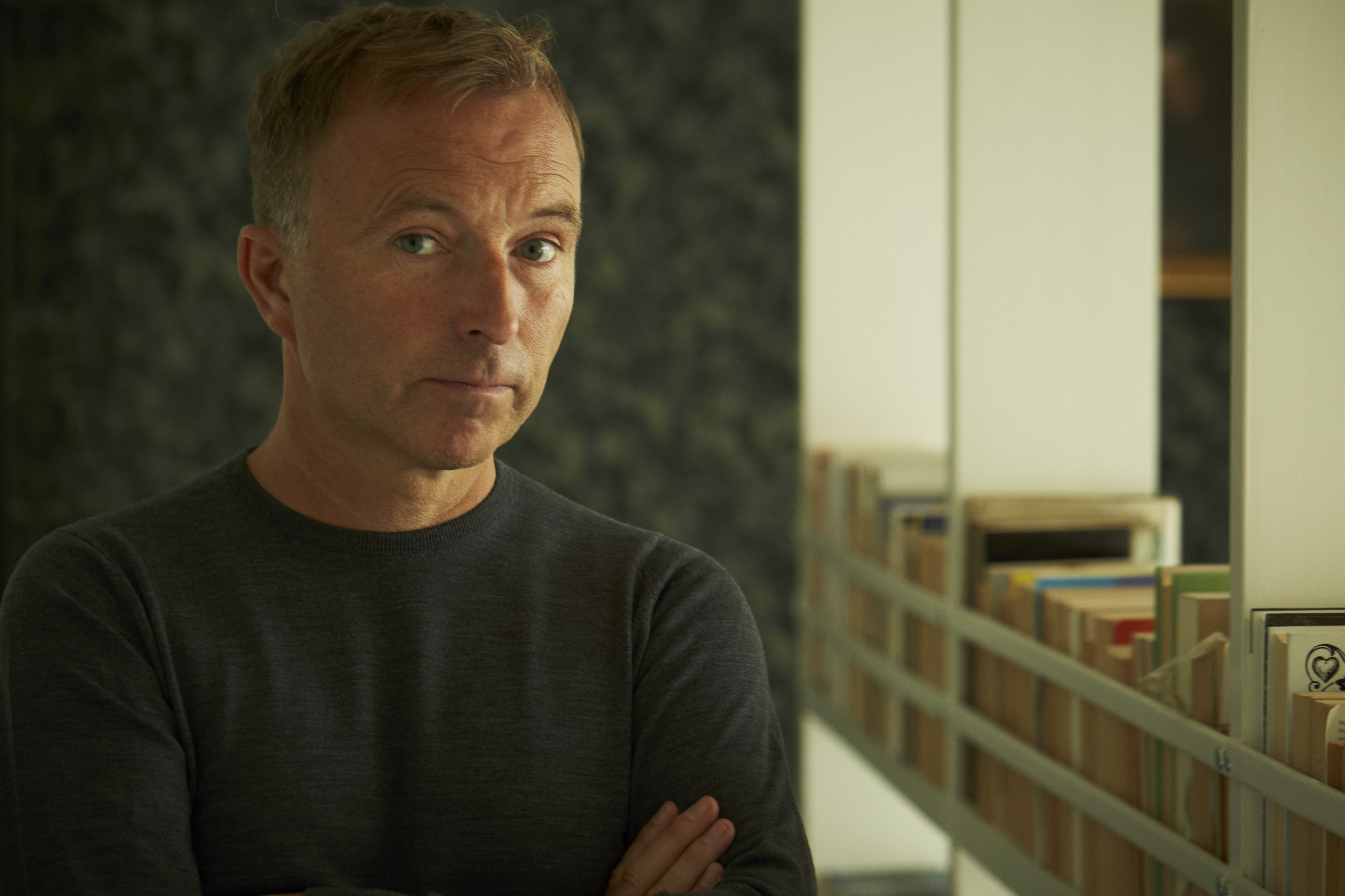
Wallpaper* Magazine: Refining The World One Issue At A Time… The Mr. Magazine™ Interview With Tony Chambers, Editor-in-Chief, Wallpaper* Magazine
November 30, 2015From London with Love
Wallpaper* Magazine and The Stuff That Refines Us – Coming to America With Gracious Elegance, Superb Content, Beautiful Imagery & Creative Design – Discovering What Refines The Magazine’s “Refiner-in-Chief” Tony Chambers.
“In terms of revenue from luxury advertisers, we’ve seen growth in print. Obviously, we’ve seen it in digital too; that’s a growing area, everyone knows that. But it’s rewarding to know that for a product like Wallpaper* in print, there is a market for it. It’s something that people treat as a moment to absorb media in a luxury way, as opposed to on your mobile phone, which is much more about news and immediacy and for solving immediate problems. I think print still has that place where you sort of lose yourself and relax.” Tony Chambers
 Visual journalism that captures the imagination with that ethereal spirit of art, beauty and the finer things in life; Wallpaper* Magazine has been around for 20 years and has proven over and over again that high quality, beautiful aesthetics and a commitment to its readers is something that still holds much value in the world we live in today, even though that world is fast-paced and bombarded with more information and venues to receive that data from than we can handle.
In a move to amplify the magazine’s discerning message, Time Inc. is bringing a bespoke edition of the magazine to the United States, in addition to keeping the mother ship magazine on the American stands as it has been since its inception, for an entire new audience of believers, people who are longing for the brush of beauty and elegance the magazine offers its readers.
Tony Chambers joined Wallpaper* as Creative Director in January 2003, and was appointed Editor-In-Chief, make that Refiner-in-Chief, in March 2007. Under Tony’s editorship, Wallpaper* magazine has been transformed into a highly-regarded global brand. He introduced a series of over 100 pocket City Guides, a hugely successful website and an iPad edition, an in-house creative agency, as well as an interior design service. He is also the creator of Wallpaper*Handmade, an annual exhibition at Salone del Mobile which brings together the finest designers, craftsmen and manufacturers to collaborate on one-of-a-kind pieces.
I spoke with Tony recently and we talked about the brand he knows and loves so well. We talked about what it means to him to strive for that refinement that flows from every page of the magazine and how he incorporates that beauty into his own philosophies on life. And about how excited he and his team at Wallpaper* are at the prospect of expanding their readership even more globally and allowing another audience the opportunity to cultivate the magazine’s easy elegance into their lives as well.
So, I hope you enjoy the Mr. Magazine™ interview with a man whose idea of refinement makes him one very nice human being who truly cares about his brand, his colleagues and his readers…Tony Chambers, Editor-In-Chief, Wallpaper* Magazine.
But first, the sound-bites:
On the reversal transplant of Wallpaper* from the U.K. to the United States: Wallpaper* from its beginning has been available globally on newsstands, but this is a brilliant idea by Time Inc. and one of those that sometimes make you ask: why we didn’t have it before? (Laughs) I think I know why; one reason is that I think Wallpaper* is more relevant now than it has ever been before. It’s at a moment where I think the audience is now more receptive; it’s a larger audience, because we’re quite a progressive title, avant-garde in many respects.
On the growth of Wallpaper* in print: In terms of revenue from luxury advertisers, we’ve seen growth in print. Obviously, we’ve seen it in digital too; that’s a growing area, everyone knows that. But it’s rewarding to know that for a product like Wallpaper* in print, there is a market for it. It’s something that people treat as a moment to absorb media in a luxury way, as opposed to on your mobile phone, which is much more about news and immediacy and for solving immediate problems. I think print still has that place where you sort of lose yourself and relax.
On the co-existence of print and digital: Ink on paper is a very clever, simple piece of technology. It’s been around for over 500 years now and it’s not going anywhere. Digital just challenges us all with the excitement of what you can accomplish and it makes you more thoughtful about what you do with print and what is more appropriate for ink on paper and what is more appropriate for pixels on a screen.
On his design philosophy: As a designer and then an art director, to me content was king. We always used to say content is the most important thing and your job is to bring these great photographers, whether they’re fashion photographers or war photographers in the case of the Sunday Times, and these great writers and editors, as a designer you have this incredible job of being the person in the middle who puts them all together. And you can either make something average brilliant or make something brilliant average. It’s a big responsibility. So, from a very young age I knew that I was in a privileged and very important position.On whether his background in design and art direction has helped him with the innovation behind Wallpaper* and his role as editor-in-chief: Oh, absolutely. Again, going back to art school and my early days printing, that was a real fascination because as a designer the more you know about the technology, particularly printing, the more you really understand it and the more you learn about it and investigate it, then you know what the boundaries are; you know what is possible and what isn’t possible.
On why he believes it took the magazine industry five or six years to realize that print and digital could co-exist: It’s a brilliant question and I wish I knew the exact answer to it. (Laughs) When you’re in the storm, the fog of war; when you’re right in the middle of it, it’s very hard to be objective and step back. Hindsight is a great thing; you can always look back and say: now it seems obvious that the two can survive, if they’re done well.
On the death of the tablet: I think novelty is the big thing; the tablet was such a novelty. But I don’t think it’s the death of the tablet at all. You see what’s happening with the Pro and the fact that you can do so many things with it. Again, the tablet will just find its place. It will be another element within this rich variety; this rich palette of ways that we consume media. And still, the important thing is the content and of course, it was a novelty in the beginning. It did add a new way of looking at content and new ways of designing content and presenting it.
On how to get your audience addicted to ink on paper: If you’re in the luxury magazine business, which we are, it clearly has to be about the seduction of the quality of the imagery and the quality of its printing, because the still image, again going back to the difference between when TV came out versus radio, the death of magazines was predicted then, in the 1950s or 1960s. News imagery on TV, with the still image, added so much more to the moving image. It has to do with the frozen moment. It’s just different. The still image has certain powerful qualities that you’ll never get from the moving image. Moving images have their own qualities.
On the “common sense” approach to the coexistence of print and digital: Unfortunately, during great technological change, you lose common sense. You see it all the time. One gets so excited about what is possible, you don’t have the common sense to step back and say, it’s possible to do that, but it’s not needed.
On the importance of typography in the design process: It requires a certain amount of mathematical knowledge and rigor, with aesthetics. But if you don’t have the rigor, the aesthetics are meaningless really. But people know more about it now and that helps because more people are typing their own stuff. When I graduated nobody even knew what a typeface was, so it should be better. Again, people just need to step back and appreciate the experts because it’s such a subtle and a refined skill when it’s done properly, where it’s elegant and relevant to its time. But the main job is, as a reader you don’t notice it, and that’s the skill of good typography; you shouldn’t notice it. You should just read the text and have a pleasant experience.
On what refines him: That’s a very good question. I think fine arts are the thing. I believe being inspired and continually fed by high art, and not just as in a painting, but art that’s from the past and the present and that strives to reach perfection. Having artists, people like that as your mentors and as inspiration is something that makes you refined yourself.
On anything else he’d like to add: We’re all so excited that this new project that we’ve produced is now being amplified in the most sensible and practical way, both in print and in digital, to get that message across more. It’s a really thrilling and exciting time for the brand.On what he could be found doing if someone showed up unexpectedly at his home: A combination of all of them really. I’m finding less time to actually engage with television, even though I think it’s still a very super-relevant medium. But just because of time and also because I have a young daughter, which absorbs a lot of my time (Laughs), I don’t have a lot of time for television. But definitely reading a magazine or a book, and yes, I love a good glass of wine. I love nice surroundings with good furniture; it doesn’t have to be expensive furniture, just well-made and well-designed.
On what keeps him up at night: The emails that I haven’t replied to. (Laughs) I know that sounds awful, but I do wake up and think about them. Not that it keeps me up at night; I do go to sleep, but then I wake up, more so lately, with the thought that: oh no, I haven’t replied lately. And I’m a stickler for replying to emails and I do have a brilliant assistant; he’s a genius who helps me. I remember when I was just starting out; if I wrote an email and sent it to somebody I admired or a magazine or a designer, that feeling of not getting a reply stayed with me. But the thrill of actually getting a reply; I’ve always remembered that.
And now the lightly edited transcript of the Mr. Magazine™ conversation with Tony Chambers, Editor-In-Chief, Wallpaper* Magazine.
Samir Husni: Congratulations on the first Time Inc. reversal transplant of a magazine with Wallpaper*. This is the first time that Time Inc. has brought a magazine from the U.K. and published it in the United States.
 Tony Chambers: Yes, but remember we are a global title. So, we’ve always been available on newsstands in the U.S. from day one and have had a very healthy presence there. But this is a very targeted edition.
As I said, Wallpaper* from its beginning has been available globally on newsstands, but this is a brilliant idea by Time Inc. and one of those that sometimes make you ask: why we didn’t have it before? (Laughs) I think I know why; one reason is that I think Wallpaper* is more relevant now than it has ever been before. It’s at a moment where I think the audience is now more receptive; it’s a larger audience, because we’re quite a progressive title, avant-garde in many respects.
I think maybe 10 years ago we were a little too avant-garde for a broader audience, whereas now I believe the audience is educated and understands design and the lifestyle, and they travel more and are more visually literate. Therefore, I think the timing was right now.
Also, the way distribution in magazines is changing and this incredible data that Time Inc. possesses, which enables you now to really target more specifically who your audience is, so that you can deliver your product to the right people.
And those combinations of things is just music to our ears because we have this wonderful product that’s been around almost 20 years now, but you know traditional distribution methods for a global title are extremely challenging financially, very expensive with shipping costs, but this enables us to reach so many more people in a very targeted, simple and practical way.
Samir Husni: I have followed Wallpaper* since its inception. In fact, I have a subscription and I also buy the newsstand edition so that I can have both covers.
Tony Chambers: Thank you. That’s great to hear. And I have followed you for many years as well. And it’s lovely to know that there are people like you out there who are as passionate about magazines as we are. Long may it last.
And I think more and more people are getting more passionate. The top-end, particularly, is the area that’s thriving and I think that’s the other reason that Time Inc. wisely thought that Wallpaper* was the right type of title because I think in the luxury end, the high-end of magazine journalism, the markets are still there for print as well as digital. For quality, it’s growing actually. We’ve seen growth, in terms of our revenue sales and it’s been very steady over the years. And I think sales are going to catapult now with this new edition.
In terms of revenue from luxury advertisers, we’ve seen growth in print. Obviously, we’ve seen it in digital too; that’s a growing area, everyone knows that. But it’s rewarding to know that for a product like Wallpaper* in print, there is a market for it. It’s something that people treat as a moment to absorb media in a luxury way, as opposed to on your mobile phone, which is much more about news and immediacy and for solving immediate problems. I think print still has that place where you sort of lose yourself and relax.
So, it’s wonderful and that’s what I had always hoped and what we’d felt would be the case if we were good enough. That the two would exist side-by-side and it seems to be true.
Samir Husni: Yes, no matter how many times you try to push your finger through the cover of the magazine onscreen, it will never work as it does on the printed edition. (Laughs)
Tony Chambers: No, it won’t. Ink on paper is a very clever, simple piece of technology. It’s been around for over 500 years now and it’s not going anywhere. Digital just challenges us all with the excitement of what you can accomplish and it makes you more thoughtful about what you do with print and what is more appropriate for ink on paper and what is more appropriate for pixels on a screen.
We always look back when we’re caught in the whirlwind of new technology and it is hard to focus when you look back 10 or 20 years later and say: wow that was such a common sense approach to what would work and what wouldn’t and what exists and what doesn’t.
I always use the analogy of TV and radio. Radio should surely be dead since TV was invented because TV is radio plus pictures, therefore how can radio exist? But of course, radio just finds its own way to make itself relevant. And I think radio has never been stronger. You use it when appropriate and you use TV when appropriate and it’s the same with print and digital.
As time passes, the past always survives and the best gets stronger because you cut your costs accordingly and you apply certain rules to certain things. Ink on paper is a very clever and a very functional technology.
Samir Husni: I’ve always said the problem is not the ink on paper, but what we’re putting on the ink on paper.
Tony Chambers: Exactly.
Samir Husni: You’re the second person who I’ve interviewed recently that started as an art director and moved to the role of editor-in-chief.
Tony Chambers: Really? Who was the other one?
Samir Husni: Stefano Tonchi from W Magazine.
Tony Chambers: Yes, he’s brilliant. Well you know, we live in a visual communication world and it’s always been important. Cave-painting is graphic design basically, isn’t it? It’s the most immediate way of communicating, but I was always an art director that loved the word and was trained very well at my art school to be very respectful of the written word. And I studied typography, which is of course about making the word visible and being very respectful to text. And the Sunday Times Magazine taught me a very journalistic approach to being a designer and not to be self-indulgent, that the content was the most important thing.
So as a designer and then an art director, to me content was king. We always used to say content is the most important thing and your job is to bring these great photographers, whether they’re fashion photographers or war photographers in the case of the Sunday Times, and these great writers and editors; as a designer you have this incredible job of being the person in the middle who puts them all together. And you can either make something average brilliant or make something brilliant average. It’s a big responsibility. So, from a very young age I knew that I was in a privileged and very important position.
Moving to Wallpaper* as creative director and being offered the job many years ago, it was a surprise because it wasn’t something that I ever thought I would do, but the people who made that decision at Time Inc. they could obviously see that it was relevant, that the magazine was in a good moment, because it’s such a visual magazine; it made sense. It’s probably the ultimate in visual communication, where it’s all luscious photography and illustration and layout and design, it’s something that people buy into. Now I look back at it and I can see that it wasn’t a surprise at all and not as much of a gamble as I thought at the time. And I had that experience; I felt confident that I had always been on the content side as a designer, more interested in telling stories visually in a sensible way, rather than in a self-indulgent way. So, I felt confident that I could do it. And I also had a brilliant team that could plug any gaps that I may have had and it seems to have worked. It’s been a wonderful experience.
Samir Husni: Do you think your background as an art director and a designer helped with those innovative ideas that you used in print?
Tony Chambers; Oh, absolutely. Again, going back to art school and my early days printing, that was a real fascination because as a designer the more you know about the technology, particularly printing, the more you really understand it and the more you learn about it and investigate it, then you know what the boundaries are; you know what is possible and what isn’t possible.
And when I was doing freelance graphics when I was younger; if you knew what print was you couldn’t be blinded with science. And that’s the way it is today with digital technology. If they think you’re a little bit ignorant of some things, then they can pull the wool over your eyes and tell you that’s not possible. But if you know, if you’re armed with knowledge, then you’ll always know what’s possible. And I realized early on that that was such an important skill and knowledge to have; to know what is possible. So, if somebody said you couldn’t print green ink on a red background hypothetically; if you knew that you could and that it is possible to do it, and it wouldn’t be economically prohibitive, if it’s done in a particular way, then knowledge is the best tool you have really.
Knowledge of print and a fascination and a love for it too; those things are great assets to have. There are certain things that you can do that may help to give you impact visually and enable you to reach more people and sell more copies and excite advertisers as well, so there are two-for-two goals that we have. And if you know how to do it and you know how to do it economically and you know where to push and where to pull back and what is possible, that makes for a huge advantage.
When I became editor, of course just pushing my design team and the success that’s followed has really propelled us forward. So, if you’re going to do print, you may as well make the most of it. And make the most of digital for what its properties are. But even more so, let’s push the qualities of print and I’m glad that you’ve noticed the things that we did, because they really have helped to keep the brand fresh and talked about and made it relevant in this age where we’re juggling two very distinct parts of publication: digital and print. You have to just push and make both relevant and it seems to have worked; we’ve had great responses from the readers and advertisers. So, we’re going to be pushing it even more.
Samir Husni: Why do you think it took the magazine industry five or six years before they discovered that digital is not the enemy of print and print is not the enemy of digital?
 Tony Chambers: It’s a brilliant question and I wish I knew the exact answer to it. (Laughs) When you’re in the storm, the fog of war; when you’re right in the middle of it, it’s very hard to be objective and step back. Hindsight is a great thing; you can always look back and say: now it seems obvious that the two can survive, if they’re done well.
But at the time people panicked and worried, and with publishers, they’re looking at the bottom line, looking at cost. And of course, some publishers think that digital doesn’t cost much, the outgoing seems to be so low. But of course, people don’t understand that initially the outgoing was so low because the editorial content was being produced by the whole family, by the print. And the cake was being cut open and it would end up some in digital and some in print. By and large the costs were put onto the print side.
Obviously, they were thinking it would be more economic to just go digital, but of course, it’s not, you still have to use great photographers and editors; great writers and designers to produce the content. It doesn’t matter whether it’s on a computer screen or ink on paper, it’s the content that’s the most important thing.
And I think five or six years ago people loved to strike at that, particularly in newspapers. They just thought it was cheaper and wouldn’t be as expensive, without realizing of course; the costs were just on a different column. (Laughs) And then when that penny dropped, everyone realized that print and digital must work together because when the costs are shared, it’s a happier ship.
But you need both; the consumer wants both. And they’ll use them in two different ways. We’re just at the beginning of the renaissance in publishing now, I think, where you’re seeing print and digital sitting so comfortably together. And both sides understanding the properties of both and thankfully intelligent people at the top understanding what is possible with both and finding the different platforms exciting editorially and rewarding financially.
Samir Husni: I was at a conference in New York recently and I heard people talking about the death of the tablet; the death of the homepage and I said, it’s only been seven years since the tablet was touted as our salvation, what went wrong?
Tony Chambers: Again, I think novelty is the big thing; the tablet was such a novelty. But I don’t think it’s the death of the tablet at all. You see what’s happening with the Pro and the fact that you can do so many things with it. Again, the tablet will just find its place. It will be another element within this rich variety; this rich palette of ways that we consume media. And still, the important thing is the content and of course, it was a novelty in the beginning. It did add a new way of looking at content and new ways of designing content and presenting it. I think therefore it was the savior if anything.
Of course, it wasn’t a complete savior, but neither is it the death of the tablet. All these things just take time to find their places. Novelty is the thing that we all have to be careful of. We get seduced by new things and we always will; we’re human beings. That’s what fashion is about, isn’t it? The whole fashion industry is based on the seduction of the new and the novelties. The fashion industry has found its way to survive in that, but with things like this we have to just be a little more objective and step back a bit and say, OK – this is interesting; we’ll give this a try. We can’t just continually keep throwing the baby out with the bathwater.
It just adds to the rich palette of what’s possible with the great things we do with content, whether it’s ink on paper or on a digital screen or poetry or radio; it’s the ideas that count and knowing what is the appropriate medium for that message.
Samir Husni: What do you think is the important cornerstone that should be used to seduce people to print, or as I like to call it that “art of addiction” that hooks people? How can I get my audience addicted to ink on paper?
Tony Chambers: If you’re in the luxury magazine business, which we are, it clearly has to be about the seduction of the quality of the imagery and the quality of its printing, because the still image, again going back to the difference between when TV came out versus radio, the death of magazines was predicted then, in the 1950s or 1960s. News imagery on TV, with the still image, added so much more to the moving image. It has to do with the frozen moment. It’s just different. The still image has certain powerful qualities that you’ll never get from the moving image. Moving images have their own qualities.
Similarly, I think we’re talking about the power of the frozen moment; the quality of that frozen moment, both in terms of its relevance of content and its beauty. Also editing is another facet that I think we lost our way in when everyone was crying the death of print. Having a printed product is about the edit, because it’s a limited number of pages. You might have 100 pages, a story can be 10 pages sensibly because you have a limited imagery space, and therefore you have to try a lot harder, think a lot harder and make tougher decisions and ultimately I think, you have to make a better result.
And the reader or the consumer will thank you for that because you’ve done a lot of work for them, instead of presenting a thousand pictures on the Internet, every thousand images that you choose, you have to become an expert, saying these are the best 10 pictures. And I think that’s the thing that we lost a little bit, seven or eight years ago when people thought the web would destroy print because we could all make our own decisions about what we wanted to consume in information. But we don’t want that. We want to trust and be inspired by a publication, an editor, a photographer that is saying these are the best five or ten pictures of the lot.
So, I think those are the key things; the power of editing, which is so relevant in a print product. And as we get busier and we work harder and have less leisure time, which we all seem to be busy, busy; that’s something that we lost our way in, in terms of its relevance and its power and value. You trust an editor and if you don’t trust them, you don’t buy the product. If you think that you trust Wallpaper* or you trust The New Yorker or TIME Magazine, because you’re busy, but you want to buy a news magazine that’s going to give you the best news stories, edited properly, photography and words, and you want a weekly magazine, so you decide that’s TIME Magazine, Fortune Magazine for financial issues.
It’s so obvious now, but with the excitement and the novelty of the Internet, where everything is available, the whole world is on the screen; we immediately think it’s amazing and it’s everything, but we don’t really want everything. I want to be told by a trusted travel expert that if I go to Beirut, these are the best 10 things I should do in my two days there. I don’t want a thousand things and to make my own choice. I think we forgot how important that was. It’s so obvious now. And it has great value.
And in print, I think it’s germane to what print is all about. You have to edit. It’s a limited space you have and often in our world having restrictions makes your product better because you have to think a bit harder and make tougher decisions and therefore you choose the best things, rather than having no limitations and no restrictions, because sometimes you can get a bit lost.
Samir Husni: And as you said earlier; it’s just common sense.
Tony Chambers; Yes, it is. And unfortunately, during great technological change, you lose common sense. You see it all the time. One gets so excited about what is possible, you don’t have the common sense to step back and say, it’s possible to do that, but it’s not needed.
Typography is interesting and has always been a big passion of mine. If you look through the history of technological developments in printing techniques and ways of the industry levels, you could do things with cutting type; you could cut the most extremely fine and thin letters because the technology was there.
Then the typography became the most extremely big, fat-shaped letters, which was extraordinary technologically, but you couldn’t read them. And what is the point of typography? It’s to make the text legible to the reader. And of course, the actual function of the thing was lost because everyone was so excited.
And the same thing happened when computers first came out and you could stretch letters. Everyone was saying, wow; we can stretch letters or put huge or tiny letter-spacing. So you had this rash of typography that was more about expressing how brilliant it was that a computer could stretch these letters than anything else. And then looking back five years later, you realized how horrible the whole idea was.
And this happens time and again with technology. You get so impressed by what is possible, that you don’t step back and see that it’s really not something that you want to do in the first place.
It’ll happen again, I’m sure. And we’ll go through these troughs and then, as I said, I think that we’re in a moment now where we’re out of the fog and we’re seeing it with clearer eyesight and thinking about everything that’s possible, but also deciding on whether we want to do it or not. And we’re going to have a really good period where people are respecting experts again and I think we’re coming into some really good moments.
Samir Husni: I wish that typography was more in the forefront of our design courses these days the way it used to be. It has taken a backseat to other things and I think it is so very important.
Tony Chambers: Yes and you know why; it’s very hard. It requires a certain amount of mathematical knowledge and rigor, with aesthetics. But if you don’t have the rigor, the aesthetics are meaningless really.
But people know more about it now and that helps because more people are typing their own stuff. When I graduated nobody even knew what a typeface was, so it should be better. Again, people just need to step back and appreciate the experts because it’s such a subtle and a refined skill when it’s done properly, where it’s elegant and relevant to its time. But the main job is, as a reader you don’t notice it, and that’s the skill of good typography; you shouldn’t notice it. You should just read the text and have a pleasant experience.
Samir Husni: Tony, what refines you? To steal a tagline from Wallpaper*. (Laughs)
Tony Chambers: That’s a very good question. I think fine arts are the thing. I believe being inspired and continually fed by high art, and not just as in a painting, but art that’s from the past and the present and that strives to reach perfection. Having artists, people like that as your mentors and as inspiration is something that makes you refined yourself.
I read something really lovely that Murray Moss, the former owner of Moss Gallery in New York, once said. He talked about the Austrian glassmaker Lobmeyr. They make the finest, most delicate glassware ever. And Murray Moss stocked that in his store at one time, it was one of his favorites, and it’s one of mine as well. It’s an old Austrian family company. They make the most exquisite glassware, whether it’s drinking glasses or decanters or anything else.
Moss said he had a guy to wander into his store once and ask him what made the Lobmeyr glassware so special. It seemed stupid to him. The man said it was so delicate that if he knocked it or dropped it, the glass would smash, therefore it was bad designing. He didn’t want a glass that he would have to worry about smashing every time he used it.
And going back to the word refinement, Murray Moss told the man this; what better thing could there be for a human being than something that could actually make you take more care as you lift that glass of wine or water to your lips? Something that forces you to take extra care and be a little more refined; to hold it in a more thoughtful way and as you put it to your lips and sipping its contents, you’re really thinking about it a little more and being cautious.
And I thought that was such a beautiful way of describing a function of something. Something that could make us all as human beings more refined. It may not be answering your question exactly, but I agree totally with what Murray Moss is saying. And maybe it does go back to what we’re trying to produce at Wallpaper* or at any other quality publication, that yes, it’s about information and it’s about informing people in our fast and busy world, but if you hold this magazine and its content, its design and printing, just its general production value, and it makes you feel a bit more refined, then that’s amazing.
And as you look through it and you see a beautiful piece of architecture or some gorgeous travel photography or beautiful fashion; if it just lifts you a little bit and makes you think about the finer things in life; the great achievements of these designers, architects and chefs, I think that’s a great thing. I think sometimes holding a magazine like Wallpaper* makes you feel a little bit better and that’s the kind of job we’re trying to do. Inform and entertain and feel a bit more refined about what is possible out there. These are such troubled times, barbaric times. So let’s focus a little more on the beautiful and wonderfully great things that humanity is capable of creating. And maybe take our minds off of the destructive side of humanity for a moment.
Samir Husni: Marvelous answer. And it’s music to my ears.
Tony Chambers: Well, thank you. I think we need to spend more time on the refined things in life, that’s what makes us more civilized, rather than these barbaric, medieval things that are happening at the moment. We need to focus on the great achievements of mankind and the things that we champion.
Another thing that makes me more refined is looking at and feeling enlightened by the great achievements in art, design, food and all of the beautiful things we cover in the magazine. And being exposed to that is healthy; it’s like medicine. It makes you feel better. And it makes you hopeful about the future.
Samir Husni: Is there anything else that you’d like to add?
Tony Chambers: We’re all so excited that this new project that we’ve produced is now being amplified in the most sensible and practical way, both in print and in digital, to get that message across more.
It’s a really thrilling and exciting time for the brand. For 20 years we’ve been producing this title to a modest audience, because highly-produced things are expensive, therefore high-quality things tend to have a more modest circulation. But now suddenly because of the things that we’ve talked about with Time Inc.’s access to this extraordinary data and with the website’s growth, with them being able to produce this high-end product to actually reach more people and we’re confident that there are more people out there who will be receptive to it, more so now than there was 20 years ago. They’re more educated and they’re receptive and hungry for these fine things in life and that’s great for all of us because the more we talk about these things, the more people engage with these finer things in life. And the better everyone will be because of it.
Samir Husni: If I showed up unexpectedly at your home, what would I find you doing? Maybe reading a magazine with a glass of wine; reading a book; watching TV; reading your iPad?
Tony Chambers: A combination of all of them really. I’m finding less time to actually engage with television, even though I think it’s still a very super-relevant medium. But just because of time and also because I have a young daughter, which absorbs a lot of my time (Laughs), I don’t have a lot of time for television. But definitely reading a magazine or a book, and yes, I love a good glass of wine. I love nice surroundings with good furniture; it doesn’t have to be expensive furniture, just well-made and well-designed.
And you might find me pouring over some beautiful typography from my vast archives; it’s all there, because I’ve collected things for 25 or 30 years. Nothing gives me more pleasure than a beautifully designed book or a perfectly produced bit of typography, whether that’s in book form or poster or even digitally. I have less and less time suddenly to really indulge in typography, but any time I do get I’ll be refreshing myself with trying to remember obscure typefaces and what country they were designed in.
Samir Husni: My typical last question; what keeps you up at night?
Tony Chambers: The emails that I haven’t replied to. (Laughs) I know that sounds awful, but I do wake up and think about them. Not that it keeps me up at night; I do go to sleep, but then I wake up, more so lately, with the thought that: oh no, I haven’t replied lately. And I’m a stickler for replying to emails and I do have a brilliant assistant; he’s a genius who helps me. I remember when I was just starting out; if I wrote an email and sent it to somebody I admired or a magazine or a designer, that feeling of not getting a reply stayed with me. But the thrill of actually getting a reply; I’ve always remembered that.
Now, I get so many emails, but you just have to do your best to respond. So sometimes at night I’ll wake up and remember that I haven’t replied to someone. And I think it is important to reply. The brand, Wallpaper* is so important that if someone tries to contact us, especially if it’s an artist, photographer, writer or designer, because by the grace of God go I. I always try to give an appropriate reply. Either it’s good for us or it isn’t good for us. Or if it is very good, get back to them, because if you ignore them, you might miss the next great designer or photographer.
So that does sometimes keep me awake at night because to me it’s a reflection of the brand and I would hate for anybody, whether it’s a student in Beirut or a credible designer or architect, thinking that Wallpaper* doesn’t get back to you. I just don’t think that’s right, because we are very much about supporting the industry and all of the things that we talk about. It’s a very important part of our role. We report on the best of what’s out there, but we have to support and encourage the next generation to keep that wheel moving. It’s an obsession of mine to respond and get back to people and I also stress that to my team. We do respond to people who reach out to us and we do support and encourage as well.
Samir Husni: Thank you.


Leave a comment