Archive for the ‘News and Views’ Category

h1

Steven Kotok To Samir “Mr. Magazine™” Husni: That’s Why Bauer Sold The Celebrity Titles To AMI. A Mr. Magazine™ Exclusive

June 15, 2018

In response to a story on Page Six about the sale of Bauer’s celebrity titles In Touch, Life & Style, and Closer and the Teen magazines to American Media (AMI), I reached to Steven Kotok, CEO of Bauer Media Group for a comment. His comment follows:

The Celebrity group grew its ad and retail marketshare last year but this isn’t about short-term considerations. Long-term we feel we can build and sustain the most value and strength focusing on our market-leading, very differentiated women’s service business. Woman’s World and First for Women are the #1 and #2 bestselling retail titles in the country, in any category; they are editorially excellent and utterly unique. That is a strong platform to build on. The celebrity titles can best thrive under a single owner and AMI is a great company to do that.

h1

Citizen Designer, Perspectives On Design Responsibility: The Presence Of Ink In Hand Design Is Powerful & Responsible – The Mr. Magazine™ Interview With Véronique Vienne, Co-Editor/Author, Citizen Designer…

June 11, 2018

“I was writing about the fact that taking ink to paper and writing something by hand has so much more credibility than taking that same message and printing it and putting it on a wall. So, the presence of the ink and the hand, which is what the kids did in the anti-gun movement. Kids went out into the streets in the United States and wrote slogans on panels and pieces of cardboard. They weren’t very sophisticated slogans, but they were done by hand. And the kids were holding them. And there were pictures being taken of the kids holding the pieces of cardboard. And those pictures made it onto the Internet.” Véronique Vienne…

The second edition of “Citizen Designer” attempts to answer the question of what it means to be a designer in today’s corporate-driven, over branded global consumer culture, according to the powers-that-be behind this simplistic, yet powerfully-written book. Between the essays that are raw and informative to the glossary of terms and words used religiously in the design community written by former art director and co-author of the book, Véronique Vienne, this dynamic tool is far from a mere self-help guide to great design.

Recently, I spoke with Véronique, via Skype at her home in South France, one half of the team (along with Steven Heller) who put this book together and we talked about the social change and responsibilities that designers can affect and do have in our world. Véronique believes that design can and should be more than just a service to clients and can bring about political and social manifestations of importance within our society. This new edition of the book, the first having been written some 15 years ago, contains a collection of definitions and brief case studies on topics that today’s citizen designers must consider, including new essays on social innovation, individual advocacy, group strategies, and living as an ethical designer.

Véronique said she felt compelled to participate in this updated version due to the upheaval in the world today, with the American political front and many other important issues. And after having spoken with her, Mr. Magazine™ can certainly understand her dedication to her convictions and beliefs; the passion in her words came through loud and clear. And her faith in the power of design is inspiring.

So, without further ado, please enjoy the Mr. Magazine™ interview with Véronique Vienne, co-author, Citizen Designer.

But first the sound-bites:

On the book “Citizen Designer”: About a year ago, the publisher thought that it would be a good idea to bring back the book and update it. And we did. I wasn’t keen on doing it, but I thought that it was my duty to revisit the topic in light of the political situation in the United States and in the world, and all the things that had happened since the first edition. And I thought we needed to take a good look at the profession, not only because of the political situation, but because of the evolution of technology and social networking and all of that. It’s a totally different situation today.

On her belief that graphic designers have a social responsibility: Since I came back to Europe, I can say that in America I think design is miles apart from Europe. The American graphic design community is unfortunately held hostage to marketing. They think they’re apolitical, but you cannot be apolitical. If you’re apolitical, that’s a political stance. You have to stop thinking that you can be apolitical. You serve an economy based on different principles and if you serve that economy, you serve the principle of that economy. You have to stop being naïve.

On what she believes the role of ink on paper is in today’s digital world: I wrote about this very topic in a recent posting on a blog called “Common Edge,” about architecture and design. I was writing about the fact that taking ink to paper and writing something by hand has so much more credibility than taking that same message and printing it and putting it on a wall. So, the presence of the ink and the hand, which is what the kids did in the anti-gun movement. Kids went out into the streets in the United States and wrote slogans on panels and pieces of cardboard. They weren’t very sophisticated slogans, but they were done by hand. And the kids were holding them. And there were pictures being taken of the kids holding the pieces of cardboard. And those pictures made it onto the Internet.

On having worked in magazine media and media on both sides of the Atlantic and some differences that she still sees today: There are many differences, of course. When I came to the States in the early sixties, it was a different time. It was the Cold War; it was Camelot, the whole thing. And I was very gullible, in a way. I bought the bull. I loved America and I still love America. I am very proud of my American passport. I adore the country, I really do. It is my home. I think in English, I write in English and I love the country.

On why a book about design has no pictures: One of the realities is that publishers nowadays want the authors to get the pictures for free. Or do the research for the picture. And you spend half of your time doing the photo research. I’m not interested in that. The second thing is people go online all of the time to look at pictures. To have really good pictures and really good illustrations, it’s a job in itself. Steve and I did a book that does very well, which is going into its second edition called “100 Ideas That Changed Graphic Design.” For that one we did a lot of research and we got designers to give us information for free and they signed paperwork and documents that we could publish it on the moon if we had to. And half of your time is spent chasing images, when actually readers go online and Google the image.

On where in the book she would like for readers to begin: Steve and I put the glossary in front, because I think it’s the first thing they should read. Second, one thing we did not do is make it a self-help book. It’s really a collection of essays, without us trying to have a theory behind it. At the very beginning what I think is there is going to be a change of mentality in the design community. We have to find our soul. We have to find that designer within ourselves. And everybody does it in a different way.

On why the book is dedicated to Michelle and Barack Obama: Yes. I think both Steve and I are sentimental and we thought they were two great people. We love them. And it came from the heart. I think one of the reasons that we did the book is because we’re under the shock of the Trump election, which did not reflect our convictions.

On anything else she’d like to add: Yes, I hope it’s a book that people can browse through and find essays here and there that resonate with them. I love the design; I think it’s very spartan. I think it’s readable. We wanted it to be easy to read, in terms of typography. The design is there in the typography; the choice of the designer. It’s a very humble book. We’re not proclaiming that we know anything. It’s a little grass roots; we wanted it to be that way, because I think that’s the way it’s going to be. I don’t believe we can change the world, but we can try to make sense of it.

On what she would have tattooed upon her brain that would be there forever and no one could ever forget about her: Smart, intelligent, provocative, and honest.

On what someone would find her doing if they showed up unexpectedly one evening at her home: You’d find me cooking for my friends. I believe that around the table, around food, around a glass of wine, yes, but also around food which takes a longer time to enjoy, a dinner, a meal, lunch, people can get to know each other and can spend some time.

On what keeps her up at night: I don’t know. My daughter in Los Angeles. That’s a long way. And I hope she’s fine. It’s thinking about all of my friends in the United States and I’m in France. My heart is still with all my very dear friends on the West Coast and everywhere in the States.

And now the lightly edited transcript of the Mr. Magazine™ interview with Véronique Vienne, co-editor/author, Citizen Designer.

Samir Husni: Tell me about the book “Citizen Designer.”

Véronique Vienne: Steve (Heller – coeditor of the book) and I collaborated together, 15 years ago, on the book, at a more gentle time. We thought that there was already a sense in the graphic design community that there was more to design than just serving the clients; the designer maybe had another function. Another thing that they could do. Pro bono work or who knows what else.

The book was mildly successful in its first edition. It remained in print because I think universities and schools were interested in the topic. It’s a very hard-to-define topic because basically graphic designers are at the service of their clients. There’s an assignment and you try and deal with that assignment. But more and more there was a sense in the community that entrepreneurship and authorship is also a part of the profession.

So, recently, about a year ago, the publisher thought that it would be a good idea to bring back the book and update it. And we did. I wasn’t keen on doing it, but I thought that it was my duty to revisit the topic in light of the political situation in the United States and in the world, and all the things that had happened since the first edition. And I thought we needed to take a good look at the profession, not only because of the political situation, but because of the evolution of technology and social networking and all of that. It’s a totally different situation today.

And more and more graphic designers were questioning and wondering what they could do to “save the world.” You know we all want to save the world. So, we decided to tackle the topic again. We kept about a third of the articles; we reread what had been written 15 years ago, and actually they were quite a few articles that were almost premonitions; they were really good and we kept them at the back of the book.

And we generated more interviews and I did a job that I wanted to do, which was a glossary, that was my main contribution. I took all of those words that we know a little bit about and all of those terms that we have a fuzzy notion of what they are, and I thought it was important to, for myself first and then share it with designers, take a good look at what was behind the terms. I think in order to be effective politically and citizen-wise, you have to be informed. And informed with an opinion and not just informed Wikipedia-style. You need to learn more of a point of view. And that’s why I tackled this glossary.

Originally, I had wanted 100 terms, but after 60 terms, I was running out of time. I feel the first thing a graphic designer needs, or anyone for that matter who wants to make a difference, is information and trying to get some straight answers. You can’t just Google something and think you know what it’s all about. So, I dug a little deeper in those entries. And they were very brief entries, but I wanted to do them to clarify for myself some of the terms.

But with “Citizen Designer,” Steven and I had a discussion about that; what do designers actually do? And my conviction, which is partly shared with Steve, is that designers have incredible communication skills. That they can put into service a lot of good causes. But what’s depressing sometimes is to see good people with really good intentions or good causes have very poor communication skills. I compare designers in a way to scribes of the past. We transcribe, we design, but we transcribe other people’s convictions and ideas into a language that other people can appreciate and interact with.

As scribes, and I always wanted to be a scribe, this ability to make visible, to make readable, to transcribe and translate other people’s convictions into a language that is powerful is what designers can do. They’ve come to save the world by doing a campaign.

A citizen designer for me is someone who is well-educated, like a scribe, smart and savvy, but also chooses their causes and puts their talents at the service of organizations or communities, or something.

Samir Husni: What makes you connect that love of being a scribe, love of translating politics and citizens, and the social aspect with design? You rarely hear graphic designers or art directors talking about social responsibility, most talk about the font their using for this or that.

Véronique Vienne: Since I came back to Europe, I can say that in America I think design is miles apart from Europe. The American graphic design community is unfortunately held hostage to marketing. They think they’re apolitical, but you cannot be apolitical. If you’re apolitical, that’s a political stance. You have to stop thinking that you can be apolitical. You serve an economy based on different principles and if you serve that economy, you serve the principle of that economy. You have to stop being naïve.

I’m actually chagrined and upset sometimes when I look at some of the topics that are discussed in the graphic design community in the U.S. because it’s totally about a tight-fist or the vernacular or blah, blah, blah. It’s about what I call the “merch.” Recently, I was reading an article and it was talking about the royal wedding of Prince Harry and Meghan Markle. The journalist who wrote the article was saying that their marriage was all about love, it was all about the love of two people and it was so inspiring. And another person in the article was saying, no, it’s all about the merch. And by the merch, they mean the merchandise. The hats, the T-shirts; it’s about the merch.

And in a way I think, and I’m really sad to see it, that the American community in general, not everybody, of course, doesn’t think that they can remain on the sidelines. And that’s why I think the book is necessary, along with many more books, not just the one. This one is just the second edition. We could try to define what graphic designers could be. I know that in Europe, political statements start with a manifesto. You write it and you glue it on the wall. So, I think posturizing, writing something on a wall, writing something on a piece of paper, is really part of the DNA of graphic design.

Samir Husni: What role do you think ink on paper, print, plays in today’s digital age? And do you think that we can do the same things through the digital platforms, or there’s a big difference between ink on paper and pixels on a screen?

Véronique Vienne: I wrote about this very topic in a recent posting on a blog called “Common Edge,” about architecture and design. I was writing about the fact that taking ink to paper and writing something by hand has so much more credibility than taking that same message and printing it and putting it on a wall. So, the presence of the ink and the hand, which is what the kids did in the anti-gun movement. Kids went out into the streets in the United States and wrote slogans on panels and pieces of cardboard. They weren’t very sophisticated slogans, but they were done by hand. And the kids were holding them. And there were pictures being taken of the kids holding the pieces of cardboard. And those pictures made it onto the Internet.

It’s a little bit of what we learned with Je suis Charlie – I am Charlie – when people took to the streets. It was a viral panel that a designer had done, Je suis Charlie. And if they had printed it and took to the streets and held it…well, I think the ink and the paper and the handheld message, even in our digital age, still has a lot of power. And it’s still very much a part of how you can harness the strength of the graphic gesture, if you will.

Samir Husni: I’m very intrigued by your own story. You spent 40 years in the States, but you’re originally from France. During those 40 years you spent here in the U.S., you had a chance to work in magazine media and in media, so you’ve worked on both sides of the Atlantic. What are some of the differences that you still see today?

Véronique Vienne: There are many differences, of course. When I came to the States in the early sixties, it was a different time. It was the Cold War; it was Camelot, the whole thing. And I was very gullible, in a way. I bought the bull. I loved America and I still love America. I am very proud of my American passport. I adore the country, I really do. It is my home. I think in English, I write in English and I love the country.

But of course there was a shift after 9/11, even before. I became politicized little by little, like everybody else. With age you start to look at the situation and of course, I had been exposed in France at the Bozar. I had gone to the Bozar School in Paris, briefly in architecture, but I did finish. I had been exposed to something called the Situationists there. And so it was sort of hanging around in my consciousness.

I wrote a bestseller, believe it or not, in the States called “The Art of Doing Nothing.” And in my brain was a critique of the consumer culture. It sold a half million copies. And people completely misunderstood what it was about. They thought it was an adorable gift book. I almost invented the gift book category with it. (Laughs) It’s still in print. I had meant it to be a political gesture. And it turned out to be the opposite. It became a franchise. They wanted me to become a television guru and I refused, because that wasn’t what I wanted to do.

So it was always in the back of my mind, a critique of that consumer frenzy, if you will, but I was never able to do anything about it. And eventually, with the second Bush administration, even before we get to our time, there was an empty intellectualism in the United States. Anti-French intellectualism. And in order to survive, I suppressed in me the desire to be more honest; it was self-censorship, I guess that’s called. After a while, 40 years, I realized that self-censorship was becoming hard; I wanted to do something else. And I couldn’t do it.

I was writing for a women’s magazine at the time, I was no longer an art director, I was writing for an architecture magazine; I was writing for a lot of different things. But I somehow always had to push the merch. And I wanted to go back to a place where I didn’t have to be fabulous all of the time. It’s so tiring to be fabulous all of the time. In the States, in order to survive, we have to be fabulous. If not, you don’t count, you don’t make a difference. So, I wanted to try living in a place where being fabulous wasn’t part of the picture. That’s why I went back to France, and to take care of my mom, who is going to be 100-years-old in a few months. I split my time between Paris and the South of France, where I moved back into the family home.

Samir Husni: As I was reading some of the essays in the book and flipping through the pages, I noticed something. Here is a book about design from two graphic designers, but there isn’t a single picture in the book. Was that intentional?

Véronique Vienne: One of the realities is that publishers nowadays want the authors to get the pictures for free. Or do the research for the picture. And you spend half of your time doing the photo research. I’m not interested in that.

The second thing is people go online all of the time to look at pictures. To have really good pictures and really good illustrations, it’s a job in itself. Steve and I did a book that does very well, which is going into its second edition called “100 Ideas That Changed Graphic Design.” For that one we did a lot of research and we got designers to give us information for free and they signed paperwork and documents that we could publish it on the moon if we had to. And half of your time is spent chasing images, when actually readers go online and Google the image.

So, we made a choice. And we decided it would be a bad idea, because the image we might find and be able to afford, there would be no budget for those images. And it was so insignificant compared to what could be done. So, we decided that we would hopefully write things that people would want to read. But we may be wrong. “100 Ideas That Changed Graphic Design” is a lot of illustrations. And it’s doing well, very well.

Samir Husni: After buying the book, if someone asks you where in the book would you like for them to begin, what would you say?

Véronique Vienne: Steve and I put the glossary in front, because I think it’s the first thing they should read. Second, one thing we did not do is make it a self-help book. It’s really a collection of essays, without us trying to have a theory behind it. At the very beginning what I think is there is going to be a change of mentality in the design community. We have to find our soul. We have to find that designer within ourselves. And everybody does it in a different way.

And so this is not a prescription; we don’t say do this or do that. Everybody has a different approach. And some are a lot more theoretical and some are just gut feelings. And so we left the essays in a raw state, because as an engaged community we are not quite together yet. We’re still in the stage of trying to find ourselves, and I’m talking about the French as well as the Americans, which are the two communities I know well. I think it’s going to take time for us to figure out what on earth we’re doing. Are we already so incredibly obsolete that we’re just kidding ourselves? And I think the book is reflecting a lot of the different attempts by individuals to make sense of what they can do.

Samir Husni: You’ve dedicated the book to Michelle and Barack Obama, why?

Véronique Vienne: Yes. I think both Steve and I are sentimental and we thought they were two great people. We love them. And it came from the heart. I think one of the reasons that we did the book is because we’re under the shock of the Trump election, which did not reflect our convictions.

Samir Husni: Is there anything else you’d like to add?

Véronique Vienne: Yes, I hope it’s a book that people can browse through and find essays here and there that resonate with them. I love the design; I think it’s very spartan. I think it’s readable. We wanted it to be easy to read, in terms of typography. The design is there in the typography; the choice of the designer. It’s a very humble book. We’re not proclaiming that we know anything. It’s a little grass roots; we wanted it to be that way, because I think that’s the way it’s going to be. I don’t believe we can change the world, but we can try to make sense of it.

I was reading recently about the first books, before the invention of the printing press, it was on scrolls, and it basically said that the very fact that we can go back to the book and leaf through it now, allows us to not scroll through a text like in the ancient times, but online we’re back to scrolling. When we go back and forth in print, our relationship, our mental relationship, the structure of our analysis of a text was changed because we were no longer following the linear narrative, we could go back or we could go forward. We could comprehend the whole thing and then choose where we wanted to go.

And that was a major change in our mental structures, because of that leafing and that ability to go back and forth. The mental structure of the text disassociated from speech, because when you scroll, it’s like when you speak, you have to listen to the end of the sentence. In a book you are free from that, you’re free from the speech and it’s a different thing.

Samir Husni: If you could have one thing tattooed upon your brain that no one would ever forget about you, what would it be?

Véronique Vienne: Smart, intelligent, provocative, and honest.

Samir Husni: If I showed up unexpectedly at your home one evening after work, what would I find you doing? Having a glass of wine; reading a magazine; cooking; watching TV; or something else? How do you unwind?

Véronique Vienne: You’d find me cooking for my friends. I believe that around the table, around food, around a glass of wine, yes, but also around food which takes a longer time to enjoy, a dinner, a meal, lunch, people can get to know each other and can spend some time.

One of the things that’s most interesting about what’s happening in the design community is the realization that, and you made a point when you mentioned a Skype interview before we talked, that we need to give it the time. Time is really part of design. You can’t design something because you’re smart and you’re doing it all electronically. I think you need to learn to listen to other people, to hear what they have to say, not be in a result mode. To me, that’s one of the most interesting things that is happening in the design community, the realization that you have to do field work. You have to go ask the people what they want. You can’t just have a brief and try to respond to that. So, you’d find me cooking.

Samir Husni: My typical last question; what keeps you up at night?

Véronique Vienne: I don’t know. My daughter in Los Angeles. That’s a long way. And I hope she’s fine. It’s thinking about all of my friends in the United States and I’m in France. My heart is still with all my very dear friends on the West Coast and everywhere in the States.

Samir Husni: Thank you.

h1

Print: When You Say & See BIG…

June 8, 2018

Last week I tweeted a quote from WWD: “Melissa Jones has launched Masthead magazine, a large format, online product heavily focused on photography.” My question is, “What is a large format online?”

Well, the reaction from that tweet was hilarious. Some equated it to a “jumbo shrimp.”

So, online, the size of your media depends on the size of your screen. You can call it anything you want: large format online, jumbo format online, small format online…you get my drift, but in reality the only size online media comes in is the size of your screen, be that PC desktop or mobile phone on the go. Enough said.

In print, on the other hand, size does matter. And today I received my first issue of the extra large format Civilization newspaper that is published in a limited edition of 1000. Richard Turley, the founder, answers Linda Leven’s question, “What is the purpose of this newspaper?” His answer on page 2 of the newspaper/magazine:

Civilization – The long answer is…I was in a magazine store at the beginning of the year and looking at the few magazines and newspapers that remain. All the magazines look the same, and are more like coffee table picture books now, and as for the actual printed newspapers, well…people only read those when they get them free in hotels. So I wondered whether I could make a new one and what I missed most was a publication about New York. What New York feels like to walk around and be a part of — which isn’t just Trump, Trump, Trump, Ramen spots and lifestyle tips — that’s not what New York is to me…”

The result, an oversized publication in print that you can actually measure and regardless where you read it, it will continue to have the same size, from the physical dimensions to the size of the type. Just check the size compared to a standard sized magazine and judge for yourself…

You ask me, what can print do that digital can’t? Well, now you have one of too many answers… continue measuring and counting.

h1

TypeNotes Magazine And How The Typewriter Changed Typography And The Way We Communicate…

June 7, 2018

Every now and then, a magazine grabs my attention, I really mean grabs my attention, and it becomes impossible to let go. One such recent magazine is TypeNotes, “A journal dedicated to typography & graphic design.” The magazine is published by the UK’s FONTSMITH that was founded by its creative director Jason Smith.

The first article of issue two is what grabbed my attention. The title “Tap Dance” and the subtitle “Fontsmith designer Stuart de Rozario on how the typewriter changed typography and the way we communicate.” Now, I know some of you don’t even know what a typewriter is, thus you will need to buy the magazine to learn the entire history of the typewriter.

Here is the first two paragraphs from the Tap Dance article… It is worth every single word:

The sound of the mechanical typewriter is a familiar one to many of us, who grew up to its distinctive percussive clack and chime. It’s also the sound of a bygone era; a machine handed its redundancy by computers, tablets and mobile devices.

The fall of the typewriter is just one moment in a long history of changes to how mankind has used written communication, from cave paintings to letter carving and handwriting to texting. Humanity as we know it simply couldn’t have existed without mark making and visual communications.

To read the entire evolution of the typewriter you have to find yourself a copy of issue two of TypeNotes at a newsstands near you. Enjoy.

h1

The Mr. Magazine™ Launch Monitor: 25 + New Titles Arrive At The Nation’s Newsstands In May.

June 3, 2018

May arrived with the warm tones of an impending hot summer for us here in the steamy south, but newsstands all across the country were also blazing hot with an abundance of new magazine titles. Some brand new, some arriving on the national newsstands for the first time, some are changing their names, and some are just testing the waters…

As Gossamer strands of pungent smoke swirl above the heads of the many marijuana users in the country, they now have a new magazine that is made by and for those  who enjoy living the “high” life. It’s another offering into the print world of cannabis, and Mr. Magazine™ must say, it is definitely a well-done publication.

Also on tap for May is a new title that honors women, past, present and future, who have made or are making a mark politically on our world. Rosa is named after the amazing Rosa Parks and brings awareness to our foremothers and to all women who are willing to fight for their beliefs. This is a must-have quarterly magazine that Mr. Magazine™ will definitely be watching for at the newsstand.

And when you’re chasing the sweet things in life, there’s nobody better to do it with than Sweet Paul. For the first time, the print-on-demand magazine made its way to the newsstands, and Mr. Magazine™ says it’s long overdue. Founder & editor in chief, Paul Lowe, Sweet Paul himself, said he has adopted his grandmother’s motto of “perfection is boring,” and you can rest assured that’s one thing that Sweet Paul magazine is not, boring, that is. However, the fantastic recipes inside come pretty close to perfection as far as Mr. Magazine™ can tell.

So, I hope that you enjoy our magnificent May covers. The magazines mentioned above are but three out of the 25 that the month gave us. The other 22 titles are just as grand.

So, until we meet again for a jubilant June…

See you at the newsstands…

******And please remember, if Mr. Magazine™ can’t physically hold, touch and purchase the magazine, it does not enter the monthly counts. And counts now include only the titles with a regular frequency that are either new, first-seen on Mr. Magazine’s™ newsstands, or arriving to the national newsstands for the first time.

****** Three magazines I read that they were launched last month but with all my newsstands searches I have not yielded or located a copy of their premier issue yet. The magazines are: Robb Report Muse, Tonal, and WSJ Far & Away.  Please send me a copy of the premier issue to: Samir “Mr. Magazine™” Husni, P.O. Box 1062, Oxford, MS 38655 to be included in the Mr. Magazine™ Launch Monitor… Thank you.


h1

Jo Packham: A Self-Proclaimed Woman Of Ideas With One Goal In Mind: Help and Create – The Mr. Magazine™ Interview With Jo Packham, Creator/Editor In Chief, Where Women Create, Where Women Cook, Where Women Create Work, & What Women Create Magazines…

June 1, 2018

“I’m a traditional print girl. I was in book publishing for 30 years. When that ended and I got the opportunity to do the magazines; I don’t even go on Instagram. I don’t answer my phone; I hate anything technological. I really love paper and print. I wouldn’t have even considered anything else.” Jo Packham (On why she chose print over digital for her brand)…

Jo Packham believes we all have a story to tell and she also believes it is her job to give a venue to those ideas; hence, the four titles that she created and formerly published (three of them anyway) with Stampington & Company by her side. But today is a new day, and a new title. No longer is she affiliated with the giant crafting publisher. Today, she is following through with her own vision, through her partnership with Disticor, and she has decided there is more to tell than just “where,” we also need to know “what.”

I spoke with Jo recently and I must say, it was one of the most delightful conversations I have ever had. Jo is as passionate about her magazines as she is her readers and contributors. We talked about that passion, which was something that ignited and brought forth her latest title “What Women Create.”

Jo believes that the stories within the pages of her magazines should all express individuality and the rawness that makes them unique. That’s the main reason there is no heavy editing with contributors’ offerings, just mainly spelling. And she likes it that way.

Since parting company with Stampington & Company, where she had had a long-running relationship, Jo is now feeling unencumbered by guidelines and predisposed aesthetics, and is enjoying spreading her wings a bit. And while she is grateful for everything she shared with Stampington, she is also excited by the future’s possibilities. Even though she says (her words, not mine) who knows what’s going to happen with a 70-year-old, self-proclaimed idea woman. If Mr. Magazine™ could offer his opinion here (and why not, it is my blog after all), I’d say 70 is the new 50 and that is just the right age for Jo Packham and her latest endeavors.

So, I hope that you enjoy this very lively conversation with a woman whose youth is apparently eternal, the Mr. Magazine™ interview with Jo Packham, creator and editor in chief of all the “Where Women Create,” “Where Women Cook,” “Where Women Create Work,” and her latest, “What Women Create.”

But first the sound-bites:

On how she got her start in magazines: I worked really, really hard and I have been very, very blessed. I think it happened because my entire career has been about surrounding myself with really creative, successful women. I always wanted to be an artist; I grew up wanting to be an artist, and I’m a horrible artist. My 7th grade art teacher told me I should do something else.

On combining food and crafts with her magazines: In the early days what I had to do was go to the crafters and the creative people, because they have fabulous kitchens and they like to cook, they don’t consider themselves foodies, but because they’re so creative they like to cook. So, we would feature five of them with really beautiful kitchens and then we would feature five of the top food bloggers and foodies in the country and focus on their food. And it kind of became more of a cooking magazine than a “where” magazine, it just morphed into that. But we still try to include some kitchens and other kinds of things, but that’s the way it started.

On how she would describe herself today: I think I’m creative in my own way in that I can bring people together, because there are a lot of publishers and a lot of agents who I think are driven by money, so I believe I am a creator and a gatherer; I think I inspire people. I don’t know, I work hard. (Laughs) I don’t know what I am. I’m just the person behind the scenes who wants you to have the opportunity that maybe I can help you get.

On how she says that she wants to be behind the scenes, yet her name is on the cover of all of her magazines: It’s on the covers of the old ones too. And the reason I did that is for the first time in my 40-year career when I went to work for Stampington, and when we launched Where Women Create at Stampington, it was an atmosphere of distrust for large corporations. And even I didn’t know in those days that Stampington was a big company; I had no idea how big they were. So, I felt if I put my name on the cover that the people who we featured and the people who were our readers would understand that it was a single woman doing the job and making it happen instead of a big corporation, so that they would trust me more and look at us through a different perspective.

On whether she’s had any stumbling blocks to face or it’s all been a walk in a rose garden: Oh, a million stumbling blocks. It’s so not easy. It’s always what you don’t expect. You’re sailing along and something happens that’s totally out of your control, and it’s that telephone call in the middle of the night that you dread your whole life. And I’ve gotten mine. I’ve lost everything. I completely lost everything and had to start from scratch, that was 10 years ago. I lost everything.

On whether she feels like she’s now in a safe end with her new deal with Disticor: I don’t believe in a safe end. I think the world is so fragile and everything we do is so fragile that I’ve got the best gig of all time. When people talk about living the dream, this is it. It’s not easy; I’m working myself to death, but it’s living the dream. But I also know that I could wake up in the morning and Barnes & Noble could go bankrupt and there could be no more distributor for the magazines and we would be done.

On whether anyone ever questions her sanity because she is publishing four print magazines with high cover prices in this digital age: Oh, yes. We just started the Disticor partnership last November and I had never met them and they flew out here to meet me. We had dinner in my studio and I had a chef here. We cooked a private dinner for them and they told me that they had just decided to do this. I told them that I didn’t believe in contracts, but my ex-husband said I had to have one and they said that was great. And I asked them how long the contract should be for, and Mike, who is the president of Disticor, said 10 years. And I just started laughing and he said, what the hell? And I said I am 70-years-old, you’ll have an 80-year-old editor in chief. No one wants an 80-year-old editor in chief. (Laughs) So, I told him that we’d start with three years.

On why she chose print and not a digital-only entity: I’m a traditional print girl. I was in book publishing for 30 years. When that ended and I got the opportunity to do the magazines; I don’t even go on Instagram. I don’t answer my phone; I hate anything technological. I really love paper and print. I wouldn’t have even considered anything else.

On her new publication What Women Create: When I got the opportunity to work with Disticor, they told me that I could do whatever I wanted. And I said, really? And they said, sure. So, we started with the three that we knew, but then we were preparing the first issue of “Create” and “What” came up at the table and it’s brilliant. And it’s not a how-to magazine; it’s just a beautiful pictorial anthology of the passion and the inspiration. It’s meant to be the story of the women who create; it’s behind-the-scenes on how they do what they do. It’s not a step-by-step. And it’s such a great partner with “Create.”

On whether the magazines, in human form, are her: I hope so. I would hope so. I would hope that I embody the passion and inspiration of all of us, that I’m a good representative and I will be cognizant of who they are and what they do and never take advantage of them. And always represent them in the best way. So, I would hope so.

On anything that scares her with this new venture: (Laughs) Everything scares me. I have these constant panic attacks, because I feel responsible. People have trusted me with their stories. Once, somebody said to me, all we do is produce junk mail because they buy our magazines and then they throw them away. And I said that’s not what I do. I give these people the opportunity to tell their stories in their own words, the way they want, without edits. We don’t change it; we don’t give any guidelines. It is their opportunity to have a magazine for just a minute to tell the world what they want the world to know.

On whether she feels she’s publishing inexpensive books, but expensive magazines: They are, and it’s because we don’t sell advertising. We’re a newsstand model, so we have to make our money somewhere and printing is more expensive, photographers are more expensive, and shipping them is crazy. When I ship one magazine to Europe it’s $27 and some cents. So, it’s not that we’re making more money on the backend on this end, it’s just that we’re producing a really beautiful, collectible piece. Because when they’re not done in seasons and they don’t do holidays, it’s not that you ever throw them away, unless you’re cleaning out your closet. You can save them as an inspiring piece of literature to go to just like a book.

On what someone would find her doing if they showed up unexpectedly one evening at her home: You would find me going through magazines. (Laughs) Right now on my dining room table I probably have 50 of the latest magazines from all over the world, trying to see who is doing what and what I love. So, you would definitely find me reading magazines.

On what she would have tattooed upon her brain that would be there forever and no one could ever forget about her: That I gave people the opportunity to do something that they wouldn’t have had the opportunity to do otherwise.

On what keeps her up at night: (Laughs) Being 70. I have all of these thoughts: what if I can’t remember anymore, or what if I can’t go up the stairs anymore. That scares me to death.

And now the lightly edited transcript of the Mr. Magazine™ interview with Jo Packham, creator/editor in chief, Where Women Create, Where Women Cook, Where Women Create Work, & What Women Create magazines.

Samir Husni: You’re the publisher and creator of not one, not two, not even three, but four magazines, all at the same time. Tell me how you got started.

Jo Packham: I worked really, really hard and I have been very, very blessed. I think it happened because my entire career has been about surrounding myself with really creative, successful women. I always wanted to be an artist; I grew up wanting to be an artist, and I’m a horrible artist. My 7th grade art teacher told me I should do something else.

And so I thought, you know what, I love it so much that early on, 40 years ago, I decided to publish cross-stitch books and I owned a small yarn and thread store. When cross-stitch was getting really popular, I decided to publish cross-stitch books, and I couldn’t do it myself, so I would just work with other women and surround myself with them and be the person who published them.

I would do the part of their creative life that they didn’t want to do, because they want to be creative, right? They didn’t want to deal with the publishing and write the stories, they didn’t want to get all the backend done, and things like that. I don’t really have very much of an ego and I was really happy to promote them and just be the person behind the scenes. I feel like a bus driver sometimes. I just get everybody on the bus and I get everybody where they need to go and then I get everybody off the bus and then I fill the bus up again.

It just led from one thing to another. It hasn’t been easy, and I’ve had some really dramatic failures in my career, but when you surround yourself with women who are so inspiring, they always have a new idea. And they always pick you back up and they always need someone like me behind the scenes. So, that’s the role that I love and that I took on, and that’s how I got where I am. It’s because of them, it really is.

Samir Husni: You combine both crafts and food; tell me about that mix. You have the food magazine, the craft magazine, and then you have the “What” magazine. (Laughs)

Jo Packham: (Laughs too). That’s really a funny story. When we started we had “Where Women Create” and it was all about the studios and everybody loved it and it’s really popular. I was not a foodie, but what happened was I was in the Texas Hill Country photographing Robin Brown and John Gray’s home, they own a company called Magnolia Pearl.

We were on a photo shoot and we got there one morning at around 6:00 a.m. and Robin’s guilty pleasure, and she lives way out in the country, her guilty pleasure was every morning a woman would come from Fredericksburg, Texas and bring in all fresh fruits and vegetables, and she was her cook for the day, her sous chef, if you will, and she would prepare all of these fresh fruits and vegetables. So Robin, because she’s a creative, had the most beautiful kitchen I’ve ever seen in my entire life.

So, when we walked in that morning and there was that entire array of fresh fruits and vegetables on the cabinet, I said we needed to publish where women cut. And when I first started it, I really thought it would be about the kitchen, just like it was about the studios. But I stayed an extra four days, photographed the kitchen, did all of the cooking, and I thought, I don’t know any foodies, so I should contact the top 10 food bloggers in the country.

I found out who they were, wrote them all a letter, said I would love to feature each of them in the magazine, they all said great, and I told them that we’d come and do a photo shoot in their kitchen, and they said yeah, no, that’s not going to happen because they were all about the food and not about the kitchen.

So, in the early days what I had to do was go to the crafters and the creative people, because they have fabulous kitchens and they like to cook, they don’t consider themselves foodies, but because they’re so creative they like to cook. So, we would feature five of them with really beautiful kitchens and then we would feature five of the top food bloggers and foodies in the country and focus on their food. And it kind of became more of a cooking magazine than a “where” magazine, it just morphed into that. But we still try to include some kitchens and other kinds of things, but that’s the way it started.

I had to go buy my first set of pots and pans. Since I was starting the magazine, I went into my kitchen, took all of my paintbrushes and all of my tools out of my silverware drawers, and all of my paintbrushes out of my cabinets and went and bought a complete set of silverware and a whole new set of pots and pans so that I would feel a little more like I could walk the walk and talk the talk.

Samir Husni: What do you consider yourself; a creator? I see “created by Jo” on each one of the four magazines. Or a curator? Someone who reaches out to all of these bloggers and creative people. If you had to describe Jo today, what would be some of the adjectives that come to mind?

Jo Packham: I think I’m creative in my own way in that I can bring people together, because there are a lot of publishers and a lot of agents who I think are driven by money, so I believe I am a creator and a gatherer; I think I inspire people. I don’t know, I work hard. (Laughs) I don’t know what I am. I’m just the person behind the scenes who wants you to have the opportunity that maybe I can help you get.

I’m a philanthropist, because I really want to sell a million magazines; I really do. But if I sell a million magazines; we always feature two really famous people in the magazine because they sell magazines, but then we feature 10 that no one has ever heard of, because if we can give them an opportunity to make their dreams come true sincerely, then that’s what sells more magazines that pays my bills and it’s a win/win situation for everyone.

Samir Husni: You say that you want to be behind the scenes, yet your name is on the cover of all four of the new magazines.

Jo Packham: It’s on the covers of the old ones too. And the reason I did that is for the first time in my 40-year career when I went to work for Stampington, and when we launched Where Women Create at Stampington, it was an atmosphere of distrust for large corporations. And even I didn’t know in those days that Stampington was a big company; I had no idea how big they were. So, I felt if I put my name on the cover that the people who we featured and the people who were our readers would understand that it was a single woman doing the job and making it happen instead of a big corporation, so that they would trust me more and look at us through a different perspective.

And the only reason I put my name on the second ones, with this new publisher, is because he absolutely insisted. And Barnes & Noble and Costco said Jo’s name has to be on the cover and I said that’s ridiculous. People don’t buy these magazines because of me, they buy these magazines because of the stories inside, but they felt like with my name on the cover that people would be assured that there was no advertising and that the stories would be sincere. And that it’s the same model. The first 30 years of my career, no one knew who I was; my name was never anywhere. Ever.

Samir Husni: Now your name is everywhere. Did it feel like a walk in a rose garden or were there some stumbling blocks you had to overcome?

Jo Packham: Oh, a million stumbling blocks. It’s so not easy. It’s always what you don’t expect. You’re sailing along and something happens that’s totally out of your control, and it’s that telephone call in the middle of the night that you dread your whole life. And I’ve gotten mine. I’ve lost everything. I completely lost everything and had to start from scratch, that was 10 years ago. I lost everything.

The story between Stampington and I is crazy and then the one between Disticor and I is even crazier. So, I’ve been at the top and I’ve been at the bottom. I’m great at cocktail parties; I have a lot of stories. (Laughs)

Samir Husni: So, today, do feel like you’re sailing smoothly, leaving what happened behind you? Does the new deal with Disticor make you feel as though you’re finally in a safe end?

Jo Packham: I don’t believe in a safe end. I think the world is so fragile and everything we do is so fragile that I’ve got the best gig of all time. When people talk about living the dream, this is it. It’s not easy; I’m working myself to death, but it’s living the dream. But I also know that I could wake up in the morning and Barnes & Noble could go bankrupt and there could be no more distributor for the magazines and we would be done.

So, I never plan on that kind of thing. I enjoy what I have. I used to plan on it in my younger days, but now I’m just very grateful and very thankful for what I have today and I work very hard for it. And if I wake up in the morning and it’s still there, I’m grateful tomorrow too. But I’m 70 years old, so who knows, right? Geez, I could fall down the stairs. (Laughs) It is what it is.

Samir Husni: At those cocktail parties, when you’re sharing your ups and downs, does anyone ever question your sanity because you’re publishing four print magazines with very high cover prices in this digital age?

Jo Packham: Oh, yes. We just started the Disticor partnership last November and I had never met them and they flew out here to meet me. We had dinner in my studio and I had a chef here. We cooked a private dinner for them and they told me that they had just decided to do this. I told them that I didn’t believe in contracts, but my ex-husband said I had to have one and they said that was great. And I asked them how long the contract should be for, and John Lafranier, who is the president of Disticor, said 10 years. And I just started laughing and he said, what the hell? And I said I am 70-years-old, you’ll have an 80-year-old editor in chief. No one wants an 80-year-old editor in chief. (Laughs) So, I told him that we’d start with three years.

But when I tell those stories and I’m at cocktail parties, people do look at me, because all of their lifetime friends in their communities are retired and traveling, doing all of those kinds of things, and I’m working 18 hours per day. And I ask myself whether I could retire and if that would be a good idea, but then I think, no, I’ll do this as long as I can. Just enjoy it. I love my job.

Samir Husni: Why did you decide to publish print? Why not just a blog or a digital magazine?

Jo Packham: I’m a traditional print girl. I was in book publishing for 30 years. When that ended and I got the opportunity to do the magazines; I don’t even go on Instagram. I don’t answer my phone; I hate anything technological. I really love paper and print. I wouldn’t have even considered anything else.

When things got really bad and I lost the first company, I lost my house and everything, I got a job at Starbucks. I was going to work at Starbucks. (Laughs) I thought that was a good alternative; they had really good benefits. And they would send you to school. (Laughs again) But it never even occurred to me to do anything but print.

Samir Husni: You’ve redesigned all of the magazines, you gave them a new fresh look. And you’ve added one new title that you didn’t publish with Stampington before. Tell me about What Women Create.

Jo Packham: When I went to work with Stampington, Kellene (Giloff, founder and president) was extremely generous with me, but even though What Women Create was my brand and my concept, I was still part of the Stampington Group. So, I had to adhere to their guidelines and their aesthetics and what Kellene wanted. And she’s very secure in that and likes that. She would never let me branch out on my own. And I certainly appreciate that. It’s hard to have two brands under one umbrella.

But I’m an idea girl, right? I have a million ideas. And I would present them and Kellene is really conservative and she has 36 of her own magazines, so she didn’t need any more of mine. (Laughs) So, the reason the whole thing happened was because Where Women Cook was just out of her wheelhouse. She’s a craft person, and so she was going to cancel Cook. And even though I am not a foodie, Cook is one of my favorites.

When I got the opportunity to work with Disticor, they told me that I could do whatever I wanted. And I said, really? And they said, sure. So, we started with the three that we knew, but then we were preparing the first issue of “Create” and “What” came up at the table and it’s brilliant. And it’s not a how-to magazine; it’s just a beautiful pictorial anthology of the passion and the inspiration. It’s meant to be the story of the women who create; it’s behind-the-scenes on how they do what they do. It’s not a step-by-step. And it’s such a great partner with “Create.”

“Create” has been on the market for 10 years and I believe that everything has a shelf life. I’m not sure if we haven’t started the shelf life over with the new, reimagined “Create,” so maybe we can start counting again. But I felt like for security, for retirement, if I ever do (Laughs), that I needed something new and fresh, and a different take on it. And I thought “What” was the perfect partner. And I called Disticor on the phone and asked them what they thought about “What.” And they said that I should absolutely do it. So, I did.

Samir Husni: When I flip through the pages of the four titles, the relaunched and the new one, I can see you in the pages of the magazines. Your passion, your craft, your touch, is there. If I give you a magic wand that could make the pages come to life and you strike the magazines with it, and suddenly a human being appears. Will that be you?

Jo Packham: I hope so. I would hope so. I would hope that I embody the passion and inspiration of all of us, that I’m a good representative and I will be cognizant of who they are and what they do and never take advantage of them. And always represent them in the best way. So, I would hope so.

Samir Husni: Is there anything that scares you with this new venture?

Jo Packham: (Laughs) Everything scares me. I have these constant panic attacks, because I feel responsible. People have trusted me with their stories. Once, somebody said to me, all we do is produce junk mail because they buy our magazines and then they throw them away. And I said that’s not what I do. I give these people the opportunity to tell their stories in their own words, the way they want, without edits. We don’t change it; we don’t give any guidelines. It is their opportunity to have a magazine for just a minute to tell the world what they want the world to know.

So, I feel responsible for that. And that scares me because they’re trusting me with their dreams and their heartaches and their pasts. I think that’s why the magazines are so personal, because they write their own stories, I don’t have editors. We do correct spelling, because I think that’s important. People write the way they speak. I speak in long runoff sentences and that’s the way I write. And I don’t want some editor making it sound like copy that you can find in any issue of the magazine that’s edited. I want everyone to be totally different. It’s like you’re sitting at the kitchen table learning about somebody new. And if they speak in broken English, they should write in broken English. That way we really know who they are and they really have the opportunity to tell their story.

Samir Husni: Do you feel that you’re publishing inexpensive books, but expensive magazines? Your magazines look and feel like a book, but inexpensive compared to hardbacks, but expensive compared to magazines.

Jo Packham: They are, and it’s because we don’t sell advertising. We’re a newsstand model, so we have to make our money somewhere and printing is more expensive, photographers are more expensive, and shipping them is crazy. When I ship one magazine to Europe it’s $27 and some cents. So, it’s not that we’re making more money on the backend on this end, it’s just that we’re producing a really beautiful, collectible piece. Because when they’re not done in seasons and they don’t do holidays, it’s not that you ever throw them away, unless you’re cleaning out your closet. You can save them as an inspiring piece of literature to go to just like a book.

Samir Husni: If I showed up unexpectedly at your home one evening after work, what would I find you doing? Having a glass of wine; reading a magazine; cooking; watching TV; or something else? How do you unwind?

Jo Packham: You would find me going through magazines. (Laughs) Right now on my dining room table I probably have 50 of the latest magazines from all over the world, trying to see who is doing what and what I love. So, you would definitely find me reading magazines.

Samir Husni: If you could have one thing tattooed upon your brain that no one would ever forget about you, what would it be?

Jo Packham: That I gave people the opportunity to do something that they wouldn’t have had the opportunity to do otherwise.

Samir Husni: My typical last question; what keeps you up at night?

Jo Packham: (Laughs) Being 70. I have all of these thoughts: what if I can’t remember anymore, or what if I can’t go up the stairs anymore. That scares me to death.

Samir Husni: Thank you.

h1

What Is A Magazine? “Polpettas On Paper” Provides Us With The Best Definition Yet…

May 26, 2018

“Polpettas on paper” is an international magazine created and produced in Spain. The name is taking from the word “polpetta” which in Italian means “meatball.”

Here is how the editors of “Polpettas on paper” define a magazine:

“We think of the elements of each story as ingredients: the artists we interview, their works, the time we spend with them, the cities they live in. All these ingredients are chopped up, mixed together and baked into delicious meatballs, each one a unique, easy-to-digest story. The pages of this magazine combine into one very tasty dish. Enjoy.”

What a wonderful way to describe what a magazine really is.

Enjoy, indeed!

h1

Taking “Issuu” With The Art Of Digital Storytelling: “Issuu Stories” Is Born…And Digital Publishing & Social Sharing Climbs To New Heights – The Mr. Magazine™ Interview With Joe Hyrkin, CEO, Issuu…

May 24, 2018

Joe Hyrkin, CEO, issuu, speaking at the Magazine Innovation Center’s ACT 8
Experience April 18, 2018.

“The future is really all about the creator, the publisher, having more and more control. So, they make the publication; they can control which stories they want to share and how; they can control how they use it. If they want they can share just on their own site; they can use it to share on Snapchat or Instagram or elsewhere; it gives them a whole set of tools now to engage the social media platforms more effectively around their whole content.” Joe Hyrkin…

“I think it offers a more comprehensive opportunity for monetization. One of the things that we’ve created in the story generator software that we’re making available as part of this, is the ability for publishers to put different images into the story than were in the original article. They can embed additional kinds of ads in the story than were in the article. It enables them to monetize the content in a more expansive way and it now also enables them to take advantage of these other platforms because they’re able to serve up that content in a format that people are aligned with already, and monetize the content as well.” Joe Hyrkin…

Issuu, the world’s largest digital discovery and publishing platform, announced Issuu Stories, a new mobile-optimized content sharing feature that enables brands and creators to highlight and share specific pages of their digital content on their favorite social channels. Joe Hyrkin is CEO of Issuu and is excited by this brand new feature, as it allows Issuu publishers, particularly ones of media content, magazines and newspapers, to be able to continue their relationship with the publishing platform and turn their content into stories that can be shared in any social experience, such as Instagram, Facebook, Snapchat, Twitter, Pinterest, LinkedIn, WhatsApp, and Reddit. To share a digital publication link through Instagram Stories, users must be an Instagram business user with more than 10,000 followers.

I spoke with Joe recently and we talked about Issuu Stories. The new feature gives users the ability to easily integrate their content on social to deliver beautiful spreads and slick scrolls, and share with GIFs generated on Issuu. Additionally, users can include a shareable link directing readers to sequential or non-sequential pages within their digital publication.

Joe believes Issuu Stories enables a deeper level of engagement by optimizing the way in which creators and brands can share their digital content. It’s an illuminating portal that opens up the possibilities for digital content and blazes that cyber trail that many are trying to machete their way through.

Leave it to Issuu to lead the way.

And now without further ado, the Mr. Magazine™ interview with Joe Hyrkin, CEO, Issuu.

But first the sound-bites:

On Issuu’s new feature called Issuu Stories: We are rolling out Issuu Stories and it’s something that I’m super-excited about because it now enables all Issuu publishers, particularly media content, magazines and newspapers, to be able to continue to use the Issuu system and turn articles into stories that can be shared in any social experience: Instagram, Snapchat, Facebook, Twitter, Pinterest.

On the restrictions that are in place when using Issuu Stories, such as on Instagram it must be a business account and have at least 10,000 followers: That’s an Instagram restriction. In order to share the story in the format that we’ve created, in order to share the content of a link on Instagram, you need to have more than 10,000 followers. So, it’s a restriction by Instagram and we’re actually going to talk to them about making some changes. I think one of the core reasons that they do that is they want to make sure that if people are sharing content from within the link that it’s high-quality content and it’s curated and there are some set of standards around it. And of course, those folks who are sharing Issuu Stories on Instagram have met a certain criteria of quality because of the publication that they’re creating.

On where he sees the future of magazine media and digital heading as Issuu moves forward: I actually think that this is only serving to drive more consumption of the full magazine. In the past, if you think about even a print-oriented newsstand, the way that magazines got sold was by the cover. The cover drove the vast majority of initial engagement for that whole publication. And now what we’re enabling people to do is engage beneath the covers, so they can use a story on page 37 to drive consumption of the whole publication.

On whether he believes this is a step toward easier monetization of publisher’s publications: I don’t know if I would say easier, but I think it offers a more comprehensive opportunity for monetization. One of the things that we’ve created in the story generator software that we’re making available as part of this, is the ability for publishers to put different images into the story than were in the original article. They can embed additional kinds of ads in the story than were in the article. It enables them to monetize the content in a more expansive way and it now also enables them to take advantage of these other platforms because they’re able to serve up that content in a format that people are aligned with already, and monetize the content as well.

On if Texture is the 800-pound gorilla, is Issuu the 400-pound one: There’s a 100-pound gorilla, absolutely, but what makes the zoo a great experience is being able to see the hundreds of different animals and how people look at the animals and the whole experience that’s available. And you can go into those areas in the zoo that are most interesting to you. You can see a 100-pound gorilla and that’s cool, but what I’m really interested in is the entire penguin exhibit and feeding the penguins and the experience that provides.

On whether he can envision a day when Issuu offers a membership and charges a set amount for all content or they just prefer to leave it up to the individual publishers: We are all about putting power and monetization control into the hands of the publisher, because I think they’re creating amazing stuff and we want them to be able to continue to thrive and build their business. And I think that means having a set of tools for distribution and it means having a set of options around monetization, where they’re not just stuck on a particular monetization format.

On any major hurdle Issuu might have to overcome: One of the hurdles here is publishers that use us have come to rely on a set of tools that they use Issuu for. So, they distribute or they sell a digital version of their magazine; often they will use us for one or two features and they sort of get locked into, this is what we’re going to be using Issuu for. And one of the hurdles that we have is to effectively communicate with them about those, which are all very much a part of the package and part of the foundation of why they’re using us, and then show them the new set of tools that are available to them around creating stories and distributing them.

On Sweet Paul magazine now having a print edition and being on newsstand: Sweet Paul is a great example. They’re a great business and they’re amazing people. I don’t know if you’ve spent much time with them, but they have built a media business essentially from scratch. And they’ve hooked some really high-quality content and their magazine has been in Anthropology and is now sold in Barnes & Noble. And a lot of that has happened, in large part, because when they first launched the magazine, they grew their audience through Issuu. And now they have this whole set of things they do. They have a magazine; they do events; they do video content; they’re advising other magazines. They’ve created this really interesting media business that I think is the wave of the future.

On anything he’d like to add: The other piece around it is, one of the things about all published magazines in particular is, often the story that is richest and most exciting to a particular reader isn’t obvious from either the cover or the way in which the magazine is marketed. And now through Stories it creates an accessibility into this quality content that hasn’t been available at scale or in a digital format before.

And now the lightly edited transcript of the Mr. Magazine™ interview with Joe Hyrkin, CEO Issuu.

Samir Husni: Tell me about this new feature called “Issuu Stories.”

Joe Hyrkin

Joe Hyrkin: We are rolling out Issuu Stories and it’s something that I’m super-excited about because it now enables all Issuu publishers, particularly media content, magazines and newspapers, to be able to continue to use the Issuu system and turn articles into stories that can be shared in any social experience: Instagram, Snapchat, Facebook, Twitter, Pinterest.

We’ve given publishers a set of tools that we’ve created, where we automatically show the whole flat plan of the publication. And then they can lasso elements of that publication. They can just very quickly click on the images and we identify the elements of text and images, and all of the different pieces of the content, they can click mobile optimize, and it turns it into a vertically-scrolling, mobile-optimized story or article that can be shared in its discreet format anywhere digitally.

And as you scroll and read through the story, as we always do at Issuu, we continue to drive engagement for the full magazine itself, so within the vertical scroll of the story, we have the cover of the publication and you click on that and it takes you to the full digital publication of the magazine itself. So, you can now start to use Issuu to share elements of the magazine, and then use those elements to drive more engagement into the full magazine.

It’s basically a two-pronged approach. First is the software that publishers get access to, which automatically turns each of the articles into stories. And then on the consumer side, they’re able to subscribe to Issuu stories or to curate the most interesting sets of content for them across different categories as well.

Samir Husni: I’ve noticed that you’re limiting it somewhat. For example, people who use Instagram have to have an Instagram business account and more than 10,000 followers. Why are those restrictions in place?

Joe Hyrkin: That’s an Instagram restriction. In order to share the story in the format that we’ve created, in order to share the content of a link on Instagram, you need to have more than 10,000 followers. So, it’s a restriction by Instagram and we’re actually going to talk to them about making some changes. I think one of the core reasons that they do that is they want to make sure that if people are sharing content from within the link that it’s high-quality content and it’s curated and there are some set of standards around it. And of course, those folks who are sharing Issuu Stories on Instagram have met a certain criteria of quality because of the publication that they’re creating.

Samir Husni: What’s the future? You had a platform that offered the entire publication, now you’re offering a story-by-story feature. Where do you see the industry heading, in terms of magazine media and digital?

Joe Hyrkin: I actually think that this is only serving to drive more consumption of the full magazine. In the past, if you think about even a print-oriented newsstand, the way that magazines got sold was by the cover. The cover drove the vast majority of initial engagement for that whole publication. And now what we’re enabling people to do is engage beneath the covers, so they can use a story on page 37 to drive consumption of the whole publication.

If you think about something like The Economist as an example, they always have on their front cover a selection of titles of different stories that are within the magazine. So, they’re sort of calling it out via headlines and putting it on the front cover off the magazine. Our whole focus is on supporting the publisher to make their whole publication accessible and distributable. And now they can take pieces of it, use that to engage their audience and drive them deeper into the magazine. These stories can be shared as unique units, but contained within the structure of the story. It’s not just a link to the magazine, but it’s actually the full cover that drives you deeper into the magazine itself.

And then when we’re doing this, the future is really all about the creator, the publisher, having more and more control. So, they make the publication; they can control which stories they want to share and how; they can control how they use it. If they want they can share just on their own site; they can use it to share on Snapchat or Instagram or elsewhere; it gives them a whole set of tools now to engage the social media platforms more effectively around their whole content.

Samir Husni: Do you think that’s a step toward easier monetization of their publications?

Joe Hyrkin: I don’t know if I would say easier, but I think it offers a more comprehensive opportunity for monetization. One of the things that we’ve created in the story generator software that we’re making available as part of this, is the ability for publishers to put different images into the story than were in the original article. They can embed additional kinds of ads in the story than were in the article. It enables them to monetize the content in a more expansive way and it now also enables them to take advantage of these other platforms because they’re able to serve up that content in a format that people are aligned with already, and monetize the content as well.

They also can use these stories to reconnect with sales, whether it’s digital sales or they certainly could incorporate by a print subscription to the magazine. It gives them a whole new way to communicate with their audience and use this to grow a larger audience.

Samir Husni: If we assume Texture, especially now after being bought by Apple, is the 800-pound gorilla; is Issuu the 400-pound gorilla now?

Joe Hyrkin: (Laughs) I love these analogy conversations. Let’s say we’re the zoo, right?

Samir Husni; (Laughs too).

Joe Hyrkin: There’s a 100-pound gorilla, absolutely, but what makes the zoo a great experience is being able to see the hundreds of different animals and how people look at the animals and the whole experience that’s available. And you can go into those areas in the zoo that are most interesting to you. You can see a 100-pound gorilla and that’s cool, but what I’m really interested in is the entire penguin exhibit and feeding the penguins and the experience that provides.

So, the way I look at the difference here is Texture, particularly within the context of Apple, is about a very specific set of titles that are now going to be, and I don’t know anything more than you do, but they’ve publicly stated it’s now going to be part of a new Apple subscription service that they’re going to create, which in a certain way enables that content to have a larger audience than what was available just being Texture, because now they can connect it to the larger Apple audience. But still a very thin layer of content.

And what we’re doing now is by automating these stories; we will see hundreds of thousands of stories available that are enabling creators to really much more directly connect to people who are interested in what they have to offer.

Samir Husni: Do you envision one day that you will offer an Issuu membership, an all you can eat buffet that you can pay a set amount per month and access everything? Or do you want to leave it up to the individual publishers?

Joe Hyrkin: We are all about putting power and monetization control into the hands of the publisher, because I think they’re creating amazing stuff and we want them to be able to continue to thrive and build their business. And I think that means having a set of tools for distribution and it means having a set of options around monetization, where they’re not just stuck on a particular monetization format.

So, we will continue to offer more ways to distribute and more ways for them to monetize. And as part of Issuu Stories, we are actually rolling out a subscription product where readers can subscribe to receive the curated Issuu Stories that get delivered directly to them. For now, that’s really available because we want to help publishers make and share that content. There may be some monetization element that we layer on top of that, and if we did that it would be in association in some form with the publishers as well.

Samir Husni: What might be a major hurdle that you’ll have to overcome?

Joe Hyrkin: One of the hurdles here is publishers that use us have come to rely on a set of tools that they use Issuu for. So, they distribute or they sell a digital version of their magazine; often they will use us for one or two features and they sort of get locked into, this is what we’re going to be using Issuu for. And one of the hurdles that we have is to effectively communicate with them about those, which are all very much a part of the package and part of the foundation of why they’re using us, and then show them the new set of tools that are available to them around creating stories and distributing them.

I think one of the things that happens is, right now publishers have their own system that they use for creating things like this. They blog or they do this or do that, and ultimately this will save them a tremendous amount of time. It’s a different set of communications for us to share with folks around that. But so far the uptake has been really good and we soft-rolled it out last week, as we were publicly announcing it.

We’re finding that people we’ve shown this to, people like Lonely Planet and Red Bull, on those sort of larger brand sides, Tom Tom Magazine and Escapism and a whole set of others on the emerging brand side, are finding this is exactly what they needed. They had been trying to figure out how they could share the articles without destroying the integrity of the publication they had created and is the focus.

Samir Husni: I noticed that Sweet Paul now has his magazine on the newsstand at Barnes & Noble, a print edition.

Joe Hyrkin: Sweet Paul is a great example. They’re a great business and they’re amazing people. I don’t know if you’ve spent much time with them, but they have built a media business essentially from scratch. And they’ve hooked some really high-quality content and their magazine has been in Anthropology and is now sold in Barnes & Noble.

And a lot of that has happened, in large part, because when they first launched the magazine, they grew their audience through Issuu. And now they have this whole set of things they do. They have a magazine; they do events; they do video content; they’re advising other magazines. They’ve created this really interesting media business that I think is the wave of the future.

Samir Husni: Is there anything that you’d like to add?

Joe Hyrkin: The other piece around it is, one of the things about all published magazines in particular is, often the story that is richest and most exciting to a particular reader isn’t obvious from either the cover or the way in which the magazine is marketed. And now through Stories it creates an accessibility into this quality content that hasn’t been available at scale or in a digital format before.

There’s this great magazine, Soul Food, and Roy Choi, who is one of the inventors of the food truck movement; there’s a great article about him buried in the middle of this magazine, and now they can use Issuu Stories to direct readers into that particular body of content that wasn’t available before, and then use that to drive more and more engagement.

I think the key here is this unleashing of access that hasn’t been available before in a way that expands engagement with the whole publication.

Samir Husni: Thank you.

h1

2018 Print Advertising Is In Decline, But Advertisers Not Moving to Digital… Todd Krizelman, CEO Of MediaRadar, Responds To A Mr. Magazine™ Question. A Mr. Magazine™ Exclusive.

May 21, 2018

“You asked what happened to the 20,400 print advertisers who stopped buying print?” Todd Krizelman, CEO, MediaRadar, writes, the results are definitely surprising!

Of the 87,943 advertisers that stopped placing in print in 2018, 7,467 (8%) instead ran a digital campaign in 2018 during the same time period. 92% of the 87,943 stopped buying all together.

Todd Krizelman, CEO of Media Radar, presenting to the students of the magazine program at The University of Mississippi at the Magazine Making in New York City, May 15.

I had the pleasure to visit (with 16 students) with Todd Krizelman, CEO of MediaRadar, earlier in the week. During Todd’s presentation he mentioned that 20,400 print advertisers stopped buying print in the first four months of 2018. So, I asked him the common sense question that any journalist should ask when faced with a statistic like that. Todd graciously offered to follow-up on my question, “which turned out to be a riddle.” His quote, not mine.

There is a decline in print advertising in 2018, but very few of the brands who stopped placing ads in print moved to digital (which is so often the assumption). The following analysis reveals the surprising shifts in ad spend at the start of the year.

Based on MediaRadar analysis, there were 172,155 advertisers in print in Jan-Apr 2017 and 151,825 in the same period 2018, a decrease of 13%, or 20,330 advertisers. The 20,330 is the net decline, not the number of companies however that stopped buying year-over-year in this period. There were in fact 87,943 brands that stopped buying altogether in print.

That 87,943 brands stopped buying is not surprising (more on this shortly), but the net decline of 20,330 is a concern. Posted below is what we discovered.

i. Normal Advertiser Churn:
In most years we observe that only about half of advertisers buy again in the following year. This at first seems surprising, but it’s not unexpected. Here’s why:

1. Perishable Advertisers. Many advertisers have a short shelf life. For example: movie advertisers do not renew their campaigns. Real estate brokers and developers too buy 1x for each property.

2. Changing Product Lines. Many companies introduce new products each year, only advertising their new models. Technology companies are a great example. Their products have a short shelf-life and so the same product rarely renews. In local markets restaurants and bars tend to only spend when they launch.

ii. Unexpected Advertiser Churn:

This past year there were two categories of advertisers that were disproportionately impacted. Retail and real estate advertising were both down sharply. The two categories represent a big piece of print advertising especially. There were ~8,000 retailers that went out of business in 2017, more than any other year in history (Source: Fung Global Retail & Technology/ Credit Suisse), and the single worst year since 2008, when the market last collapsed. Many casually assign the decline in retail to the rise of firms like Amazon. Additionally, with rising interest rates, mortgage refinancing is crashing (down 40% last year, and expected to decline again 26%k) and new home buying is in decline. Just Friday morning, May 18, the WSJ wrote about the topic “The Era of Low Mortgage Rates Is Over”.

iii. The Takeaway
Of the 87,943 advertisers that stopped placing in print in 2018, 7,467 (8%) instead ran a digital campaign in 2018 during the same time period. 92% of the 87,943 stopped buying all together.

Of the 7,467 brands buying digital in 2018, 3,228 of them were new to digital (they didn’t run digital campaigns Jan-Apr 2017). This means that just 3.6% actively moved their business from print to digital this year.

While this analysis disproves that advertisers are moving in droves to digital, it does raise a question about the quality of the overall market for advertising. Bottom line is that a disproportionate number of companies sat out the market at the start of this year.

Methodology Notes:

How the 20,330 decline is calculated: There were 67,806 that were new to print in the first four months of 2018 and 87,943 that did not return in the same period. The difference between the companies stopping and starting is the 20,330 advertisers. (87,943 – 67,806 = 20,330)

MediaRadar analysis compared Jan-Apr 2017 vs. Jan-Apr 2018.

h1

TYPE Magazine Presents A Conference That Looks At The Visual Side Of Rolling Stone & The People Who Contributed To That Legacy – The Mr. Magazine™ Interview With Roger Black, Editor In Chief, TYPE Magazine…

May 21, 2018

“I believe that’s the real problem and that’s the second part of what we’re going to talk about at this conference, what do we do; how do we recreate the magazine experience in the digital era? And how do we do it digitally? I will be the first to admit that I have not succeeded in figuring out digital formats for magazines that have the same compelling feeling, the same attraction, the same experience where you sit down with a good print magazine and you enjoy it. And then you get to a finish; you feel like you’ve completed it and you put it down. And that’s not true with the websites or the apps. They’re never finished. And it’s a very tangential and short experience. You dive in and read part of an article and you’re gone. You don’t even know where the article came from some of the time.” Roger Black…

“What I want to ask everyone (at the conference) is what they learned. What was the point? What is the value that we can impart? If you had a young designer today, what would you say to them? Or a young photography editor, what are the main guidelines? What is the meaning of Rolling Stone? What is the end result of all of this? And try to push that into not just an oral history, but actual analysis. And that’ll be fun to do. Andy Cowles, who was one of the designers who shook things up, who burned the brush, he is going to try and talk about how the brand was built and what that means now. And for the new owner, that may be what he paid for, the brand. What can you do with that?” Roger Black…

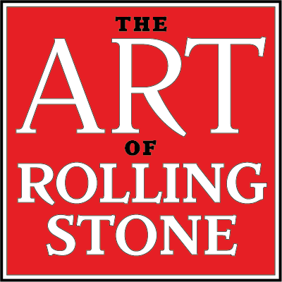
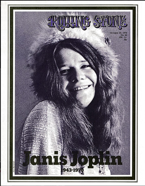
May 25, 2018 at the School of Visual Arts Theatre in New York, TYPE magazine will present “The Art of Rolling Stone,” exploring the impact art directors, illustrators, photographers, and visual creatives have had on the 50-year-old magazine.

Roger Black is editor in chief of TYPE and a typographer and designer in his own right. The stories and ‘lessons learned’ from the visual leaders of the magazine is the ultimate goal of this conference.

“And I want to get them to tell some of their funny stories, because they all have hilarious anecdotes,” Roger told me when I spoke to him recently. Each time I speak with Roger Black, I feel energized and learn something new with every conversation. This interview was no different. As a former art director for Rolling Stone, the magazine holds a special place in Roger’s heart as he told me during the interview, and he gives the musical icon total credit for putting him on the national map when it comes to design.

The conference, which will be held on May 25, 2018 at the School of Visual Arts Theatre in NYC, will pay tribute to the people who created a design legacy, from Rolling Stone’s first art director to its current one—plus photo editors and photographers who’ve immortalized a whole culture. As the magazine is at a turning point in its 50-year history, what better time to explore the impact of the visual aspects and ask the questions that deserve to be answered: what have we learned from something as influential and connective with its readers as Rolling Stone? And what’s next for the five-decades-old publication?

So, I hope you enjoy this very informative conversation with a man as knowledgeable about design and the magazine industry as a whole, as I have ever spoken with, the Mr. Magazine™ interview with Roger Black.

And for more info on “The Art of Rolling Stone” conference, please visit TYPE magazine’s website here: http://www.typemag.org/home/the-art-of-rolling-stone

But first the sound-bites:

On the conference TYPE magazine is presenting on Rolling Stone magazine: We really hear a lot more about Hunter Thompson and the writers than we do about Mike Salisbury or Fred Woodward. We started talking about doing this a few years ago, but by the time we got it organized it was 2018. (Laughs) Essentially, it’s a non-profit event. We have a nice bit of support from Rolling Stone, they’ve been very friendly about it. But at the same time, we’re really taking stock of what has Rolling Stone done on the visual side and who are the people who did that. So, to some degree they’re very proud of that and happy with the legacy, but they’re preoccupied with trying to figure out what to do next. So, at that level, it’s probably a good idea that we do this, because I don’t know when it would get done again.

On whether he can think of anyone other than Jann Wenner or Hugh Hefner who had 50-plus years as editor in chief at the same magazine: William Shawn, although he was not editor in chief of The New Yorker the whole time. He was there for 50 years, a ridiculously long time and he was an old man when he retired, but in some respects, it wasn’t his magazine, it was Harold Ross’s magazine; he inherited the mantle, so it isn’t quite the same.

On whether the move from the west coast to the east coast for Rolling Stone had an impact on the design or the brand: It’s difficult for me to sort out how much of it was because of New York and how much of it was because of the change in the business, because if you remember, that move coincided with the magazine’s heyday. That was a time when it was filled with ads and had everyone’s attention. It was very important at that moment. It was also past the 10-year mark and it was beginning to institutionalize; it was beginning to settle into patterns. If you look at, say, Fortune magazine, it was very experimental and very interesting from a design point of view in the early days. But then by the 50s it became almost formulaic, and I think Rolling Stone was settling into a formula, into its formula. Three features and one of them would be rock and roll, one would be personality and one would be politics, the front of the book and the back of the book. And a certain number of pages.

On bringing all of these art directors together at the conference and if he thinks it will be a “Clash of the Titans” or they’ll check their egos at the door: One thing that I’m trying to do, and we’ll see how successful I am, is to get everybody to focus, not so much on their portfolios, because with people like Fred Woodward, we know his portfolio. And we don’t need to see the history of Annie Leibovitz’s photographs again. It’s like going to a Picasso show, okay that’s the Blue Period, I get it. (Laughs) I want to get them to tell some of their funny stories, because they all have hilarious anecdotes. But I really want to find out what they learned.

On the collective art of print magazines: Yes, and that’s the fun part too, I think. We do have one session on the team at Rolling Stone, and none of the top art directors are there, but all of the people who are on the panel have gone on to become art directors. We’ve had more people who have become art directors from the 70s than anything else. Some of them went into advertising, there is Rich Silverstein in San Francisco, but there are people like Mick Stevens, The New Yorker cartoonist, he was a paste-up artist.

On why he’s always had a soft spot for Rolling Stone, even though he’s worked on many magazines: Well, I owe a lot to Rolling Stone. It taught me, because I never went to design school. I had already done some newspapers, tabloids. I had been the art director of a weekly in L.A. and then I had done some freelance work. I recently found the first issues of Cycle News that I did in 1973 or 1974. (Laughs) And they looked pretty good. And that was before Rolling Stone. So, I had learned a few things along the way, but Rolling Stone was a much more challenging environment. I had a year before I had to be the art director, so that was great training. And Jann had to be the most, he is a completely compulsive lunatic, but he’s a genius. He would come up with something in a split second that would electrify you and you’d have to move as fast as you could to keep up with him. And that was a wonderful experience.

And now the lightly edited transcript of the Mr. Magazine™ interview with Roger Black, editor in chief, TYPE magazine.

Samir Husni: Tell me about the conference that Type magazine is presenting about Rolling Stone.

Roger Black: Rolling Stone magazine is at a turning point and at a very interesting moment in its history. There was quite a lot of attention with the HBO special, and there was a very beautiful book put out, but very little about how the magazine was designed and how that visual style developed over the years and the people who contributed to that.

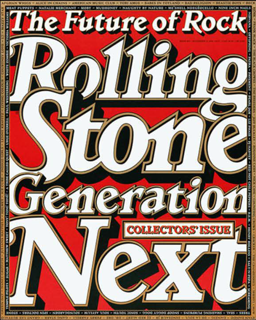
The book about the Rolling Stone covers is in its third edition, and this edition is called “Rolling Stone 50 Years of Covers,” and Jann (Wenner) has a nice introduction to that, where he gives due credit to the designers and the art directors and tells a few anecdotes about that.

But other than that, we really hear a lot more about Hunter Thompson and the writers than we do about Mike Salisbury or Fred Woodward. We started talking about doing this a few years ago, but by the time we got it organized it was 2018. (Laughs) Essentially, it’s a non-profit event. We have a nice bit of support from Rolling Stone, they’ve been very friendly about it.

But at the same time, we’re really taking stock of what has Rolling Stone done on the visual side and who are the people who did that. So, to some degree they’re very proud of that and happy with the legacy, but they’re preoccupied with trying to figure out what to do next. So, at that level, it’s probably a good idea that we do this, because I don’t know when it would get done again.

Samir Husni: When you really think about it, we had two magazines; we had Rolling Stone and Playboy, with the longest-serving editors; from the beginning of Playboy in 1953, Hugh Hefner was editor in chief, and the beginning of 1967, it was the same thing with Jann Wenner. When you look at the magazine industry as a whole, can you think of any other icons who lasted 50 years-plus?

Roger Black: William Shawn, although he was not editor in chief of The New Yorker the whole time. He was there for 50 years, a ridiculously long time and he was an old man when he retired, but in some respects, it wasn’t his magazine, it was Harold Ross’s magazine; he inherited the mantle, so it isn’t quite the same.

At Playboy there was someone else, Art Paul, who just passed. Art Paul did the magazine, when we were at Esquire or something, you’d look at Art Paul a little bit like you would look at Hugh Hefner; he did the magazine very sleek, with a love of chrome and velvet. And it was a little too rich and too polished for the kind of AIGA wisdom of what design is supposed to be. And it was much more eclectic; it wasn’t a powerhouse, modern design, despite the fact that he was in Chicago. It was much more fun. (Laughs)

A little later in the sixties, we saw people like William Holbert, the art director of Look, adapt that modern style in a much warmer way than say, the Germans had done it. But still, what Art Paul was doing was a little more like what Rolling Stone was doing, he was trying to create his own voice or the voice of the magazine, that had its own rich personality. It was what we call today “branding.” (Laughs) And incredibly successful. The paid circulation of Playboy was what, two million at one point? I don’t remember. But it was huge.

Samir Husni: Seven million at one point.

Roger Black: Seven million? There you go. And it wasn’t a discounted magazine either. Now, Rolling Stone never got to those kinds of numbers, but it held over a million for quite a few years; I’m not sure where it is now.

But it was the same kind of thing. Instead of being one art director, there was a series of art directors who all had a different take on the same voice. And I think Jann gets an enormous amount of the credit for pushing that and for also shaking it up from time to time. I don’t think he would be particularly surprised or disheartened by the changes that are very likely to be made today.

There are two things that we’re going to talk about at this conference with this group, and we do have the photography editors too, all of them, and that I’d say has more continuity than the art directors, but I’ll get to that in a minute. In the graphic design, in the format of the magazine, it started in a very restrained, very classical type of typographical style. I’ve said that it was trying to look like it was the entertainment section of The Times of London. (Laughs) Not even the Sunday Times. It was very sober.

And all of this was pushed back against the why of the illegible underground press, because right in San Francisco, you had all of the wonderful underground comic artists and illustrators. That whole underground look, which was rampant in the mid-sixties, by the time Jann got going, and actually in a way, it was inspired by what Warren Hinckle was doing at Ramparts, because Jann went to work at the Sunday Ramparts. All of this period is very nicely told in Joe Hagan’s book, “Sticky Fingers: The Life and Times of Jann Wenner and Rolling Stone Magazine,” which came out last year. The book’s account of the first 10 years is fun and interesting. How do they do this?

Actually, Steve Heller asked me recently in an interview for Print Mag, did we think Rolling Stone was going to be a long, enduring publication when it was in its first 10 years? And actually, by the time I arrived, which was year eight, I was so young that it didn’t occur to me that it wasn’t already a fixture. It seemed like it was a permanent institution. And your attitude is quite different about that from the hard travel underground, which I also knew from the 70s. There was a staff; there was machinery; everyone had fancy typewriters and we had a budget for editorial. So, we didn’t really think it was anything but something that was going to last a long time. We were building for success and we were building for a continuing style and idea that could be carried on.

And a lot of that has to do with the relationship a magazine has with its readers. I mentioned William Shawn; The New Yorker under keyed a fairly big visual change, but it still looks very much like The New Yorker. The cover idea, the style of illustration may have changed from time to time, but it’s still The New Yorker. You see a painting someplace or another picture and you say, that could be a New Yorker cover. And that’s an amazing thing.

Rolling Stone had that silly rock song, “Cover of the Rolling Stone” about it very early. It had already become a thing, a visual icon that people recognized. So, the first art director struggled with that and started this fairly straightforward, kind of an antidote, to the crazy underground that was unreliable and not very long-lived. Rolling Stone was setting itself up as the arbiter of the style and the culture and the politics. It was trying to give itself authority. And that was something that the underground was pushing against; they were pushing against authority.

So, that was a very interesting thought. For the first five years Jann worked with this fellow, John Williams, the first art director, and who is coming to our conference and who is never mentioned, someone Jann didn’t even know was still around. He’s been in San Francisco the whole time and he’s done very well and is in great shape. He’s done well as a designer, but he went away from publications. He’ll be at the conference and talk about those early days.

Robert Kingsbury, who is still alive, but unable to attend, was the second designer and actually Jann’s brother-in-law. The magazine started getting a little bit of money and hiring named illustrators and then Annie Leibovitz joined the staff. And all of that started the change. And he’s the one who first had Ralph Steadman in the magazine. He was an amazing guy. He was not part of the community of art directors; he was a sculptor and an artist that Jann pressed into service because he didn’t have much money. And he wanted to help. He was a very nice guy. Later, he did a lot of the book.

Then Jann turned to Mike Salisbury, who was a record company art director, fairly big-time and had done Surfer and Surfing magazines. He was a very lively and funny guy, kind of impetuous. It was difficult to have Jann and him in the same room at the same time. (Laughs)

He didn’t last that long, and then Tony Lane came in from a record company in the Bay area that had had some big hits. He was also a really polished art director with a big Rolodex, as we used to have in those days, filled with illustrators and photographers’ names. And he made a lot of amazing assignments. His typography was also superb. But he was also an extremely volatile customer, he and Jann were great friends for a while, then fell out.

I had been hired as the assistant and I came in and was there for about four years. I was the art director for almost three years and then my assistant, Mary Shanahan, took over. So, at that point, we had a certain kind of brand-building era. That was the first 10 years. Five art directors, Mary came in after the 10-year mark, she came in 1978. She went on to do GQ and French Vogue, and then Town & Country, not exactly the same kind of magazines, but she was very good, and the only female art director we’ve had at Rolling Stone for 50 years.

And at that point, when she left, Jann said, clear to the next, getting all so self-referential. And then he brought in Derek Ungless, a Brit, he had been Robert Priest’s cohort on “Weekend in Toronto.” And he took the Oxford rules off; he took the borders off the pages. (Laughs) So, that set up the cycle. Then Fred Woodward came in and he restored it all, put the Oxford rules back, and he was there for a long time. I think about 12 years.

Then another Brit came in and burned off the brush again. (Laughs) And then my friend, Amid Capeci, who is no longer alive and was a wonderful art director, came in and started doing the restoration, and Joe Hutchinson put the typefaces all back. And if you look at the last 10 years of the magazine, it’s very much Rolling Stone-looking. So, the obvious next step would be a big change, but we’ll see. It’s been reformed, has had a whole lot of brand-building, and has had a revival or shall we say, been reformed; radical change again and then revival. It’s very interesting to look at its 50-year history.

Samir Husni: It would make a nice case study, in terms of a conversation about brand-building and change.

Roger Black: Yes, and the amazing thing is people say that Rolling Stone isn’t what it used to be, but nothing is what it used to be. The culture is totally different and it has changed several times since. People say the magazine business is in convulsion and we haven’t figured out what we’re doing, and I think that’s fair. But if you talk to people in the music business, it’s morphing constantly They’re struggling to come up with new business models all of the time.

And the same thing with movies. Every two years, I’d say, there is a Variety or Hollywood Reporter headline that says, the studio system as we know it has collapsed. (Laughs) It’s all changing. And I don’t know what business doesn’t do that. But with the case of the long-form motion picture industry, with the kind of consolidation they’ve done and those huge franchises they’ve built, they’ve figured out how to make money, so there is a business model there.

Not so much with magazines. I believe that’s the real problem and that’s the second part of what we’re going to talk about at this conference, what do we do; how do we recreate the magazine experience in the digital era? And how do we do it digitally? I will be the first to admit that I have not succeeded in figuring out digital formats for magazines that have the same compelling feeling, the same attraction, the same experience where you sit down with a good print magazine and you enjoy it. And then you get to a finish; you feel like you’ve completed it and you put it down.

And that’s not true with the websites or the apps. They’re never finished. And it’s a very tangential and short experience. You dive in and read part of an article and you’re gone. You don’t even know where the article came from some of the time.

Samir Husni: Maybe that’s something that’s good. Maybe we should reconsider and say that if it’s not ink on paper, it’s not a magazine. You can call it anything you want, but it’s not a magazine.

Roger Black: Yes, I agree. It isn’t a magazine. I think that the apps, some of the news apps, particularly Financial Times and to some degree, The New York Times; the Financial Times actually still has an edition concept, you can look at live news or the edition, which is interesting. I guess the Brits are a little more conservative than we are. I can spend time in the morning with The New York Times’ app, I can spend 20 minutes without changing it, but the tendency nowadays is to immediately go to the Washington Post or the Financial Times or the L.A. Times or The Guardian; all have the same reading experience. Maybe some of us used to get five daily papers every morning, I remember at one time I got three at least. And I used to read The Wall Street Journal too.

So, there was some of that, but with a magazine, Esquire and The Atlantic, and at one moment in time, New York Magazine, there have been quite a few where you felt like when you needed something to do, you could just sit down and read the magazine. And that experience, the edition experience is unique.

Samir Husni: I’ve always had this question in the back of my mind, was there a difference in culture, design-wise, for Rolling Stone when it moved to the east coast from the west coast? Did that impact the design or the brand, or was it looked at as just a different location?

Roger Black: It’s difficult for me to sort out how much of it was because of New York and how much of it was because of the change in the business, because if you remember, that move coincided with the magazine’s heyday. That was a time when it was filled with ads and had everyone’s attention. It was very important at that moment. It was also past the 10-year mark and it was beginning to institutionalize; it was beginning to settle into patterns. If you look at, say, Fortune magazine, it was very experimental and very interesting from a design point of view in the early days. But then by the 50s it became almost formulaic, and I think Rolling Stone was settling into a formula, into its formula. Three features and one of them would be rock and roll, one would be personality and one would be politics, the front of the book and the back of the book. And a certain number of pages.

Now, from a design point of view, that was the year that the new design appeared, which was really a consolidation of what we had been working on for the last couple of years. There were particular typefaces and that morphed frequently, but it was still very recognizable and it’s still recognizable, if you look at the news section in the front of Rolling Stone, there’s a resemblance to what it did 40 years ago.

However, we did have access to a much bigger pool of talent visually. Annie (Leibovitz), at that time, was beginning to pull away from the magazine. She took a year’s leave and went off with the Rolling Stones band. And we had to find people who could do that kind of work. And Jann loved the kind of social side, so he got Richard Avedon to do that big issue, “The Family.” And he got Avedon’s old buddy, Hiro, the famous still-life photographer; he hired him and pretty much made his own assignment to cover the space shuttle series that Ed Zuckerman wrote. He took that picture that you later saw everywhere, it was a clothing rack with spacesuits hanging on it, so it was like ready-to-wear spacesuits, which was a symbol of the shuttle. Famous picture, and that was something that Annie never would have taken. She didn’t think that way.

We began to see a lot of other photography. We would send photojournalists like Nancy Moran to Panama with Jan Morris, things like that. So, it became much more big-time. Anybody would answer the phone. And that was a change from when I started in 1975; you’d call somebody in New York from San Francisco and they’d say, I don’t know, what are you going to pay? (Laughs) By 1977, you’d call New York and they’d seen all of the publicity and parties; we had an architectural review in The New York Times of our office, it was becoming very big-time, so you’d call somebody up then and they’d say yes before they heard any of the details. That was a big difference.

The other thing is, one of the big upsides of the early days of Rolling Stone was that it took a lot of risks and it wasn’t afraid of failure. It was actually part of the culture, sort of like a Silicon Valley culture, where you aim high and sometimes you fall flat on your face. But because we had a limited budget, we would just go ahead and print it. (Laughs) And by the time we got to New York, we started to understand that there was a kind of bottom, a threshold that we had to get over. We couldn’t print failures, we had to have a certain level of sophistication at the bottom. And that’s a difference.

So, if you look back at Mike Salisbury’s or my early magazines, there were things that seemed like a good idea at the time, and then two months later we’d ask, what were we thinking? (Laughs) And that also allowed the most extraordinarily wonderful layouts to appear.

And Jann was doing the same thing, his interest in space was very interesting. It was almost like he had become an Arthur C. Clarke fan. What was Rolling Stone covering space for? We did an astronomy piece called “The Odyssey and The Ecstasy” about Mars. And I did the “2001” look for that, very elegant and minimal. And that was a great layout. In a more formatted magazine, you would have to use all of the same typefaces for all of the stories, which is sort of the pattern today, but we were able to create things that were very individual.

Rolling Stone was big enough that you had a kind of “Rolling Stone World or Universe,” it was like a theme park. And you could have quite a lot of variety within that and you were still New York and Rolling Stone. Today, in publishing and in the media, particularly in digital media, the theme park is the whole Internet, it isn’t one brand. And so individual brands have to strive for consistency. I’ve heard designers criticize The New York Times for using different fonts in their magazine, so you’re going through the website and sort of randomly, you come up on a magazine article and because you’re not holding the magazine, people say that it doesn’t go with the brand. Give me a break, come on, why does everything have to be exactly the same? (Laughs)

And I think that was beginning to be lost in New York. It became more institutionalized, more establishment, more self-conscious. But nevertheless, look at what Fred Woodward did in his era. That was some of the most wonderful layouts in 20th century magazines. And that was quite a few years later.

Samir Husni: You are bringing all of these people together on May 25th. Is it going to be the Clash of the Titans? Are they going to check their egos outside the door before they come in? (Laughs)

Roger Black: (Laughs too). One thing that I’m trying to do, and we’ll see how successful I am, is to get everybody to focus, not so much on their portfolios, because with people like Fred Woodward, we know his portfolio. And we don’t need to see the history of Annie Leibovitz’s photographs again. It’s like going to a Picasso show, okay that’s the Blue Period, I get it. (Laughs) I want to get them to tell some of their funny stories, because they all have hilarious anecdotes. But I really want to find out what they learned.

We also have the three big photo editors. They were big in the industry, Karen Mullarkey, who I brought in. And then Laurie Kratochvil, who I had known from the 70s, and was photo editor for 15 years or so. And she hired Jodi Peckman, who has been there ever since. So, there is a 40-year span of photo editors that are going to be there too.

And what I want to ask everyone is what they learned. What was the point? What is the value that we can impart? If you had a young designer today, what would you say to them? Or a young photography editor, what are the main guidelines? What is the meaning of Rolling Stone? What is the end result of all of this? And try to push that into not just an oral history, but actual analysis. And that’ll be fun to do. Andy Cowles, who was one of the designers who shook things up, who burned the brush, he is going to try and talk about how the brand was built and what that means now. And for the new owner, that may be what he paid for, the brand. What can you do with that?

Samir Husni: As you talk about the integration of the design, the photography, the writers, you name it; don’t you think that’s what differentiates the creation of a magazine from any website? Anybody who thinks they can create a blog and they can have some magazine online, with the same person doing the writing and the editing, while you rarely find in the history of magazines, any of them done by one person. It’s always that collective art.

Roger Black: Yes, and that’s the fun part too, I think. We do have one session on the team at Rolling Stone, and none of the top art directors are there, but all of the people who are on the panel have gone on to become art directors. We’ve had more people who have become art directors from the 70s than anything else. Some of them went into advertising, there is Rich Silverstein in San Francisco, but there are people like Mick Stevens, The New Yorker cartoonist, he was a paste-up artist.

At the time they were there, they were part of a team. It was the hippie radical culture, a lot of people were doing the whole women’s movement that’s going on now; what was it like then, did women have equal pay and were they treated equally? Near as I can tell, we never even asked that question. If somebody was an art director, they all got the same pay. It wasn’t much, we weren’t paid a lot, but there was never any thought that you would pay a woman less. That didn’t make any sense.

In fact, we probably got better women at each grade because they were scrambling. They were willing to work for less. But I think if you look at the editorial department, it was all women. Harriet Fier, who just died this year, was a managing editor during that time. Sarah Lazin, who has gone on to become a fairly big-time book agent and Marianne Partridge were there. There was an enormous group of very great, very talented and wonderful editors who were all women. And that was interesting to me in the current context. It was the interaction between the team, now sometimes we had huge fights between editors and art directors, mostly over space. Jann actually agreed at one time that in the feature well, we do the following allocation, 50/50 solid text and everything else. So, art and white space, whatever you want to do with it. (Laughs)

But it was on the average of an issue, it wasn’t every article. So, we could have one very texty piece. But the idea of what the headlines were; how the actual picture worked within the sequence of the story, or the way the captions, how much spacing for captions; that was all done in a collaborative effort. And it was quite fun; it was a really great group.

We had moved on in that generation, the first 10 years of Rolling Stone, even though there were people like Mike or Tony, who were already fairly big-time art directors before they got there, unlike me, who nobody had ever heard of. There was never a feeling of the great master, there was none of that. We didn’t hand down sketches as art directors to a staff who implemented them. We sat down as a team and decided what would be best to do and who should do it.

By the time I got there, it wasn’t one art director designing everything, everybody in the art department, all of the designers anyway, contributed. They did layouts; they did covers. The job of the art director was to corral that group and get them to work together harder.

There is a fellow who will be at the conference on the team panel, Vincent Winter, who lived in Paris and is mostly a photographer now; we worked together subsequently on many projects. He had this brilliant idea of the way the typography should work at that moment in time, which was use modern construction, modern architecture, and use old-style typefaces. And it gave an enormous charge to the magazine. It became much more electric than previously. He went in and worked with Robert Priest at Esquire. In that early 80s period, Esquire got really exciting under Robert Priest. And I credit Vincent, maybe in the same way that we worked together, it was like he would challenge me and I would challenge him. And that created something that might have been better than you could create on your own.

And that was the wonderful thing about it. And I feel like they had that same camaraderie among the writers. It was an amazing group.

Samir Husni: You’ve worked on so many magazines, but from talking to you many times, I’ve always felt that you have a soft spot for Rolling Stone. Why?

Roger Black: Well, I owe a lot to Rolling Stone. It taught me, because I never went to design school. I had already done some newspapers, tabloids. I had been the art director of a weekly in L.A. and then I had done some freelance work. I recently found the first issues of Cycle News that I did in 1973 or 1974. (Laughs) And they looked pretty good. And that was before Rolling Stone. So, I had learned a few things along the way, but Rolling Stone was a much more challenging environment. I had a year before I had to be the art director, so that was great training. And Jann had to be the most, he is a completely compulsive lunatic, but he’s a genius. He would come up with something in a split second that would electrify you and you’d have to move as fast as you could to keep up with him. And that was a wonderful experience.

I’ve been lucky enough to have worked with some great editors. Terry McDonell, who did Smart and then we did Esquire together, that was really fun. He is going to be a moderator at this thing, so that’ll be nice. And of course, Abe Rosenthal at The New York Times, there is no greater New York Times editor in its history. And I got to be his art director and that was pretty amazing.

Before Rolling Stone, as I said, no one had ever heard of me. I had never done anything nationally, and then I was. And it was huge success. And we won all of the awards. That was a great moment in my life. For many, many years, I tried to push back and people would say he’s the guy who did Rolling Stone and I would say that I had done other things. (Laughs) But still, it was very important to me and it was a great moment in time, so I’m happy to use that as the center of my resume. (Laughs again)

I think there’s a whole other conversation, which we touched on, which is that experience online. I did this thing called Tree Saver, which was a web app for turning pages. And we never had a matching business model, so we could never really make that idea work. We did quite a few of them, but they never made us a business success from it.

The same thing with the PDF magazines that Condé Nast got so excited about. And I remember at the time being skeptical. I’m working on my own book and I found a quote that said, “The iPad is not a magic pony.” That’s something that I said in a trade paper.

But there are people at Condé Nast and elsewhere who thought that they had solved the digital magazine problem. Just take the PDF’s and cast them into that format and that’s it. We ended up with Texture, which I think Apple bought. But Texture itself promotes individual articles for their magazines. And it’s not even a really good experience. It certainly doesn’t work on an iPhone. It’s okay. I subscribe to Texture. I can read The New Yorker on Texture if I don’t have my copy. And that’s good, I like that. I can go to The New Yorker app too, it’s very convenient. There are things that I don’t subscribe to, that I don’t get in there.

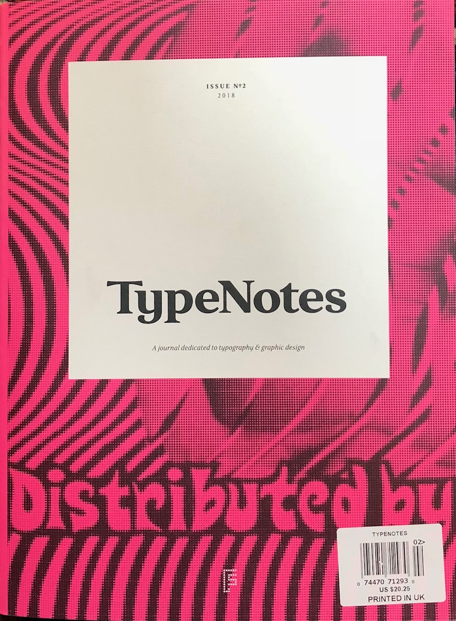
So, how can we work on this experience? If we can find a business model, I think we can recreate some of these. There are some things working. I’m doing TYPE magazine, for example, which is now in its second issue. It’s very much for love and not money. But we’re getting support and it’s kind of a tripod of members, advertisers and patrons holding it up.

Then there’s the billionaire magazine, Alta, which is quite good. And if we can find a benefactor, maybe we can hold on long enough until we can find an actual business model. I keep finding people who love the printed magazine.

That’s the conversation: how do we keep it going? Whether it’s things that you can create online, and as you pointed out, that’s not a magazine, but what could it be?

Samir Husni: Thank you.