
The VIP Factor in Magazines
May 4, 2007For years I have been telling my students and my clients that the Visual Impact in Print (the VIP factor) depends on marrying the photography with the typography to create a visual impact that will stop you and make you pick up the magazine. Well, today while scanning the newsstands I found a great example of how not to achieve that impact. In fact it was just the opposite. The cover of the new special from Cook’s Illustraded magazine on Summer Grilling & Entertaining stopped me in my tracks for the complete wrong reason. Summer grilling screams the name and berry pie screams the picture… My brain kept showing me images of a grill and barbecue and my eyes kept showing me a delicious cold pie ready to eat…confused by the mixed messages I started to walk away, but then I remembered it is a first issue that I need to add to my collection plus, I thought, it will make a great blog on what NOT to do with your magazine cover. Well check the cover for yourself. It is grilling below this blog…
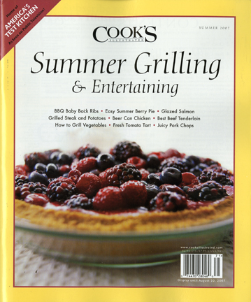


This is crazy! Why would they put a pie on the cover of a grilling magazine? Would it have been better if they were absolutely stuck on the pie to maybe put it on a table among delicious grilled summer meal?! Would that be the correct way to do it? To me using the VIP factor for Magazines is a lot like in creating an Ad campaign…Am I understanding it right?
This is crazy! Why would they put a pie on the cover of a grilling magazine? Would it have been better if they were absolutely stuck on the pie to maybe put it on a table among delicious grilled summer meal?! Would that be the correct way to do it? To me using the VIP factor for Magazines is a lot like in creating an Ad campaign…Am I understanding it right?