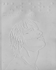


On a recent trip to Amsterdam I picked up the latest issue of COLORS magazine, the United Colors of Benetton magazine. Issue number 73 of the magazine that I cherished every issue of its first few years of existence. It was the example I gave in class for innovation, content, design, you name it. And, as is with a lot of great creative magazines, the magazine fell on hard times and was reduced to yet another printed publication. Well, starting with issue 72, innovation is back, and is back with a vengeance. The last two issues remind me so much of the early issue of COLORS the magazine that set a new standard of innovation in print. Issue 72 was dedicated to a world with color. The theme of the issue was Without Colors. A Braille cover on a white background adorned the front of the magazine with another cover on the back in black and white. A CD with audio readings of the entire magazine was enclosed with the magazine.
Issue 73 on the other hand was dedicated to Money. Back are the double covers, different size magazines, great use of multiple photography and of course, excellent use of design.
If you have not seen COLORS in some time, or if you have given up on the magazine, like I did, I invite you to take a look at some of the sample pages from issue 73 (below) and the covers of issues 72 and 73 (above). Trust me, you will not regret picking it up again.


Archive for the ‘Across the Pond’ Category

Innovation in Print (1): COLORS is Back with a Vengeance
March 14, 2008The Best Use of “Christmas” in a Magazine…
December 24, 2007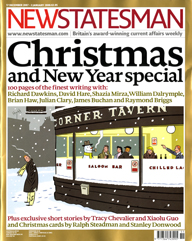
New Statesman magazine bills itself “Britain’s award-winning current affairs weekly,” and keeping with current affairs this week’s issue celebrates Christmas and the New Year in a very special way. The magazine offers “100 pages of the finest writing…” inside this end-of-the-year issue. Included in the issue is more than one defense of the use of the terms Merry Christmas and Happy Christmas rather than the so-called politically correct Happy Holidays. What caught my attention was the essay by Richard Dawkins, the Oxford University professor and self professed atheist and author of The God Delusion book. He writes,
“For better or worse, ours is historically a Christian culture, and children who grow up ignorant of biblical literature are diminished, unable to take literary allusions, actually impoverished. I am no lover of Christianity, and I loathe the annual orgy of waste and reckless reciprocal spending, but I must say I’d rather wish you ‘Happy Christmas’ than ‘Happy Holiday Season.”
New Statesman magazine is filled with Christmas essays, fiction, quizzes and awards. Very well done and best usage of the word Christmas that I have seen in a long long time…
And for those of us who celebrate the birth of Jesus, Merry Christmas and a Happy New Year.
Lessons we can learn from Finland (take two)…
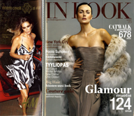
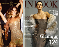
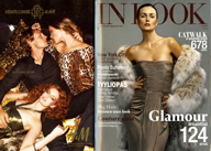
November 6, 2007There is nothing new about using an extra flap on the cover to create space for more cover lines and at the same time be able to use the back of the flap to sell some extra advertisement. The New Yorker has been doing that for years and so is the new Condé Nast Portfolio. However, while in Finland I picked up a magazine called In Look and it did not have one flap but rather three. They added three layers of flaps over the cover making space not for one ad but for three in addition to that of the inside back cover. As you can see from the pictures below the first flap covers one fourth of the cover, the second one half and the third three quarters of the cover. A nice way, indeed a very nice and creative way to add more space for advertising in your magazine that is both attractive to both customers: the advertiser and the reader. (If you look hard at the main cover you can see the edge of the flaps).
Is HELLO! testing the waters for a USA launch?
November 5, 2007
In the midst of the gossip weeklies raising their cover prices (In Touch and Life & Style from $1.99 to $2.99, and US from $3.49 to $3.99) the British import HELLO! is just doing the opposite by decreasing its American cover price from $6.95 to $4.99. This is the second time the British magazine seems to test the waters for a launch in the USA. Back in the late 80s HELLO! ran a full page ad in The New York Times offering a free sample issue of the magazine. Based on the response to that ad, the powers at HELLO! opted not to launch the magazine in the USA. But now, with OK doing better than expected and the gossip market still going strong, it looks as if HELLO! is testing the USA waters one more time. The magazine that had a limited distribution in the USA is now more widely distributed with an added yellow circle promoting the new reduced American price. Is the USA ready to welcome HELLO!? Wait and see is the name of the game for now. Keep your greetings and enjoy the British editions for now…
Lessons we can learn from Finland…
November 3, 2007
I just came back from a week’s visit to Helsinki where I was conducting seminars and workshops with the staff of several magazines published by Sanoma Magazines Finland. One magazine stopped me in my tracks: Aku Ankka, which simply means Donald Duck. The weekly magazine has a circulation of over 320,000 and a readership of over one million in a country of five million. It is the best known media brand in Finland and is read by almost one fifth of the population. What stopped me more than the statistics is the cover price. The magazine sells normally for two Euros, but when they have any special supplement or extra pages they cross the two Euros and have a big star burst with the higher cover price of two fifty…yes, they highlight the higher cover price. Talk about dedicated readership. Just the opposite of what we do in the States where we highlight the lower cover prices not the higher. Another surprise with Aku Ankka is the ads the magazine carries: automotive, yes automotive. Just look at the picture of the back cover above. So, the first lesson I have learned from Finland on this trip is very simple: create an addictive content for a magazine, even a comic magazine, and people will pay for the content. It is the content that people pay for and the more you give them the more they will pay. If you are in the business of selling content you do not have to fear raising your cover price.
Size does matter…
October 5, 2007


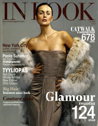
During my trip to Germany I picked up the 10th anniversary issue of the German edition of GQ. It came in two sizes: the standard size and a handy “pocket size” edition to fit easier in your briefcase. I was amazed to the see the difference in price: the standard size four euros, the mini only one euro. A difference of three euros for the same stuff. However, unlike the original pocket size magazine Glamour (the UK edition) the mini GQ is in fact a reduction of the original magazine rather than a specific design for that size… (so have your magnifiers ready). The next day I traveled to France and picked up a copy of Cosmopolitan. The same story there. One standard size and one mini. However, the French were not willing to give the store away just because it was a mini…only 20 cents discount for the mini. The standard Cosmopolitan was two euros and the mini was 1.80. In fact I saw more maxi and mini magazines in France than any other country that I have visited. The mini editions vary in adjectives from travel size, to handy size, to handbag size all the way to pocket size. Thank you UK Glamour for introducing a new “buzz” size to the magazine market place…
Remedy for the cold (at least Down Under)
June 21, 2007My friend Ravi Pathare (Mag Man) from the Mag Nation in Auckland, New Zealand is celebrating the beginning of winter (lucky them for now) with the following advice to his clients and customers:
The cold weather has finally arrived, and what better way to while away winter than to read lots of magazines.
Cuddling up by the fire place – you need a mag
After a long day of skiing – you need a mag
Stuck in bed with a terrible cold – you need a mag
Looking for that recipe for chicken soup – you need a mag
About to go skinny dipping in Kaikoura Bay – you need a mag
About to celebrate your friend’s birthday – you need a mag (or at least one of our gift vouchers)
So cold that you haven’t been outside or seen anyone for 16 days – you need a new life, but in the meanwhile, a mag wouldn’t go astray
and oh what mags we have for you…
Great advice. Thanks Ravi and if you want to take a virtual tour of Ravi’s Mag Nation stores click here.
In Touch’s Scandinavian Expansion…
June 20, 2007
The success of Bauer’s In Touch Weekly is continuing to spread overseas. After launching in Mexico and Germany, the magazine today launches its first Swedish edition through its licensee the Swedish’s First Publishing Company. My friends at the media blog Vassa Eggen inform me that First Publishing has a “portfolio of eight magazines: originally a tech mag publisher but now publish magazines about poker and horse riding…The first issue of the Swedish In Touch has no Swedish content, only US material. It’s distributed by the largest Swedish distributor Tidsam.” It comes as no surprise to me that a magazine like In Touch weekly, which I have selected as the launch of the year back in 2002, continues to grow and spread worldwide. The Bauer formula in the United States has been a very very successful one: Focus on the reader, focus on the newsstand, charge the right price for the magazine, and all will follow… it is amazing why the rest of us in this business cannot learn from their formula.
A Daring Cover Treatment
June 19, 2007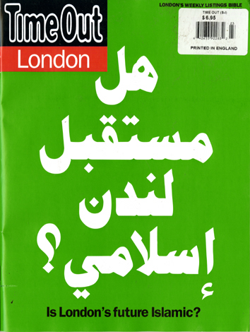
What do you do when your cover story addresses a hot topic about a major ethnic/religious issue… Go for the shock impact. Time Out London did exactly that with their cover story on the future of Islam in London. They opted to have a typographical cover with Arabic type instead of English. Big type, big words and only those who can read or speak Arabic can read it. The rest of the audience had to read the little translation at the bottom of the cover. It has been ages since I have seen a cover that really stops you in your tracks…this one did. Congratulations to Time Out London for a great cover idea. A daring cover treatment for these daring and trying times.
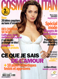
It is no longer a UK fight…
June 15, 2007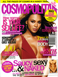
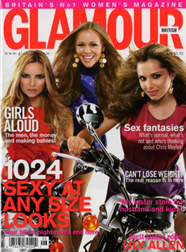
Hearst and Condé Nast seem to have decided to import their “handy travel size” women’s magazines to the United States. It looks like the newsstands have been flooded with copies of the June 2007 of the British Cosmopolitan and Glamour magazines. The first offers “All the pages of Cosmo in a handy travel size,” and the second offers “Britain’s no. 1 women’s magazine” in the same handy travel size. Needless to say that it was Glamour that “glamorized” this “pocket size” for women’s magazines and is now being imitated all over the world (North America, as usual, is always an exception). Both magazines are offered at a very discounted price (a bargain compared to the rest of the British titles on the marketplace). Glamour with its hefty 388 pages sells for a mere $4.99. Cosmo with its 276 daring pages including an “exclusive sealed section” sells for a mere $5.95. It should be noted that the Glamour price seems in tune with its UK price of 2.20 British pounds while Cosmo’s price in the UK is 3.30 British pounds, thus some discounting is taking place here. The exchange rate of the British pound to that of the American dollar is almost two dollars. So you may ask, aren’t the American titles enough? Well, the simple answer seems to be no. I remember when it used to be that when a British title was first published in the States (Marie Claire {the UK’s and not the French}, Maxim, etc.) the importing of their British counterparts ceased or dwindled a lot. Times are changing and the world is indeed getting flat. Let us hope that the words of one newsstand’s seller do not become prophetic. He told me when he saw the two UK titles arriving in his store, “they look more appealing and revealing than their American counter parts.” Will that translate to more selling? Time will tell. Stay tuned.

